After what feels like a lifetime of ‘greige’ living rooms, paired with carefully positioned coffee table books, next to the same arrangement of Diptyque or Jo Malone candles, it’s a pleasant change of pace to see maximalist design entering the mainstream again. After many years, confined to the kooky corners of the interior design world, 2022 has seen maximalism burst back onto our feeds – with over a 5,000% increase in searches across Google over the past year. Stay with us today as we deep dive into what this design style is, its key characteristics, design tips and unpack where it came from and why it’s so popular right now.
What is Maximalism
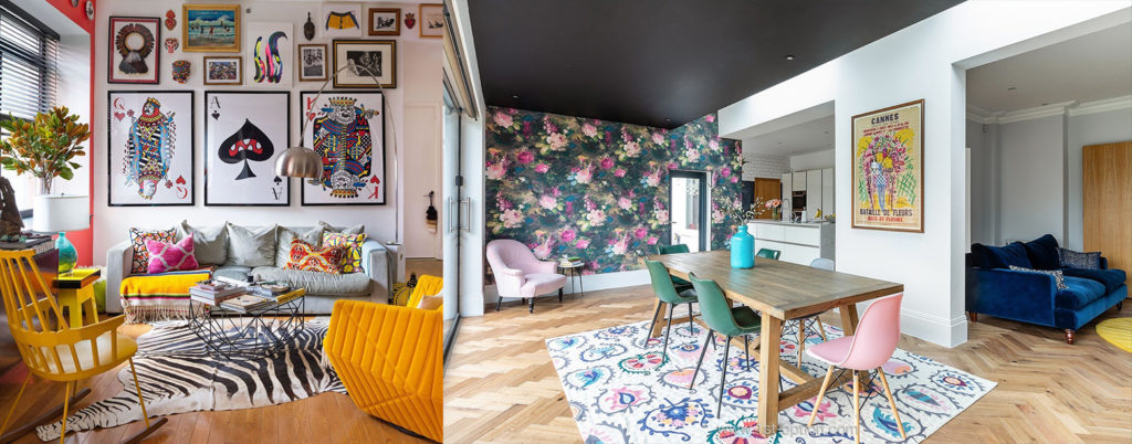
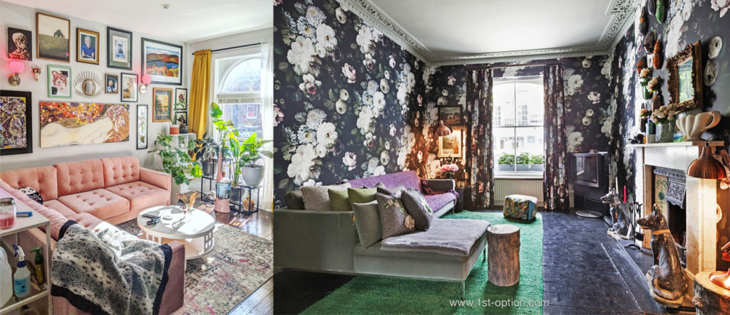
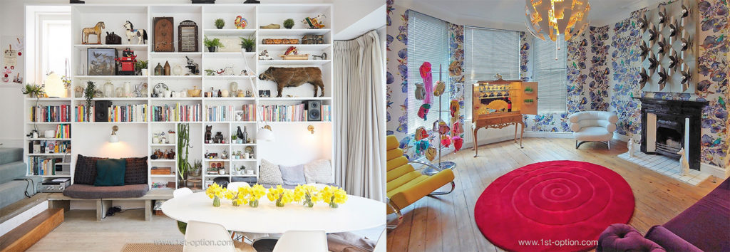
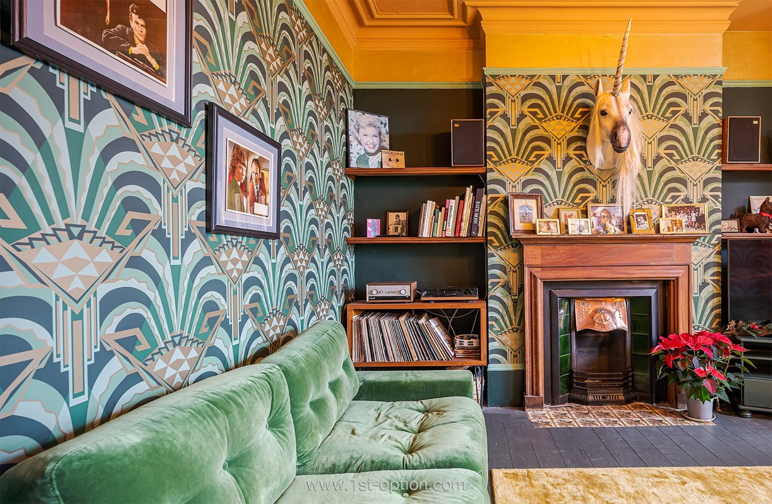
Maximalism isn’t just a trend that goes against ‘less is more’, it actually goes one step further and actively says ‘less is lacklustre’. Ingrained into its very fabric, perhaps fairly self-explanatory, Maximalism is about designing the space around you to the absolute max. You can’t miss a maximalist design! As you can probably imagine, the style is hyper-personal and oozes with personality, character and individuality. Teetering on the edge of chaos and what’s acceptable, maximalism is a cheeky modern off spin of clutter and cottagecore. Expect to see tons of layers, textures, colours, prints and a hatful of objects that carry intense personal meaning to the beholder. Nothing is off limits with maximalism – chintz with leopard spots and stripes with explosions of florals, all working in harmony with your treasure trove of personal objects. That being said, there are ways people can get it wrong, so don’t go anywhere if you want our key design tips and tricks, as well as the few mistakes people often make.

History
Whilst maximalism is certainly having its time in the limelight, it is by no means a modern trend that has burst onto the scene out of nowhere. It has in fact existed around the globe for centuries, with it first popping up in the mainstream around the 16th Century. It was a way for the rich to flaunt their wealth, showcasing all the artwork, and lavish pieces of furniture they had obtained from their travels. A private museum of sorts into the lives of the mega rich at that time. When Queen Victoria came to the throne 200-300 years later, we saw a return to opulence, extravagance and ostentatious living. The Victorians had a penchant for materialistic things, they were eclectic people with busy interiors. Every inch of the homes of those who could afford to, were covered in the goods they could acquire – again showing their levels of wealth. It was a time when people started to develop their own individual personalities through design and items such as rugs, drapes, wallpapers and decorative accessories were great ways to do this; reflecting their personal selves onto their visitors.

What people get wrong
Whilst we did mention that nothing is off limits in maximalist design, there are ways you can get this off-the-wall design style wrong. Sure, in its purest form, maximalism is about an abundance of decor, however, there is still an art to curating this style. The art is about telling your story – showcasing your individualism, your character and your personality through your favourite colours, textures and objects. When people get it wrong, they throw everything they own into a space and are left with a cluttered and mismatched space that screams junkyard more than treasure trove. Maximalists that know what they are doing acquire decor that holds value through time, rather than obtaining as many pieces of furniture and decoration as they can. Maximalism is about investing in timeless pieces that look good and tell your story, however you decide to style your place. Look to add a few bold pieces that add texture and originality, whilst grabbing your viewer’s attention immediately.

Recent popularity
Taking cues from the past, modern maximalists are curators of their own space, showcasing their own personal style and personality through the adoption of having belongings on show. However, following the economic crash in 2008, interior trends moved towards a more minimalist look – making statements with less. As the country recovered, however, the next decade saw people start accumulating wealth again and filling their spaces with meaningful objects and accessories. In recent years, social media has been a big driver in the boom of maximalism, with platforms like Instagram and Pinterest giving it a vast audience to curate their own variations. Maximalism is particularly popular with millennials who want to decorate with eclectic decor, plants and their accessories from their travels around the world.

Design tips
Maximalism can actually be one of the hardest design styles to get right – tying an array of concepts, colours and patterns together can easily make a space look disjointed or cluttered. However, as a starting point, experts say you should think about the top-level items that are a ‘must’ and then work your colour, texture and pattern play in from there. Whether it be a room dominated with plants, or a feature wall with a myriad of abstract art, have something take the lead and design the rest of the space from there. Once you have your ‘wow-worthy’ pieces that draw the eye, you can turn to walls to express yourself further; add oomph through wallpapers, colour and that all important texture. Layering is vital in a maximalist home, take the things you love and spread them across multiple surfaces, including furniture, tables, walls and even bookshelves. Remember, however, know when to stop, no-one wants to walk into a mismatched junkyard of clutter! Think about the right pieces that tell your story and the rest will flow naturally.

