Top 5 trendiest shoot locations in South London

First, we took a trip around East London, looking at the best properties it had to offer, then we analysed North London, deciding on our top 5 locations in that distinct pocket of London. While both areas will claim they have the trendiest homes in the capital, boasting properties such as Spratts Factory and Nash, South and West London will certainly have something to say about who deserves the crown. South London is one of the most up-and-coming parts of the city, and is where we will lay our hat today – with locations ranging from bachelor pad-style homes in Brixton, to architect-designed new builds in Wimbledon, our top 5 trendiest shoot locations in South London will definitely give you something to think about. 

Celeste

Situated atop a hill in affluent Wimbledon, our first location to make the list is Celeste, an incredibly unique architect-designed new build with a contemporary exterior and timeless interior. From the moment you lay eyes on Celeste’s exterior, you know it’s going to be a showstopper, and the interior leaves nothing to be desired either – a contemporary masterpiece with fantastic design features. Uniquely designed, all three floors are linked through connecting voids, double and triple height ceilings, a one-of-a-kind central staircase and floor-to-ceiling windows that immerse the space with natural light. Premium features are a running theme at Celeste, with the ground floor offering an incredible kitchen/ diner with marble island, wooden flooring, wood panelling, bi-fold doors and views up through the house. Moving through the property, design features that set it apart are still on show, with living spaces on the first and second floor, finished with heaps of natural light, earth tones, more simple wood panelling, and a mixture of antique and modern furniture. There’s also a bang-on-trend wood burner, crittal doors and outstanding views, adding to the personality and drama of the space. 
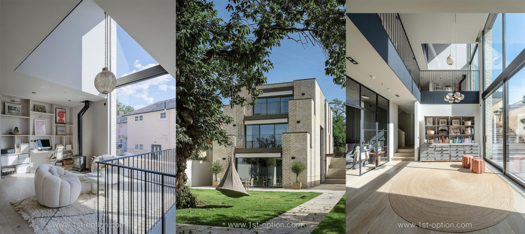
Celeste showing its interior matches the spectacle of its exterior

Lotus 

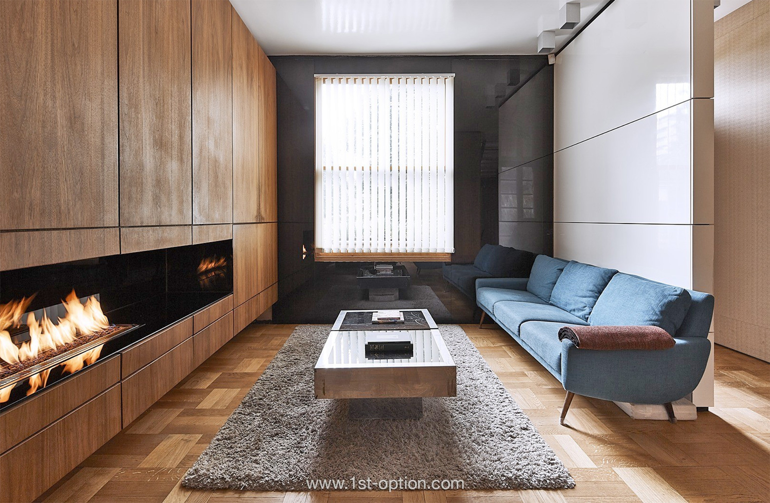
Moving from Wimbledon, we remain in South West London and take a short trip to Tooting Bec and Lotus, an exceptional recently-renovated Victorian house, with a gorgeous juxtaposition of modern and classic finishes. The property benefits from a truly superb rear glass extension, boasting astonishing 5m tall sliding glass doors, that break up the space and flood it with natural light. It is to the rear where you’ll find the kitchen/ dining room, finished with wooden flooring, a huge kitchen island and an abundance of natural light that floods in not only through the glass wall, but also the skylights above. Neighbouring the kitchen on the ground floor, where the majority of the creative shooting opportunities are, is the elegantly designed broken-plan living space, separated by a bioethanol fire. Expect to find parquet flooring, a crittal screen divider, designer furniture and a wealth of eye-catching artwork. With premium detailing, a wine cellar, designer furniture, an abundance of natural light and more space than you can shake a stick at, you won’t run out of ideas at Lotus and that’s why it makes this list.

Gorgeous broken and open-plan spaces at Lotus

Onyx

You can’t have a top 5 trendiest shoot locations in South London without including one of the most prestigious bachelor pad-style properties in the industry. Onyx is an outstanding end of terrace Victorian house with a unique side wing. Built in 1893, this Brixton-based property has been recently refurbished and is now approx. 3,700 sq. ft, set over four floors. With a largely open-plan ground floor, including a drawing room, library, dining room and large, modern kitchen/ diner, you aren’t short of interesting backdrops for shots here. The decor is largely dark in appearance with an incredible industrial-chic aesthetic, featuring dark stained parquet flooring, crittal doors, dark patterned kitchen units, a marble kitchen island and burnt orange breakfast stools that add visual weight and personality. There’s also a walk-in-wardrobe and a luxe cinema room that really help to rubber stamp Onyx’s place as one of the trendiest locations in South London. 

Onyx with its moody industrial-chic aesthetic

Marmora Road

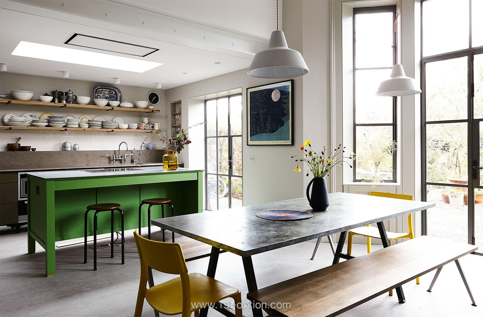
If you’re talking about trendy shoot locations in South London, Marmora Road has to make your list. This beautiful Victorian family home, based in East Dulwich, has recently undergone a sumptuous rear renovation, leaving you with a gorgeous period property that blends traditional features with contemporary touches. Enter through the front of the property to discover all of its period features, including the distressed walls in the hallway, original cornicing, ornate ceiling roses, original fireplaces, bay windows and wooden floorboards. It’s this juxtaposition of contemporary and traditional, however, that makes Marmora Road so exciting and creative. One shot and you feel like you’re in a purpose built, run-down dilapidated home, thanks to the distressed walls, and the next you’re in a modern extension with crittal doors, concrete flooring, steel beams, a fabulous green central island and skylights that brighten the space up immeasurably. If this wasn’t enough, there’s also a rear garden with a pallet shed and a roof terrace with unparalleled views of The City. Marmora Road is the perfect unorthodox shoot location with endless creative shooting opportunities. 

Delapidated and contemporary stylings at Marmora Road

Terracotta

When you think of trendy properties, your brain will most likely go to Pinterest, so it makes sense to include one of the most Pinterest-ready locations you’re likely to see this year. Terracotta is a fabulously designed period house, hailing from Clapham South. While we have many period homes on our books that could have made the list, Terracotta makes it for three distinct areas, – the hallway, front room and the exceptional kitchen/ dining room. Enter through the hallway to find a superb geometric green tiled hallway that perfectly complements the black painted bannister and door frames. Neighbouring the hallway is the living room, a striking space finished with another shade of green – in here you can expect to find washed parquet flooring, bay windows, designer lighting, an original fireplace and a wealth of biophilia that adds visual weight and depth. The jewel in Terracotta’s crown, however, is the rear extension that houses the kitchen/ dining room. The first thing that catches your eye will undoubtedly be the incredibly unique herringbone brick flooring, however, the whole room is elegantly designed and perfectly tied together. Notable elements that make this a perfect shoot location include the pastel pink kitchen units, complemented effortlessly by gold fittings, the wooden ceiling beams, the crittal doors, the marble countertops and the well-placed houseplants that bring a sense of character to the otherwise exquisitely styled room. 
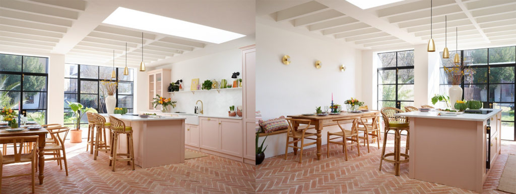
You find many better kitchens than at Terracotta

In Conversation with Celine Da Silva of Celine

Rob – “Today I have with me, the lovely Celine Da Silva from Da Silva Design and our aptly named shoot location Celine.”  

“How are you today?”  

Celine – “I’m very well thank you, had a lovely day filming with you guys.”  

Rob – “Amazing, as did we! Okay, can you tell us a little bit about your design style?” 

Celine – “So, I think my design style is influenced a lot by my family’s background. My dad’s side of the family grew up in Uganda, while my mum’s side grew up in Singapore, so there’s an African and Asian fusion, along with pattern and a love for natural materials.” 

Areas that nod to the African and Asian infusion within Celine

Rob – “Awesome, and how did you get into design?”  

Celine – “So I’ve been a graphic designer first and foremost for the past 13 years, before I moved to Singapore for a bit to work for a small start-up, where there was a graphic design and interior design department; I spent a lot of time working with the interior designer. Before long I was being asked by graphic design clients if I could help them with their interiors, so it kind of organically flowed from there. When I moved back to London, I decided to do an interior design qualification and went from there really.” 

Rob – “So, were you born in London?” 

Celine – “Yes, born in London, born in Tooting”  

Rob – “Ah, I love Tooting! So, born here and then you went to work in Singapore?” 

Celine – “Yeah, so I’ve lived in a few places – I’ve lived in Barcelona, Helsinki and Singapore in my 30’s, so that was the most recent place I’ve lived in. But London is my home.” 

The iconic Gardens by the Bay in Singapore and the Senate Square in Helsinki

Rob – “Wow, you’re so well-travelled!”  

“Can you tell us a little bit about your biggest influences in design?”  

Celine – “So I’d say my biggest influences probably come from staying in lots of different places and experiencing their cultures. You’ve got staying in wooden huts, to boutique hotels; I really love boutique hotels and I’ve taken a lot of inspiration from the calmness in the atmospheres there, as well as the functional, beautiful designs.”  

Rob – “Amazing, so I guess you’ve already touched on it, but why did you decide on certain styles and elements within the house?”  

Celine – “I think a few elements are places I’ve travelled to, in enjoying the warmth. In the UK we have to consider how we want to feel in all types of weather, so wanting to feel cosy and warm when it’s raining, but also wanting to feel quite spacious, tropical and inspiring when the weather’s warm as well. So, I think I’ve tried to consider all of these things.”  

“As you can probably see, wood is also a big feature for me. It makes me feel connected to nature, and offsetting it with the black and the darker features just kind of grounds everything and reminds me a bit of Scandinavian design. There’s that kind of hint of Scandi/ Japandi design – there’s just a lot of inspiration taken from different places.  

Wood is a big feature in the slight Japandi design at Celine

Rob – “So you’d say there’s quite an eclectic mix of styles from around the world?”  

Celine – “Yeah, i’d say so!”  

Rob – “Where’s your favourite place you’ve travelled?”  

Celine – Ooh, good question – I would have to say probably Borneo. There was this really unexpected rainforest there, with loads of really cute gorilla babies and a music festival. It was just this mishmash of nature, fun and great food. And it was only an hour flight from Singapore, so it was really cheap and decided on a whim. It was a really unexpected trip and combination of everything I love.”  

Rob – “Love that! What’s your favourite area within the house?” 

Celine – “Ooh, my favourite area is the step that connects between the living room and the kitchen. It’s probably a weird thing to say, but because of the different heights all over the house, we weren’t actually sure how that would turn out – I was worried it might be too big, but actually it doubles up as a seat. So, I think it’s that connection between the two spaces that’s my favourite.” 

Rob – “Amazing! And what’s your favourite room?”  

Celine – “My favourite room is the bedroom in the loft because it’s the room that feels the calmest. It’s the quietest and has the best views that make you feel like you’re not in London.”  

Celine’s favourite spots in her home

Rob – “So, what made you decide to become a shoot location owner?”  

Celine – “Well, when I was doing my interior design training, I learned about it through someone I was training with on the course. And because I used to Airbnb my old house, I really enjoyed the hosting side of that. I enjoyed meeting new people and now it’s nice to meet people that are working on creative projects, because I’m a creative myself.” 

“So, I get to hear about lots of cool things that are happening, you get to meet nice people, make contacts as well, and because I’m self-employed, it actually makes me feel like I’m part of a permanent set up in a way.” 

“When I used to work at Selfridges, it was just one campaign after another, very seasonally focused and I feel like that’s kind of been brought back into my life a little bit.”  

“Having the Hilliarys shoot here that was Christmas focused, just reminded me of working in Selfridges when we would open our Christmas shop in July. With Hilliarys, it was August I think and there just this massive Christmas tree in here and it was really hot.” 

The gorgeous desing within the living room and dining room at Celine

Rob – “Yeah, it’s always a bit weird when you realise brands shoot Christmas in July.” 

“How did you find out about 1st Option?”  

Celine – “So, I found out about you guys actually through the girl who used to live in Streatham, I think she’s called Nikki at Tierney Terrace? I saw her post something on her account and she mentioned 1st Option on it, so went from there.” 

Rob – “We love to hear about word of mouth and people finding us through social media. What’s your favourite shoot you’ve had to date and why?”  

Celine – “That’s a good question, I think my favourite shoot has to be the one we had with a company called Makers Cabinet, who were shooting a new luxury pen. It sounds quite niche, but actually they really utilised the space; it seemed to suit their aesthetic and it was really nice to see how they used a lot of the props we already have, in their shoot. It just made me feel fulfilled that the styling elements we already have are helpful for shoots.  

Scandi design and Poodle and Blonde curtains in the master bedroom

Rob – “Yeah, I love that! Last question, why do you think your home works so well as a shoot location?” 

Celine – “Well, the ground floor seems to be the most popular, I think cause of the open-plan space that’s multifunctional, with the concept that you can open and close off the two spaces. There’s also lots of breakout areas for people to chill in, check their emails, send shots off etc. But equally, there’s a clear heart of the space, which is why the kitchen is in the middle of the house. I had all sorts of ideas about where the kitchen should be, because it was in a completely way; when we bought it, it was in a run along the side of the property. So, now having two kind of living spaces either side of it, means that there are options for what kind of living set up you want.”

“Even the banquette seating can double up as a seating lounge area and I think having lots of options for those things is really helpful. Then having the central area, which everything kind of falls around, I guess is what makes it effective as a shoot location. I think also the amount of props we have and the way things can be swapped out and brought back in, people can bring their own things quite easily and make it work.”  

Rob – “Amazing, that’s everything from me, thank you so much for having us round today and we will see you all in the next one.” 

Design elements within the open-plan ground floor at Celine

In the Spotlight: The Return of Retro

The return of retro is upon us; following years of ‘greige’ and ‘fast fashion’ design trends leading the race, ‘retro’ is currently having a massive revival. All you have to do is take a short scroll through your explore feeds and timelines across social media to find copious amounts of vintage furniture, bright colours and funky designs dictating the content. Offering a great alternative to the fast homeware trend, people are now appreciating original, retro and vintage pieces for their classic design and durability – they are timeless pieces that still look great in contemporary homes. Stick with us as we deep dive into the trend, its origins, key characteristics, why it’s currently so popular and how to get it right in your own home.  

Unicorn and Palm Springs showcasing colour and bold designs

What is retro?

Retro design refers to any style that has had notoriety since the war. The majority of people think it refers to the 70’s, however, in reality it’s anything from the 60’s onwards. Following the war, mid-century era designers started creating bright and bold designs that were brought to the fore to inspire hope and optimism for the future. Retro designs have a fun and lively appeal to them, something which people are trying to recreate today. The aesthetic is characterised by timeless silhouettes that evoke feelings of joy, with a pertinent lived-in feel. It plays with heritage looks that are lively and impactful and forever pieces that ooze personality – much like the way shabby-chic plays with decorating using vintage furnishings. 

Timeless design and bright furnishings on show at Palm Springs and Marilyn

Key characteristics

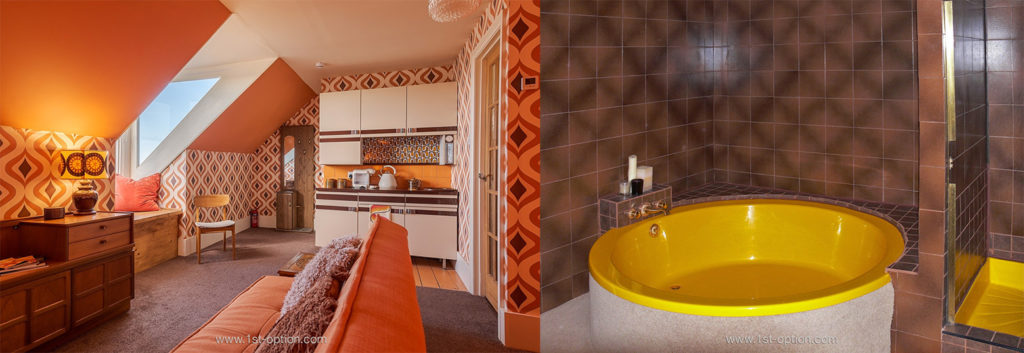
Key characteristics of the return of retro include mid-century furniture, curved and angled pieces with bold hues or bold materials such as metals and chrome. These are often complemented by specific colours like avocado green, brown, mustard yellow, burnt orange, cherry red and bold psychedelia. Pattern and texture are at the heart of the style with eye-catching wallpaper, funky lighting and wood, often adding visual weight and depth to largely open plan spaces. A special mention should also go to the palm beach style that is often associated with the trend.  

Unicorn boasts burnt orange and bold prints while Deerhurst Road showcases browns and mustard yellow

Why it’s so popular now 

In recent years, we have seen a move away from the picture-perfect home, filled with modern, fast fashion homeware, where there is an exact place for everything. People are now looking for a home that feels lived-in, with pieces that tell a story – another reason that maximalism and shabby-chic trends are so popular right now. The move away from fast fashion and homeware is largely because of our changing ideologies towards the environment, which is why retro is appealing to more and more people with its eco-friendly and recycling allure, as well as timeless design. Furthermore, there’s also a cultural element to this trend shift – these pieces and designs were so popular in the 60’s, 70’s and 80’s because of the post war optimism; we have just been through a life changing moment in history, and people are now looking for joy and fun in their homes. Some lean towards the trend due to nostalgia, while others want well-made pieces of furniture that they can repurpose, nevertheless, if you want to get it right in your home, check out our guide below.   

Eye-catching 70’s seating at Palm Springs and Lichfield

How to do it in your own home

There are a few things that separate the return of retro from other styles from the past like mid-century modern; as mentioned previously, retro styles love warm, saturated colours, with fluent lines, layered textures, and vintage accents, as opposed to more traditional muted tones, with occasional pops of boldness, minimal ornamentation, and clean lines. The key to getting it right, however, is to not go over the top and create a to-the-tee movie set that looks like it’s been teleported straight from the 70’s. Keep your space tasteful and in touch with modern life; you’re creating your own space centred around a notion from the past, not a garish space that hurts the eyes. Don’t think your retro space has to pay homage to one era either, play around with colour schemes from the 70’s, mid-century seating and perhaps even throw in an 18th century table to add your personal character. Have a starting point and work your way out from there, for example, a bold piece of furniture, a feature wall or maybe a striking colour scheme. While bright and bold colours may be your first point of thought, to achieve it and make it look good in your own home, it’s best to go for something more neutral and supplement with compelling, vivid hues. A great way to create your base is to consider earth tones and blend with rich warm colours – from there you can bring in your quirkier more abstract pieces of furniture that were extremely popular in the 60’s and 70’s. Make sure texture is implemented to add your visual weight and depth with materials like crushed velvet and boucle, both of which curate a sense of casual comfort. Play around with textures and materials from different eras to create an eclectic vision that tells your story – it’s all about balance when creating a retro space in your own image. 

Tasteful modern interpretations of retro design at Fournier Street and Perry

Top five for September

We’re back with our monthly instalment of top new locations for your perusal. As always, if you’re looking to be the first to shoot at some of the best new location homes that are entering the market, this is the place to be. Last month we saw two industry heavyweights return with their new shoot locations, as well as three differing family homes, all offering premium features, eclectic furnishings and bundles of space for unique and creative shooting opportunities. So, without giving too much away, let’s jump straight into it with our top five for September. 

6ixteen Country

Following the sale of the hugely sought-after London based property, 6ixteen, we all thought this might be the end of the 6ixteen location house franchise. However, the owners, Malcolm and Fiona had different ideas. After buying a Kent-based country home, a lengthy renovation was needed before 6ixteen was reborn as 6ixteen Country. Designed in the same unmistakable 6ixteen style, the new property will have you aching to shoot there as soon as possible. Some exceptional features include wooden flooring, eye-catching wooden furniture and more wood panelling than you can shake a stick at. What’s more, this outstanding property showcases varying colour schemes, including pastel hues to complement darker tones, as well as period features and distressed elements. There’s also a beautiful conservatory area that looks out towards the manicured garden, swimming pool, tennis court, lake and woodland area. Thanks to its endless shooting possibilities 6ixteen makes an ideal editorial shoot location, as well as a perfect site for filming. 

Period features and a wealth of wooden elements on show at 6ixteen Country

Britton

Similarly to 6ixteen Country, but heading back into London this time, our next location to make our top 5 may also look a bit familiar. Do you remember Bottega? Well, Britton is the latest property from the owners of Bottega and they have opted for the same design style that made their previous property so popular before its sale last year – we have a feeling Britton may be just as popular. This Grade II listed building, dating back to the 1720’s is a gorgeous terraced house, set over four floors, overlooking St Johns Gardens, with access to the park from the back door no less. With a wealth of rooms to shoot in across the four floors, memorable elements unsurprisingly aren’t hard to come by. Striking features include wooden flooring, sash windows, fireplaces, eye-catching tiled flooring, a cinema room, an art studio, an array of houseplants and a minimalist decor with eclectic furnishings throughout. 

Minimalist interiors that feature at Britton

Phoenix

Moving from London to Brighton and Hove, our next shoot location is Phoenix, an outstanding detached 5 bed location house a stone’s throw from Hove seafront. This gorgeous property showcases a striking kitchen/ living/ dining room, finished in neutral olive tones with crittal windows, wooden flooring, a huge central island plus oodles of natural light that immerses the space, allowing for the biophilia to thrive. It is here (within this glorious kitchen) that the interior opens out to the generous terrace, overlooking a luscious green garden, finished with an eye-catching plant-covered pergola offering sheltered seating for up to 12. The front of the property boasts large rooms with period features including high ceilings, architrave, dramatic bay windows and an original fireplace with wood burner. The house is stylish and tasteful, yet welcoming, thanks to an array of beautiful plants that soften the space. If this wasn’t enough, there is also a basement where you’ll find a furnished vintage bar/mini night club, with disco ball and dart board, so there’s a little something for everyone.

Phoenix offers a bright and airy aesthetic with tons of plants

Feasts

A mock arts and crafts double fronted family home, with a grey exterior and rear brick extension, Feasts, in West London, is the next property to make our list this month. Following a complete renovation, knocking down the original property and subsequently rebuilding, the property is now very open and bright, with vast lateral living spaces that give you the opportunity for creative shooting. The extensive open-plan ground floor features a kitchen, living room, dining room and study, showcasing a gorgeous blend of contemporary elements with mid-century furniture, crisp white walls and abstract artwork. One of the main attractions, and a feature that offers endless shooting possibilities is the impressive spiral staircase, with views from the bottom to the top. Another interesting shooting area undoubtedly comes from the basement, finished with quirky green flooring, chill out area, ping pong table and mini table football. The house has a modern but comfortable and inviting feel and is an extremely adaptable space, so get in touch today to book your shoot.

Mid-century furniture and a unique green basement at Feasts

Jenette

Our final location this month takes us on a short journey from West to South East London. Welcome to Jenette, a gorgeous four-storey Victorian Villa that combines original features with a marvellous mix of minimalist decor and art deco touches. Striking features include period fireplaces, original coving, ceiling roses, sash windows, wooden flooring and a whole host of incredible designer furniture, all of which offer endless creative shooting opportunities. With four stories, vast rooms and quirky backdrops, Jenette could be perfect for your next editorial shoot, as well as filming.

Jenette and its modern art deco twist

In Conversation with Marta Vilella-Vila of Roma

Rob – “So, can you talk to me a little about what you’d say your design style is?” 

Marta – “I think it’s a bit of a mix between my hometown (which is Barcelona) and the architecture from Barcelona and London, as I’ve been here for twenty years now. Just walking around the cities and taking inspiration from the architecture of both cities.” 

“I would say my style is a bit eclectic as I like to mix things. You spotted a few old things upstairs, so there’s a combination of modern furniture and modern features with more traditional pieces, which you have to keep, because London has these old houses, so you have to keep the essence of the house a little bit right?” 

Rob – “You don’t want to knock it down and start again, right?”  

Marta – “Exactly! There’s no point in knocking a house down to build a new one. If you want to do that, you build a new house from scratch. But if you move into a house you want to keep the essence and history of the house. This house was built in the 1920’s, so we wanted to keep elements of that within it.” 

“Lots of my neighbours have actually kept more of the history of the house than I have; I think I’ve been less respectful to the house, as this space is completely different to what you see around the neighbourhood. But I didn’t mind getting rid of a few things that were traditional that I was less interested in.”  

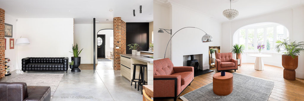
The industrial-chic rear extension at Roma

Rob – “You have to keep it to your style as well though, don’t you?”  

Marta – “Yeah, yeah. And you want to make it functional because at the end of the day, this is a family house and this is where you live, cook, clean, relax etc. So, we want to keep it functional and sometimes traditional is not the most convenient.”  

Rob – “Yeah, I mean especially with older houses, you have to think about insulation, can you keep the house warm enough. And more often than not, you can’t.”  

Marta – “Absolutely! I think insulation was one of the most important factors for us in the whole renovation process. We took out all the old windows and put new ones in – which was a great decision with everyone talking only about energy prices now. You want to make sure the house is 100% insulated.”

Rob – “What are your biggest influences in design? Any designers or schools of thought you adhere to? There’s definitely a Mediterranean aspect to some of the furniture, especially down here.”  

Marta – “Yeah, I think there’s a bit of a Mediterranean flavour, but I think architecture in Barcelona is very modern and contemporary, so I think I’m inspired by contemporary designers.  I also look at a lot of websites; I like Nordic websites, but I wouldn’t define this house as Scandi. Perhaps it has a few Scandi elements like the timber, but there’s a lot of Italian as well. The extractor fan above the central island, which is quite fancy is Italian for example.”

Some Scandi elements along with the industrial touches at Roma

Rob – “There are quite a few industrial elements as well.” 

Marta – “Yeah, there are a few industrial elements, but I didn’t want to go too industrial because that’s a bit too ‘office Shoreditch style’ for me, and of course it doesn’t make the house comfortable.”

Rob – “Why did you leave Barcelona to come here?”

Marta – “I came here to study; I came to Goldsmiths to do my Masters degree and then met my husband who was also from Barcelona, but he lived in London and that was it really, it’s been 20 years since then and we’ve never looked back. Barcelona is close you know, it’s just two hours by plane; we have a nice place by the sea, so it makes it easy to go back and forth.”

Rob – “It’s one of my favourite cities for sure.”

Marta – “Do you like it? I do like Barcelona, but it’s changed so much. It’s not the city I left 20 years ago. It’s become too touristic and honestly, this year it’s back to what it was like before COVID – it’s just awful, too much! It’s a small city that can’t cope with so many people and what’s happened is that the city has been transformed to serve the tourists first and then the people living there.”

The city of Barcelona and its touristic atmosphere

Rob – “I think in some ways I feel like London is a bit similar in terms of it just serves the tourists a bit.”

Marta – “Yeah, but London is huge. When I lived in Barcelona, I used to have a scooter, but now when I’m there because I’m used to London (and I told you I don’t have a car), I walk everywhere because everywhere is walking distance. You can get from one side to the other in around 20 minutes.”

“We don’t actually have our place in Barcelona anymore, we are by the sea, around 20 minutes away; it’s a commuting town, just by the beach, so makes it nicer – we are not in the hub of the city. And it was very hot this year, so would have been quite a challenge in the city.”

Rob – “Moving back to your property a little (sorry, I like to go off on tangents where it feels right). I guess you’ve already touched on it a little, but why did you decide on certain elements within the home? For example, the brick walls, the clay, the concrete, the timber?”

Marta – “So, it was a sort of collaborative process with the architects. Of course, we started with mood boards and I gave them ideas of things I liked, which were I guess not your traditional extension. And then from that, I was actually looking at aluminium panel extensions and they gave me a few options, but ironically the one I liked the most was actually more traditional and that was the red brick.”

“So, we went for the red brick and I guess that sort of set up the theme for how we’ve done the rest of the house. Once we kept the exposed brick, one thing we didn’t want to compromise on was the concrete floor and from here, it sort of led us to choose more natural materials – this sort of then set up the theme with the house. The architects were also very conscious of not letting us make it too industrial; we had to find the balance within a minimalist space, and that’s how we decided on this kitchen, not to make it too black or grey. So, in the end we went with this colour that was more similar to wood and warmer.”

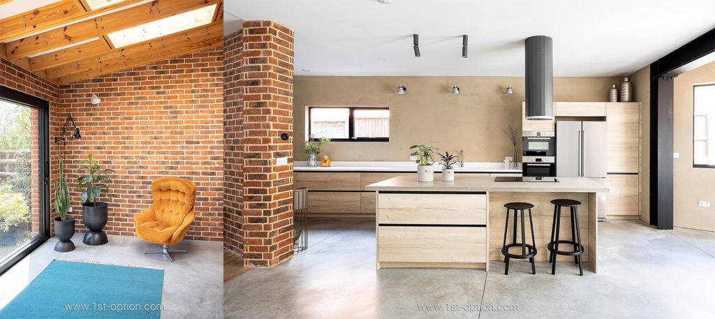
The exposed brick, timber frames and clay walls at Roma

Rob – “That’s really interesting! What’s your favourite area within the house?”

Marta – “What’s my favourite area within the house… I think this open-plan kitchen/ living area. I mean, when you wake up in the morning and come down here, it’s like, oh this is nice. But then, there’s also the front room – because of COVID we changed a lot of things in the house – it used to be a guest room, but it is now my workspace and I quite like it because of the light and because I quite like to work and see what is happening outside day-to-day.”

“I think it’s also good to have two spaces to relax in. That can be one of the challenges that people who only have one space have to think about. If everything is in one place, you don’t have anywhere to go and just escape from your family (which you need sometimes).”

Roma’s open-plan living area and the front room used as a workspace

Rob – “Do you do most of your entertaining in here then?” 

Marta – “Yeah, and outside. We have the long garden and the weather has been nice this year, so when we have had people round, we’ve done a lot of entertaining outside. But yeah, also in the kitchen, but that’s part of the reason why I want a new table because this is 6 seats, so you can only have maximum 6 people at the table and generally when friends come round, we are 8-10, so we have to move things around.”

Rob – “I guess when you extend the concrete outside, it will be perfect to have friends’ round.”

Marta – “That’s the idea yeah – let’s hope for some more hot summers.” 

Rob – “So, what made you decide to become a shoot location owner?”

Marta – “Actually, it was the architect who designed this space. She recommended it and I also have a sister who’s a producer and works in TV. Every time she came round, she would say this space is so good for shoots; the kitchen is quite unique, in that it’s very spacious and it would be very easy to have crews in here. So yeah, I had my sister who works in the sector suggesting it and the architect who said it would be perfect for shoots and she recommended 1st Option.”

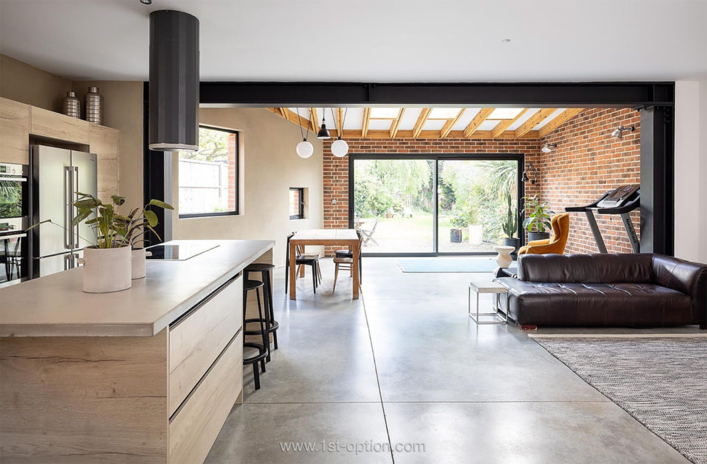
The open-plan kitchen/ living/ dining room at Roma that’s perfect for shoots

Rob – “That was going to actually be my next question – how did you find out about us, but there we go.”

Marta – “Yeah, the recommendation came from the architect as she already knew about your company through another client of hers.”

Rob – “It’s great to hear about our word of mouth.”

“One last question and I’ll get out of your hair. Did you go to the architect with the design brief or did they offer up examples for you? How did the process work?”

Marta – “Well, the house was selected for Open House, so it was great marketing for the architects because it had a lot of people coming round to see their work. This was in 2019, just before COVID, but I think it was a collaborative process in which I showed them images from Pinterest, magazines, things that I liked, places I had seen and taken pictures of. You know sometimes you’re walking round London and you see an extension, something you like and you show them that, so it was a continuous process.”

“The other thing I’d like to say is that the design is never finished. You can’t ever do everything at once. I think what’s nice is as you live in the house, you discover how you use the house and then you keep adjusting how you have things, the things you buy for certain areas etc. It’s a constant process or evolving.”

“In five years’, time this may look completely different. My kids will be older and we’ll have different needs and also different things that you like. It’s an evolution and that’s the nice thing about design – it needs to fit your needs.”

The child’s bedrooms at Roma that will evolve over time

Rob – “That’s amazing, that’s everything from me. Thanks so much Marta, you have been great. Thanks for letting us have a look round your amazing house and we will see you all in the next one.”  

In the Spotlight: Japandi Design

Intro  

As the name suggests, Japandi design refers to the blend of Scandinavian and Japanese interior styles. Why would you blend these two unlikely trends? Well, they’re both actually fairly similar and promote similar core tenets, in fact elevating each other. They both focus on simplicity, natural elements and comfort, so it’s a no-brainer that designers decided to merge them together. Though it’s still a fairly new design style, it has risen to popularity very fast and isn’t showing any signs of going anywhere – expect to see it populating your Instagram feeds for years to come. If you want to get to grips with this ever popular and current design trend that is taking the world by storm, make sure you read on as we deep dive into the trend’s characteristics, why Scandi and Japanese blend so well together and how to get it right in your own home. 

What is Japandi design  

As a mixture of both Scandi and Japanese design styles, Japandi is influenced by two schools of thought that actually promote many similar ways of life and design tropes. Firstly, you have the Japanese philosophy of wabi-sabi – a lifestyle that embraces and values slow living, contentment, simplicity and the beauty in imperfection. You then have the Nordic practice of hygge – a custom that promotes comfort, cosiness, wellbeing and the pursuit of happiness; you get the smooth, modern lines of Scandi and blend it with sleek, functional elegance of Japanese style. You are left with a minimal-yet-welcoming and functional-yet-cosy space that utilises neutral tones, lots of texture and heaps of natural materials. This fusion creates the perfect blend of function and form, focusing on clean lines, bright spaces, and light colours. While both individual styles promote function over form, they both advocate a pleasing and welcoming space with well curated furniture that is right for the space; Japandi spaces aren’t sparse, they’re intentional. The key principles of Japandi design include minimalism at its heart and the incorporation of sustainable, eco-friendly materials (no wonder its popularity has grown so much over the past few years).  

Britton and Melrose showing classic examples of Japandi style

How to do it yourself  

If you’re a fan of Scandi/ minimalist design, chances are that you’ve probably already incorporated elements of Japandi into your home; let’s break down the key ideas and principles, offering some tips on how to do it in your own home.

Natural materials  

Using natural materials is one of the easiest ways to bring the style into your home. Look to materials that encourage simplicity and beauty like bamboo or unrefined woods. Key sustainable materials to implement include cotton, bamboo, rattan, hemp and paper. For visual interest, you can add in some cool metals too (if you’re feeling fancy). Natural doesn’t merely refer to pieces of furniture, showcase plants and natural colours within your home too – think beige, sand, cream, taupe, oatmeal and stone. The idea is to use subtle and supple tones that blend into the space; nothing too bright or harsh that can dominate attention. Remember you are trying to create a calm and harmonious atmosphere. If you feel the area is too bland, soft, tranquil colours can be incorporated to add visual depth. Pale pinks, blues, greens and greys are great, or add some richness with a darker accent colour, such as black or a charcoal grey. 

Natural materials on show at Peony and Arezzo

Reduce clutter  

When you think of a minimalist space, clean lines and open spaces are probably the first things that come to mind – this is exactly the case with Japandi. Reducing clutter is the easiest way to implement this within your home and get that Japandi feel instantly. If you have an active household, play around with natural containers like boxes and baskets that store your stuff away, whilst still encapsulating the clean aesthetic of the style. Another great way to achieve the feel without throwing things away is to pop in a folding screen that can tidy your stuff away behind it (the ideal accessory when entertaining). Great ways to make the room feel cosier without adding clutter are mirrors, picture frames, artwork, wall hangings, table lamps, vases and rugs. Our favourite way to achieve the look is to implement house plants, they add the natural element, improve air quality, are welcoming and fill your space without cluttering at all. They also have huge health benefits, so if you want to add the eco-friendly tenet, whilst staying true to the individual areas’ heritage, look to plants that are native to their individual regions. A true authentic aesthetic!

Fern and Britton show you exactly how to reduce clutter

Craftsmanship  

Craftsmanship is at the style’s core, focusing on well-made, quality products. Ask yourself, is this going to stand the test of time – will its condition hold up, but also will it still be stylish in years to come? With its focus on sustainability, Japandi is the antidote to fast fashion and the one-time-use culture we have become so accustomed to. While both Scandi and Japanese design promote top quality goods on their own, they do differ in the look of the furniture – Scandi design is all about clean lines and angular pieces, while Japanese prefers curved and used objects that have had a life. Mix and match with both to create further visual interest. Don’t forget that there is a need for cohesion, achieve this through either colour, shape or size. 

Treehouse showcases elegant craftsmanship

Texture  

The best way to add warmth and interest to your Japandi space is to add different textures and fabrics. The Japanese are renowned for their use of eye-catching intricate patterns, so incorporate them into your cushions, throws, curtains and tableware; indulgent textures will help to advocate hygge and patterns will add vibrancy. Texture is key in helping to keep your space feeling warm and welcoming, rather than cold and stark. Rugs are the perfect hygge element as they are cosy, functional, don’t add clutter and perfectly complement wooden floors, stopping them from feeling inhospitable and bare.

Texture is vital to the overall aesthetic at Arezzo and Jupiter

In Conversation with Mark Dolan of Honeycomb

Rob – “So, what would you say your design style is within this property?”

Mark – “That’s a good question. I guess the design style is… I mean it’s obviously influenced by modernism, I guess a little bit of brutalism also, with the concrete elements and obviously the Scandi/ Japandi thing is a big influence, as well as minimalism. Minimalism within the context of a family house, where we try to keep everything as sleek and tidy as possible.”

Minimalism with brutalist elements within the design at Honeycomb

Rob – “And what were the influences within the design would you say?” 

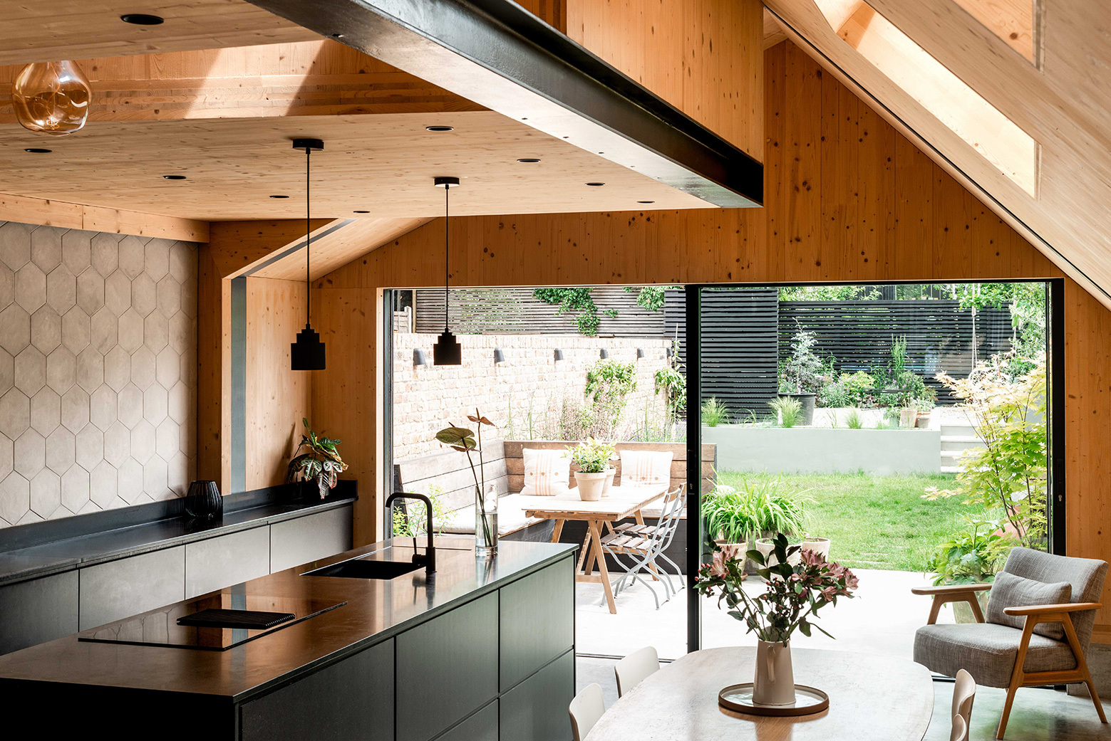
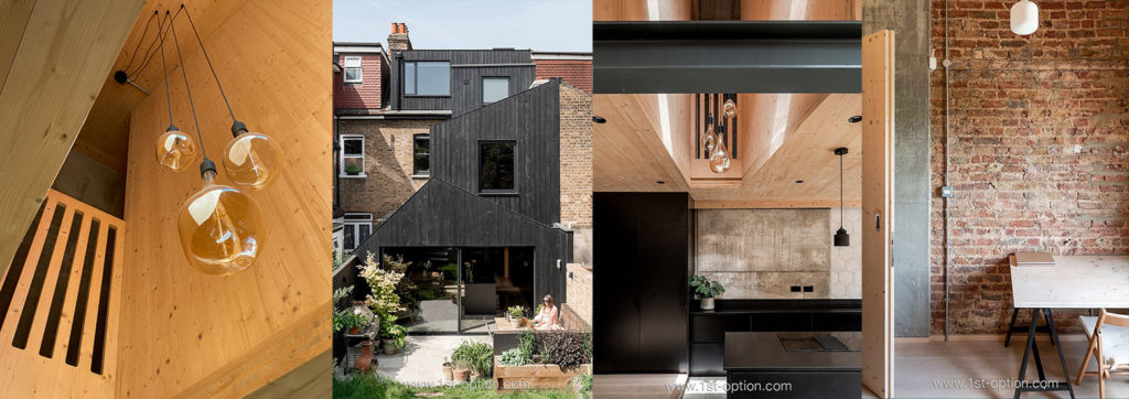
Mark – “I guess… well I mean obviously we’re not professional designers or architects, so you know, in terms of the big picture, it all came from the architect. The big design idea was building a cross laminated CLT extension. Once we established that as the envelope, we did a lot of visual research for what combinations would look good within that, and we really loved the contrast of the black kitchen units against the pale timber.” 

“So yeah, the architect designed the inflow envelope and then really it was just a lot of visual research to hone down the interior style we were after. Looking at Pinterest (as everyone does), and all the visual resources that are out there for inspiration.” 

“I think ultimately, the biggest influence on the style is a Scandinavian aesthetic because it’s pale timber, simplicity at its heart, simple furniture and is fairly utilitarian throughout.” 

Honeycomb showcases a utilitarian decor with Scandi features

Rob – “Just touching on that – I personally really like the way you’ve got modern spaces, complementing the mid-century elements; it really works together so well.” 

Rob – “Why did you decide on the architecture and the timber construction?” 

Mark – “Well, when you first meet your architect, you want them to come back with some kind of big or bold idea that’s going to blow your mind; not some kind of identikit extension that you’ve seen before. So, when we first met our architect, Tom Gresford, at Gresford Architects, his big idea was effectively knocking down the rear of the house and rebuilding the kitchen upwards in a timber, CLT construction.”

“So, it was a fairly bold step to effectively demolish a third of our house – that we had just spent a lot of money on – but we knew we’d have a lot of building work anyway, so demolishing and starting again actually gave us the opportunity to do something a little different. When you look at the void, the sense of the house would only be possible by starting again and using a different form of construction. In the end it actually gave us a lot more flexibility to be nimble and more playful in terms of what we did with the back of the house, within the constraints of the footprint.”

Bold design is seen through a CLT extension with a double height void, steel beams, concrete and exposed brick

Rob – “Amazing! What’s your favourite area within the house would you say then?” 

Mark – “Ah, the kitchen! The kitchen’s got to be my favourite, closely followed by the seating area just outside the kitchen in the garden, where we do just spend a lot of time and entertain whenever possible (certainly in the spring and summer months). Everyone just loves it out there, as it’s near the kitchen, near the fridge, gets the sun in the morning and then by the time it hots up in the afternoon, it gets nice and shady. Just an amazing space to entertain!”

Rob – “I bet it’s been perfect this summer as well.” 

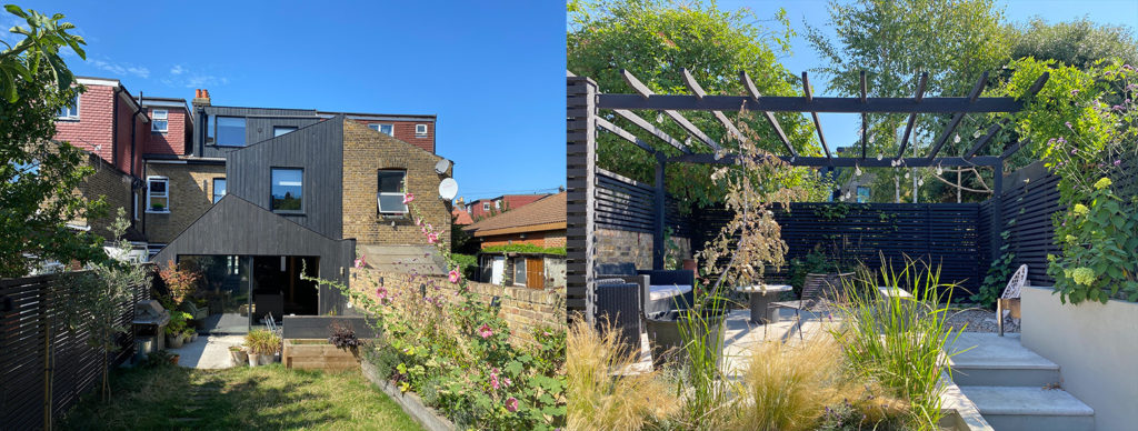
Mark – “Yeah, it certainly has! Although too hot sometimes in the morning, because we haven’t built shade there, there’s shade at the back of the garden on the pergola, but it gets direct sun in the morning, so can get too hot when it’s beaming down. This might have to be something we think of in the future; build some shade there, or perhaps plant a tree or something.”

The garden in full bloom at Honeycomb

Rob – “I guess there’s always going to be things to add.” 

Mark – “Yeah, exactly, well certainly the front of the house is the last bit to add, we’ve got plans for that, but it costs money. Hopefully we can get more bookings and the money can go into the front of the house fund.”  

Rob – “Hopefully we can get them for you. So, you work on the other side of the camera, how did you get into the TV industry?” 

Mark – “Ooh, that’s a good question. I started my career a long time ago, being a runner for a post-production company in Soho. I then worked my way up to an editor – cutting and editing factual programmes. I then moved across to become a director and producer in factual TV, which is where I am now. I don’t direct so much anymore, now working more as a producer for factual documentaries and series’ for UK and international broadcasters.”

“So yeah, that’s kind of how I got into it, like most people, I started at the bottom and found my way up. So, hopefully working in the industry gives me an appreciation of the needs of the client. For example, this property is on a very quiet street in a low traffic neighbourhood, so I know how important sound is a lot of the time when filming. Often when filming, sound is a crucial consideration – sometimes it’s something you can’t tell from the pictures, knowing whether the location is going to be noisy or not. But as this is a really quiet street, with quiet neighbours, actually as quiet as you’re going to get in London, it’s great for filming sound.”

“There’s also lots of on-street parking and nearby coffee shops, which I know are super important. We’re close to the tube station, so from all of those perspectives, we understand that those practical considerations can be just as important for the crews as the aesthetic ones.” 

Coffee shop and the London Underground

Rob – “Brilliant! You kind of touched on it, but how do you find working on the other side of the camera and being a shoot location owner?”

Mark – “I think because I’ve been a director and producer on the other side of the camera, I understand that when you hire a location, you do need full and complete access to the house.  Because of that, as a location owner, you really do need to take a step back when you welcome the crew into your home. Make sure they have everything provided on hand. Answer any questions they may have, but then take a step back and let them do their thing. You have to let them bring their kit in, not be too precious about where they put things, because at the end of the day, they’re paying you to have the space for the day, so you have to get out the way and make yourself scarce.”

“I think I’ve got a pretty good understanding of that – it’s important that the crews feel welcome when they turn up and that you are able to give them the information they need and they don’t feel like they’re putting you out. Ultimately the client is paying for your property, and they know they’re paying for your inconvenience, so we try to make sure they don’t feel like that when they’re here. “It’s really important to us that clients are happy filming here, that they feel welcome and ultimately that they give good feedback from their experience filming with us.”

Rob – “I guess as well, having the industrial elements is quite handy for not being too precious with the house.”

Mark – “Yeah, 100%. I think there’s a lot of hard-wearing surfaces in the house; there’s concrete floors, wooden floors, timber walls. So the house is designed (well, you know it’s a family house), so it’s designed to withstand the rigours of family life – young kids and all that kind of stuff. While obviously crews generally take care to protect the floors, accidents can happen, so the house is perfect as it’s designed to be robust.” 

Brutalist hard wearing elements at Honeycomb

Rob – “Yeah of course! So last question, what made you decide to become a shoot location owner?”

Mark – “Good question again, so when we set out to build this house, we set ourselves two goals, firstly we wanted to build something, design something that would be beautiful enough to be photographed and to be in the press. And you know, we’ve actually had some press recently; we’ve just recently been featured in Grand Designs Magazine and also in Dezeen. We were also nominated in the Waltham Forest Design Awards. Not that those things are important to us per se, but it was more a question of: let’s set ourselves that goal to design ourselves something that is of a standard that people would want to photograph it and nominate it for awards.”

“It’s a bar you set yourself, and obviously because we designed it to be beautiful – or at least what we think is beautiful – it actually lends itself quite well to being photographable and becoming a shoot location.”

“Being in the industry is obviously something I know about; I’ve hired various locations myself before for shoots, so I know it’s an option for homeowners and we think it’s a fun thing to do. It’s always really fun and interesting to welcome people into the house and to meet talented directors, art directors, actors, producers etc. There’s obviously a financial aspect, as well, which is not unimportant given we’ve made a large financial investment on the house.”

“So, partly it is also a way of recouping some of that financial investment that we’ve made, or certainly gaining a little bit of extra income that helps us to pay for holidays and things like that – so that is an important aspect.”  

Rob – “Amazing Mark, that’s all from me and everyone at 1st Option. Thanks so much and see you all in the next one.” 

Spot the Difference at Tulum

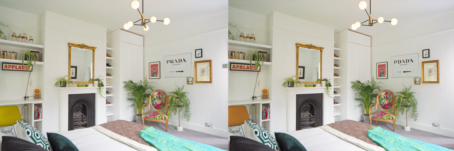
In our sixth edition of the classic spot the difference, we bring you Tulum. As always, it’s all a bit of fun, but if you can find all ten differences, you could get a half-price booking fee on your next shoot in September! Top tip – most of them are pretty obvious…

Top 5 for August

As always, we are back with our monthly instalment of shoot locations, looking at our top five new locations to have registered with us over the last month. August was another cracking month, taking on a gorgeous array of differing family homes across the capital. If you’re after sleek or eclectic, colourful or contemporary, we have you covered this month. So, without further ado, let’s get straight into our Top 5 for August.  

Celine – 

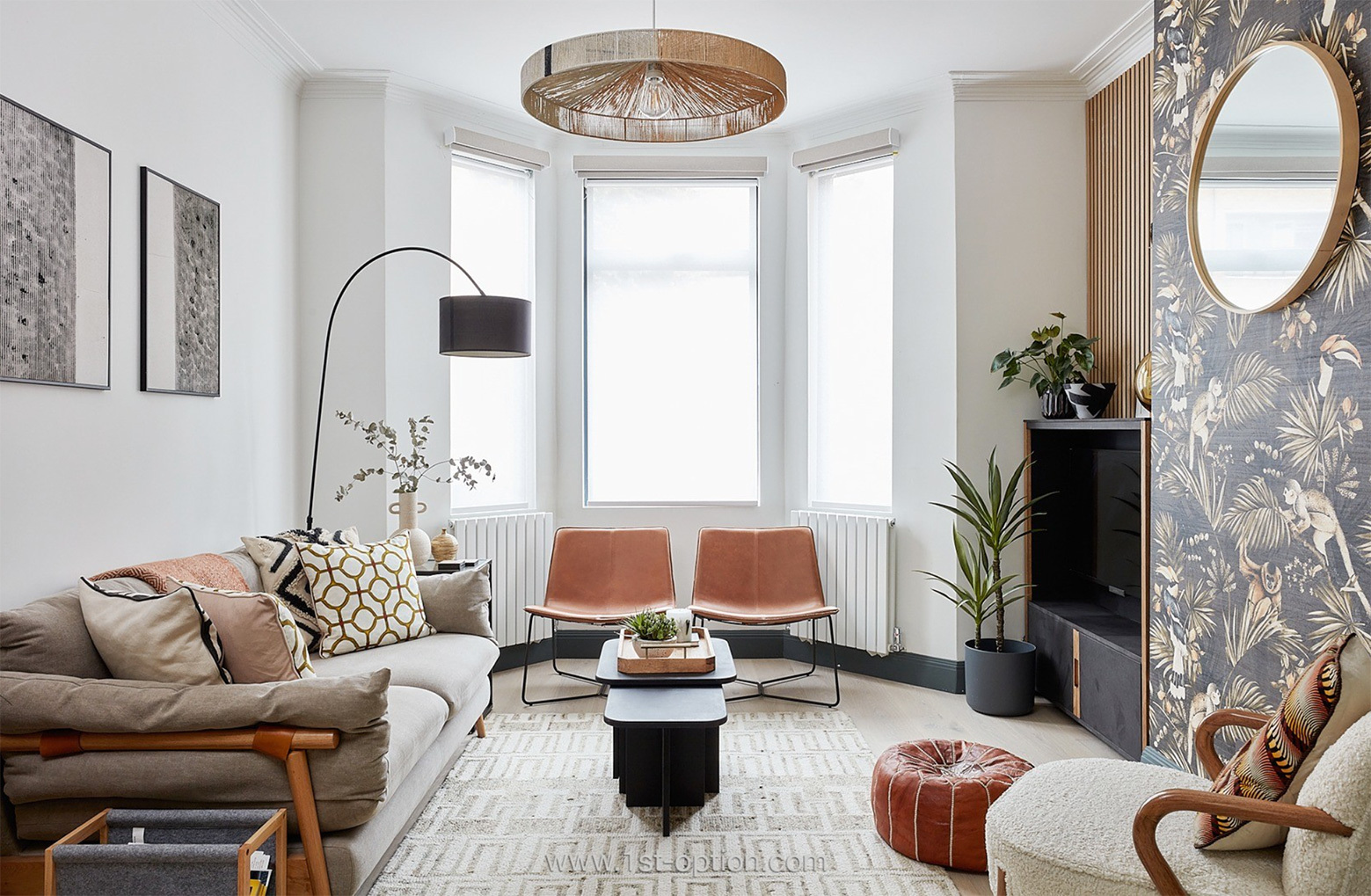
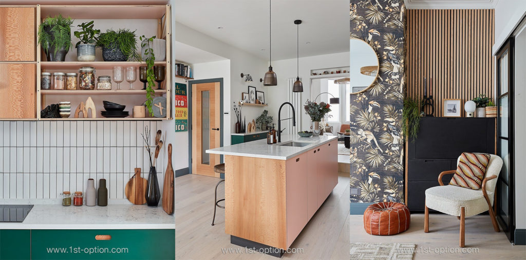
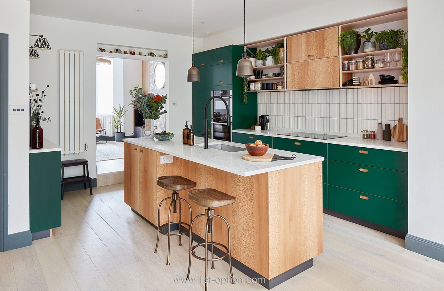
The first to grace our list this month is a gorgeous family home based in South East London, a short walk from Crystal Palace railway station. This fabulous property catches your eye through an impeccable blend of elegant design with a crisp finish and pops of colour with eclectic touches. The house predominantly showcases neutral backdrops with a fresh white finish throughout; however it comes to life through the use of green kitchen units, quirky wallpapered areas and biophilia across the location. Standout features include wooden flooring, crittal windows, a wooden kitchen island with marble countertops and an abundance of natural sunlight that bursts in through the skylights to the rear of the property. Celine is perfect for any family or kitchen shoot, so get in touch today if you’d like to book.

Colourful, yet elegant design on show at Celine

Daws –

Moving across the capital, our second location this month is Daws – a beautiful and modern family home, based in North West London. The standout area within this contemporary Scandi shoot location is the open-plan kitchen/ living/ dining room. An inside/ outside aesthetic is felt here, with bi-folding glass doors, a large patio, garden and summer house. The Interiors give off a definitive contemporary take on a Scandi design, thanks to the light and airy feel, natural materials and pared back furnishings. These elegantly complement the striking features that include parquet flooring, marble countertops, wooden furniture, biophilia, crittal doors, original cornicing, ceiling roses, fireplaces and wallpapered areas. If you’re looking for a refined family home with pops of colour and character, Daws may be ideal for you. 

Contemporary take on a Scandi aesthetic at Daws

Clark – 

Third up this month takes us on a short journey south of the river to Wimbledon in South West London. This time we visit Clark, an outstanding property that offers a subtle, yet premium aesthetic, with oodles of eye-catching shooting opportunities. Refined is the word that springs to mind with Clark, and this sophistication can be felt through the home gym, home office, formal living room and the vast open-plan kitchen/ dining room. Striking features here include wooden flooring, wooden furnishings, a sliding glass wall and an incredible central island with ribbing and marble countertops. Thanks to its elegance and size, this chic property is perfect for photoshoots and small-scale filming and is available for shoots right now!
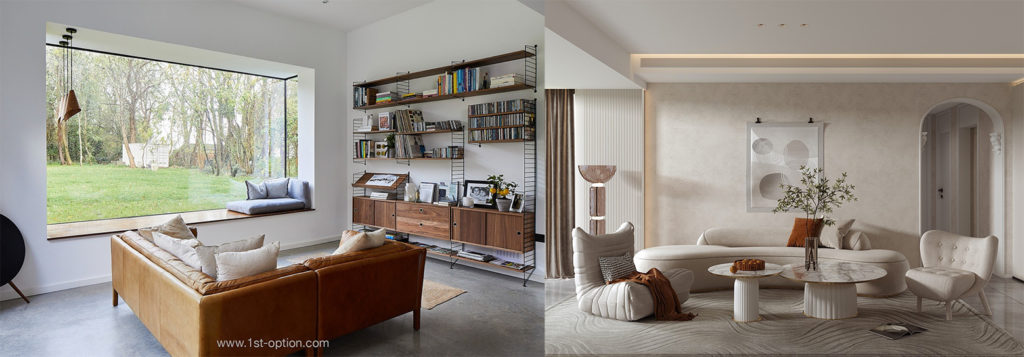
Sleek and refined decor at Clark

Tess –

Moving east, our next property to feature is the fabulous Tess, hailing from Bethnal Green. If you are after a bold, bright and colourful property, oozing with personality and charm, Tess may be the one for you. This characterful location showcases a breadth of eclectic furnishings that are complemented by eye-catching colours throughout. These include abstract artwork, quirky and unique furniture, one-of-a-kind ornaments, tons of biophilia and a wealth of natural light. Tess is a truly memorable location brimming with charisma and colour – make it your next shoot location now.

Tess showcases its colourful and eclectic furnishings

Teal –

Last up this month, we head back to South West London to check out the fabulous 5 bedroom interior-designed Victorian home: Teal. Offering a gorgeous open-plan aesthetic, with spacious rooms and a whole host of eye-catching features, Teal will have you swooning in no time. This contemporary shoot location showcases a large rear garden, viewed through bi-fold doors found in the magnificent kitchen/ dining room, finished with tiled flooring, wood panelling and unforgettable teal accents. Other standout features include painted wooden floors, two fireplaces, ceiling roses, bay windows, original cornicing, wood panelling and tons of natural light throughout the majority of the location. Teal has recently had updates, so now is the perfect time to get your first shoot in. 

Teal offers spacious rooms with premium features

Glorious gardens – 10 of the best

With spring’s dew and rain well and truly behind us and temperatures soaring into the high 30’s, there has never been a better time to get out into the garden! Since our last best gardens article, we have seen an exponential number of locations come on with us. And with the scorching summer we are in the midst of, we just had to give you the rundown of our best gardens you can shoot at in 2022. Ranging from London family homes with enchanting gardens, to country estates with the best views you’ll see this year, as always, there’s a little bit of something for everyone! Without further ado, let’s dive straight in and let you make your decision on your favourite this summer.

Dacres 

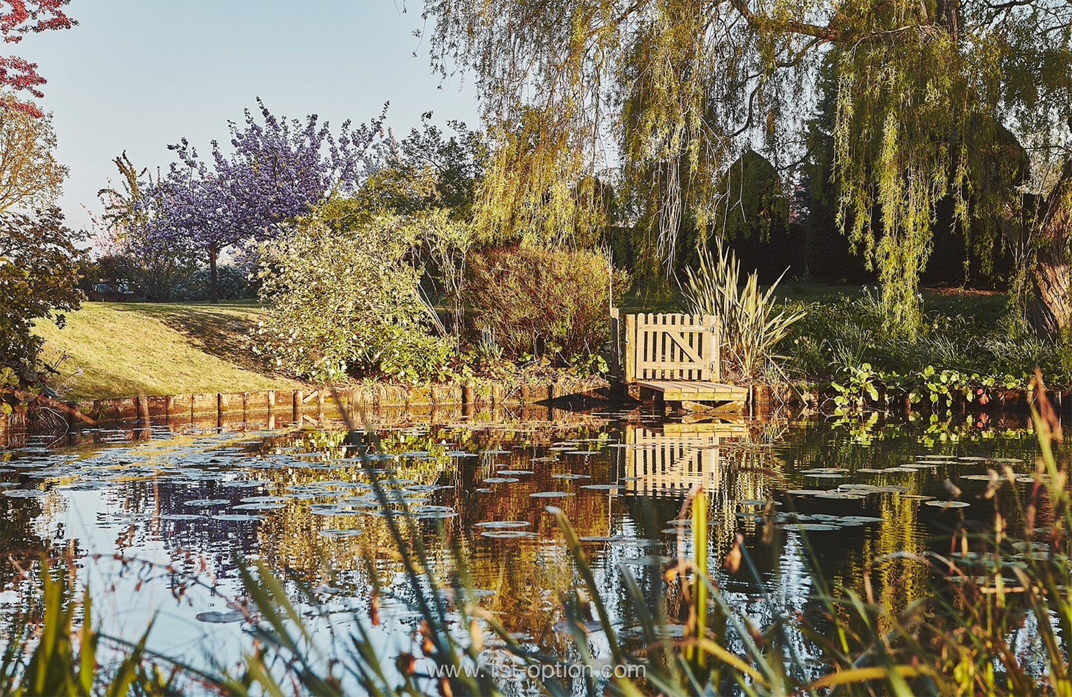
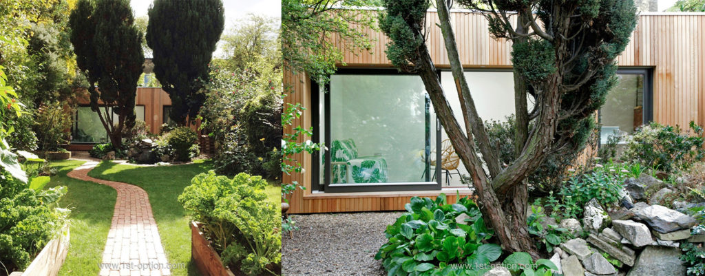
From the front, our first location to feature may first appear as a slightly understated double-fronted family home. Interiors are subtle and nuanced, combining premium touches with period elements, however, it’s not the interiors that bring Dacres to this list. Venture into the back garden and Dacres truly comes to life! Filled with an array of plants: bushes, flowers and obscure trees, including an outstanding branch arch; as well as two ponds and an art studio, Dacres is one of the most enchanting gardens you’ll find in London. We like to call it the secret garden of South East London. 

Medallion 

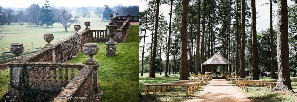
From a magic garden, to a manor house, you can’t say we don’t offer a diverse range of locations for you to have a gander at! Set within 88-acres of parkland, on the edge of Salisbury Plain, Medallion is a classic Georgian manor house, located in an area of outstanding natural beauty. Approached through an alluring tree-lined drive, Medallion will have you swooning before you even enter the property. With 4 acres of formal and informal gardens, a swimming pool, a garden kitchen, tennis court and a Georgian stables complex, you won’t struggle for unique shooting opportunities at Medallion. 

Valentine

Moving from the South West to the South East, our next garden to feature is Valentine – a gorgeous country home situated in West Sussex. Set atop barrelling hills, Valentine offers spectacular views as far as the eye can see. If this wasn’t enough to entice you, Valentine also showcases a patio area, a beautiful landscaped garden and a glorious swimming pool, overlooking the hills. Perfect for the summer months. Imagine having a dip in the pool gazing over the English countryside.  

6ixteen Country 

Part of two separate shoot locations – 6ixteen Country and 6ixteen Cottage – 6ixteen Country is the larger, main part of the complex. Situated in the heart of Kent, this gorgeous property is the ultimate outdoor destination for photoshoots and filming. With beautiful formal gardens outside the main house, this might alone be enough to make the list, but they’ve taken it way further – there’s also a lake, informal grounds, woodland areas, a tennis court and a swimming pool. You won’t struggle for that perfect outdoor shot here. 

Poulton Farm 

Made up of a number of large Cotswolds stone barns that have been brought together through a gorgeous French colonial interior style, our next location is Poulton Farm. Offering an extremely eclectic aesthetic, the outdoor area is a vast vineyard with incredibly extensive and beautiful grounds. Areas to shoot include formal gardens, a greenhouse, vineyards, considerable grounds and a tennis court. 

Rooke

Rooke screams opulence from the moment you lay eyes on the property – offering a deluge of premium features, including a home bar, home cinema and wine cellar. However, we are here for the plethora of exterior features that wouldn’t be out of place in the Hollywood Hills. Check out the exquisite landscaped garden with gorgeous views of the surrounding hills and River Thames, a hot tub, swimming pool and a fabulous exotic tiki bar. 

Simax

Designed by Sandy Rendel, our next location – Simax – is an award-winning home that had to make our list. Offering something a little different to the rest of the properties on this list, Simax showcases a less conventional garden, set atop the River Ouse in East Sussex. With an indoor/ outdoor patio area to shade from the sun and a stretch of grass that overlooks the river and surrounding nature reserve, Simax is the definition of idyllic. 

Swan Court 

From a modern grand designs style building to a classic Georgian manor house, we always like to offer as much diversity as possible! This fabulous shoot location is embedded within fields of trees that overlook a beautiful lake. With a delightfully groomed maze, woodland areas, landscaped gardens and a collection of the most marvellous flowers you’ll see today, there are boundless opportunities for that perfect shot. Every nook and cranny offers another possibility; Swan Court is a real gem, with endless charm and opportunities!  

Burlotti 

While the majority of the locations on this list are either large detached homes or manor houses in the countryside, we thought we should throw in something a bit more relatable (whilst gorgeous).  Burlotti is a late Georgian East London semi-detached family home with a glorious south facing garden. Receiving tons of natural light throughout the day, this incredibly pretty garden is lined with an array of beautiful flowers and trees. Showcasing a cobbled path leading down to a fabulous garden studio and a stone garden, Burlotti offers a distinct Mediterranean feel – this is every Londoner’s dream garden! 

Somerley 

Last but never least, we give you Somerley. Perched on the high west bank, overlooking the River Avon’s Water Meadows, two miles north of Ringwood in Hampshire – Somerley and its 7,000 acres, sits nestled between the New Forest and the Dorset border. A Georgian stately home, Somerley features a unique walled garden with an ice house built into the side of the bank. There’s also extensive grounds that include large formal gardens, a trident water fountain, 180 acres of parkland, an outdoor swimming pool, tennis court and stables. If this wasn’t enough, Somerley also contains deciduous and evergreen woodlands, a 4×4 driving track, a quarry, a river and lakes as well as a shooting range. What are you waiting for?