For the longest time, fresh, crisp and muted colour palettes have dominated the interior scape. However, the tides are shifting thanks to trends like maximalism and grandmillennial style. Colour in the home is taking strides away from the child’s bedroom, into the kitchen, living room and the rest of the house. Decorating with colour has often been seen as daunting and scary; not all colours match and it can be easy to get wrong. Nevertheless, if implemented in the right way, decorating with bright colours can create an adult space, with delightful hits of personality and character. Stay with us as we explore the nuances that go into the implementation of colour – where to start, what to do if you are a bit colour shy and how to not saturate your space with too much/ the complete wrong combination.

Choose your backdrop first and add colour accordingly
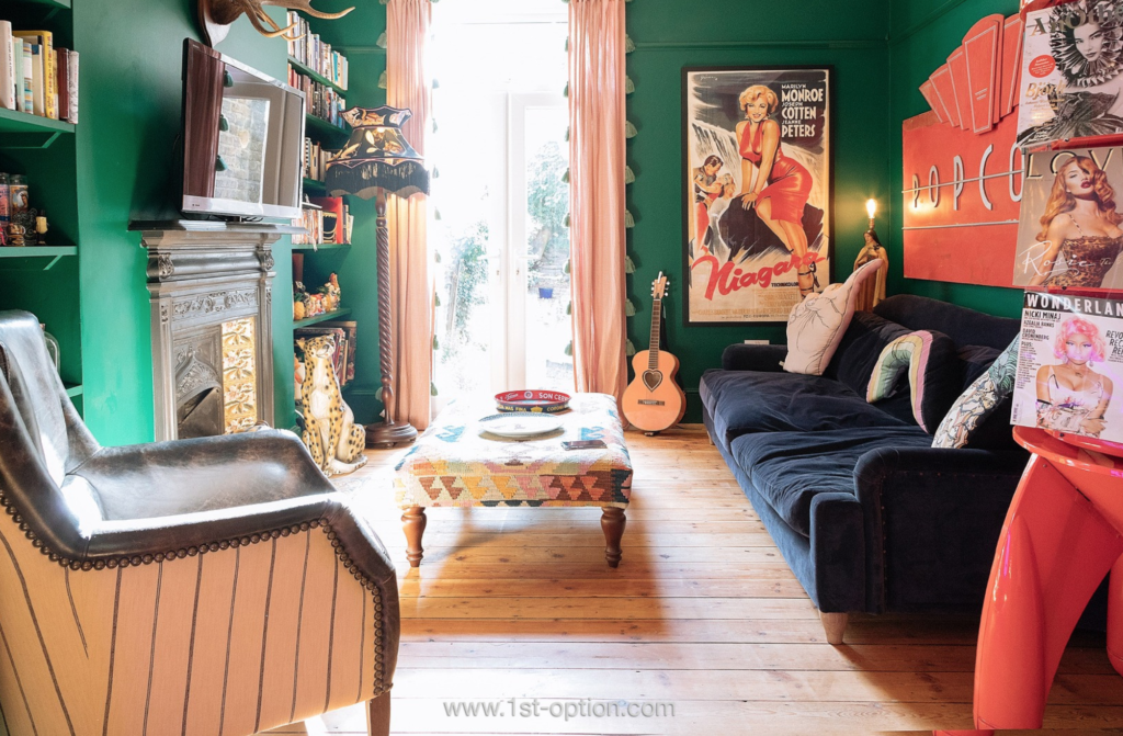
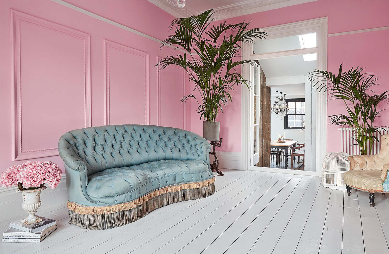
The key to making bright colour work in interior design is choosing the right backdrop! Choose the backdrop first to keep the sparks of colour in control and add accents for a milder take. If you want the colour to pop and stand out, go for a dark background. On the other hand, neutral backdrops help bring out the warmth in subtle pastels. In photography, there is the term: ‘black balance’. Most high-end cameras have the feature built in to help calibrate shades of black, this is done to make the colour in shot more vibrant. To translate this to interior design, add a dark element to the design and this will bring the brighter colours to the fore, catching the viewer’s eye. A brilliant way to achieve this is the 60-30-10 strategy. Find a suitable colour for the backdrop, one that fades into the background and doesn’t take up too much attention for 60% of the room’s colour. Then complement this with a second colour for 30% of the room. Finally, accent the room with the remaining 10%. If you want to go for a more neutral backdrop, pinks and pastels are the greatest ways to add colour without saturating the space.

Consider your focal point
When it comes to bright colours in the home, it is all too easy to go overboard and splash colour everywhere. However, this can have a lot of negative effects, including colour clashing, over-saturation and a complete lack of flow and cohesion in the room. Having a focal point is necessary to tie the room together, giving you that needed harmony for a cohesive room. A focal point can be anything that helps anchor the colour scheme, this can be a table, a piece of art, or perhaps a statement piece of colourful furniture. If you have opted for a neutral or dark backdrop and don’t know where to start, a statement piece could be the ideal tool that ties the rest of the colour in the room together. If there is a vibrant colour scheme going on, a multicoloured item could be a great anchor. The flamboyant tones create a harmonious atmosphere. If a statement piece is too much for your decor, a feature wall could be perfect to add colour – this also acts as a great anchor for the rest of the room. The key here is to figure out the focal point and tie the rest of the room in with it.

Accent colour through the use of accessories
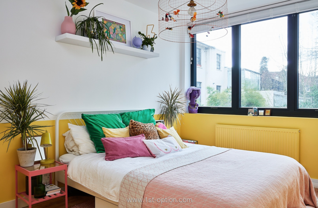
Accenting is the art of using colour in small amounts to add interest to the overall colour scheme. It can be a great place to start as it doesn’t saturate a space. The aim for accenting colour is to either complement or contradict the overall palette, creating an emotional response in the viewer. Implementing accents also has the ability to add personality to any space – this is achieved through having fun with the design. Include your character wherever possible. Accents are added in small amounts and don’t take up much room; because of this, they are easy to change if the colour doesn’t look right. Cushions, throws and blankets can be the ideal accessories when entering the world of accent colours; they aren’t permanent, they won’t over-saturate the space and they are easy to change with the seasons. When opting for a neutral backdrop, play around with pastel hues, if darker colour schemes are more to your taste however, experiment with bolder, more vibrant colours.

Complementary colours
It goes without saying that not all colours were created equal. Some work incredibly well with others, while some stick out like a blot on a landscape! With colour, the key is to understand that there are rules to adhere to; however quirky the aesthetic is, however unique the room is, certain colours cannot go with one another. Colour combinations like purple and red, yellow and pink and silver and yellow are great examples of combos that should never go together! Complementary colours are polar opposites on the colour wheel, they are often seen as a challenge to match with each other. If thought about and implemented correctly, they can create a harmonious balance in any design. The powerful contrast of complementary colours can be very sharp, creating a crisp and arresting aesthetic that really stands out. Usually, when choosing a contrasting colour scheme, it’s important to choose the primary colour first and use the secondary for accents. This choice will set the impression of the final result – leaving you with a warm or cool design.

Analogous colours
On the other hand, there are analogous colours. This refers to three colours next to each other on the wheel; these create a more relaxing, monochromatic feel. They are usually composed of one dominant primary colour, a supporting colour and a third colour that is either made up of a blend of the other two or an accent colour that pops. When choosing an analogous colour scheme, the key is to understand moderation and recognise that small touches with a neutral base go a long way. The 60-30-10 rule will help you keep to your colour scheme and works perfectly for an analogous colour scheme. 60% for the walls and large furniture, 30% for smaller furniture and rugs and 10% for accents and accessories.

Suit the purpose
Many think this is enough understanding to create the perfect space, however, not every colour suits the purpose of every room. Different colours have different psychological effects – blues tend to be calming, while reds can bring about excitement and energy. Make sure the colour scheme chosen fits the room it’s going in, complementary colours may not be the best idea in a reading nook or dining room, they tend to be brighter and therefore wouldn’t achieve the relaxing effect you are looking for. On the other hand, the analogous, calming colours like a pastel pink with a duck-egg blue could be ideal.

Follow these simple steps and you will be adding colour to your home like a top interior designer in no time. If you would like to see some examples of how colour can be implemented into the home, negating the fear often associated with it, click here to check out some of our top properties that utilise colour within the home.
