In the Spotlight: Biophilic Design

If we look at interior design as a concept that begins with human experience, taking into consideration the emotional, physical and mental needs of people, then it is a human-centred reflection of how we live today. Since today we are taking new approaches to the promotion of health, welfare and sustainable living it is intuitive to see and understand why biophilia has become such an influential and popular trend in interior design. 
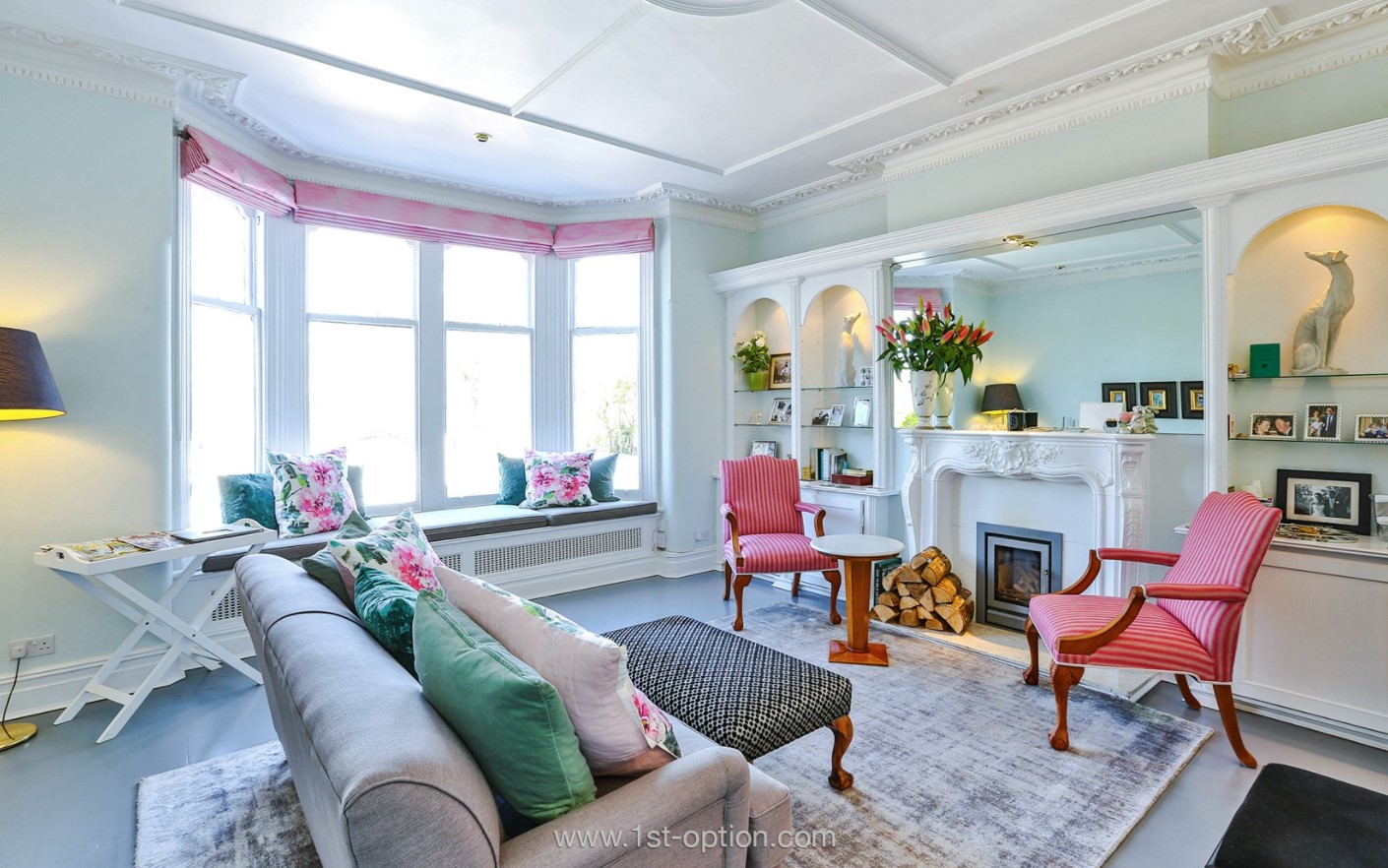
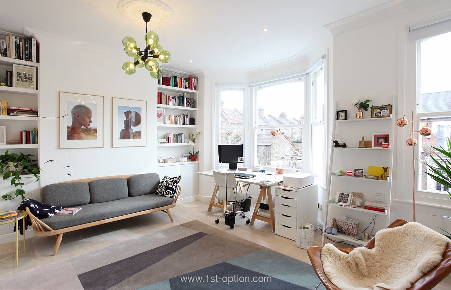
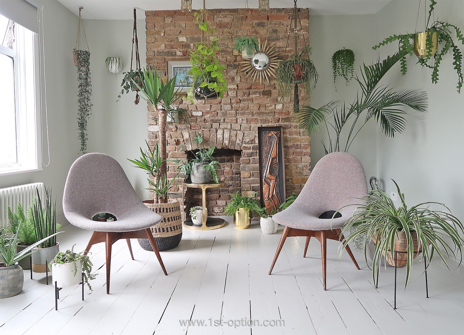
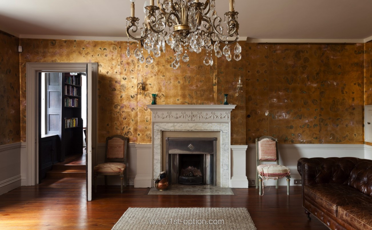
The enchanting Frognal

If interior design incorporates all aspects of the environment and human experience including elements such as furniture, lighting, finishes and layout, how does biophilia connect with design? 
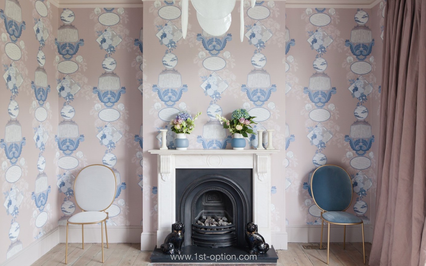
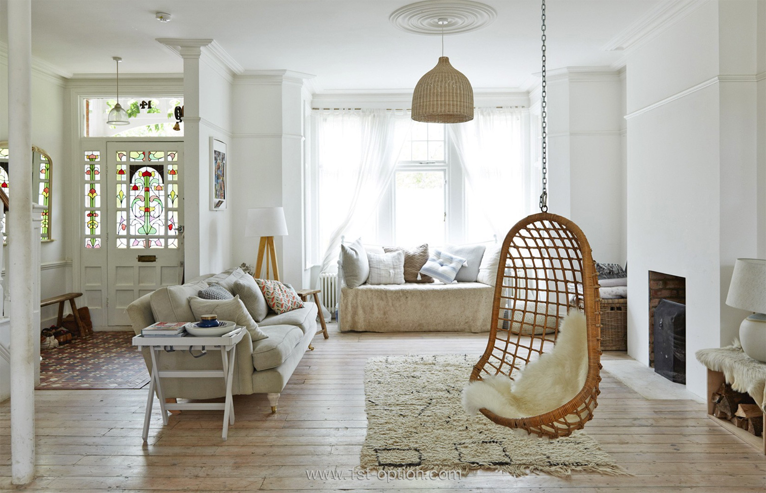
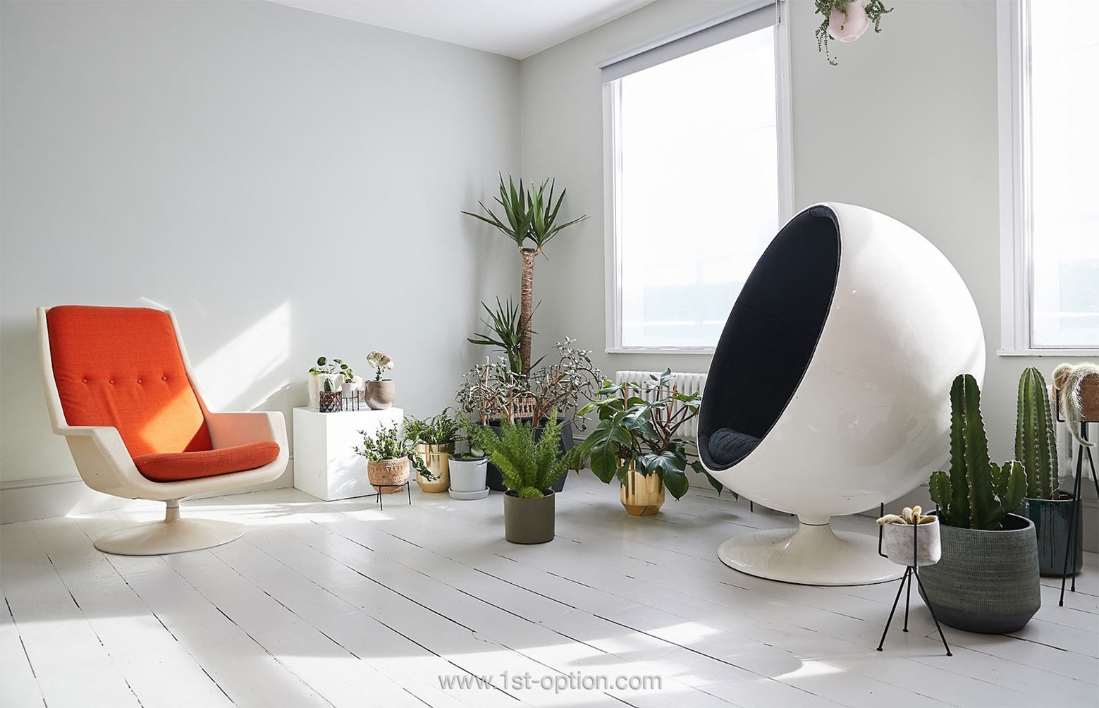
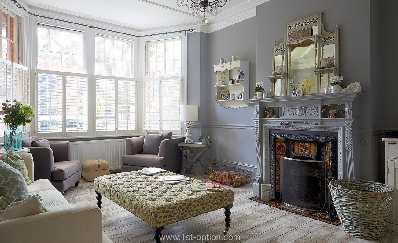
The eye catching Little Venice

Well biophilia is the idea that built into our genetic coding is an innate link to nature, we come from it, so we’ll always have a connection with it. The word itself translates to love of living things from the Greek word philia meaning love of and essentially it has been proposed by experts that because of this link and our innate tendency to affiliate ourselves with nature and all living things, we can gain something from it. 
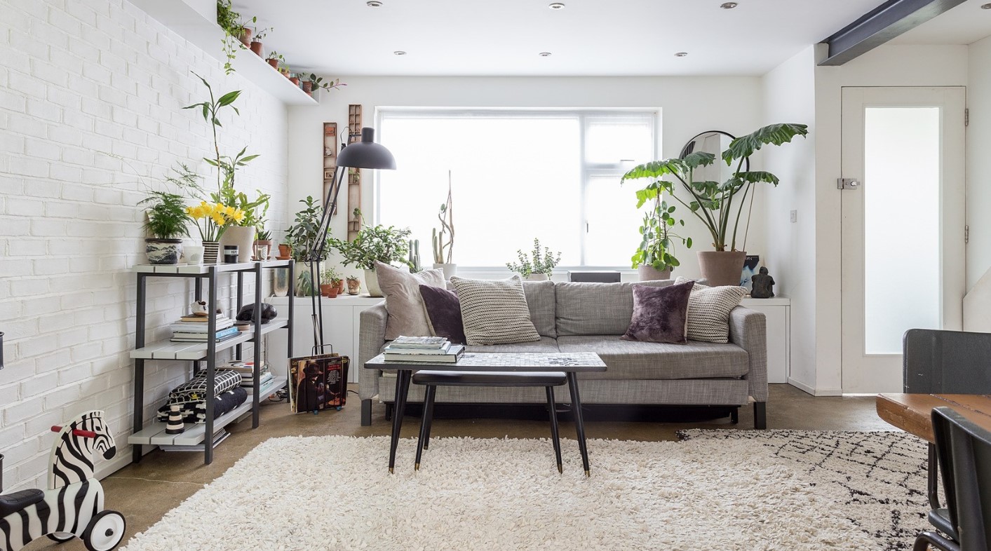
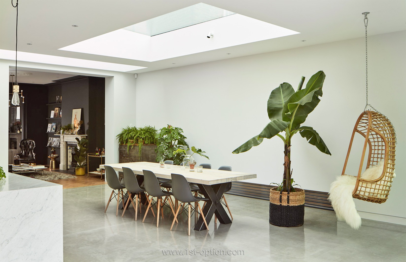
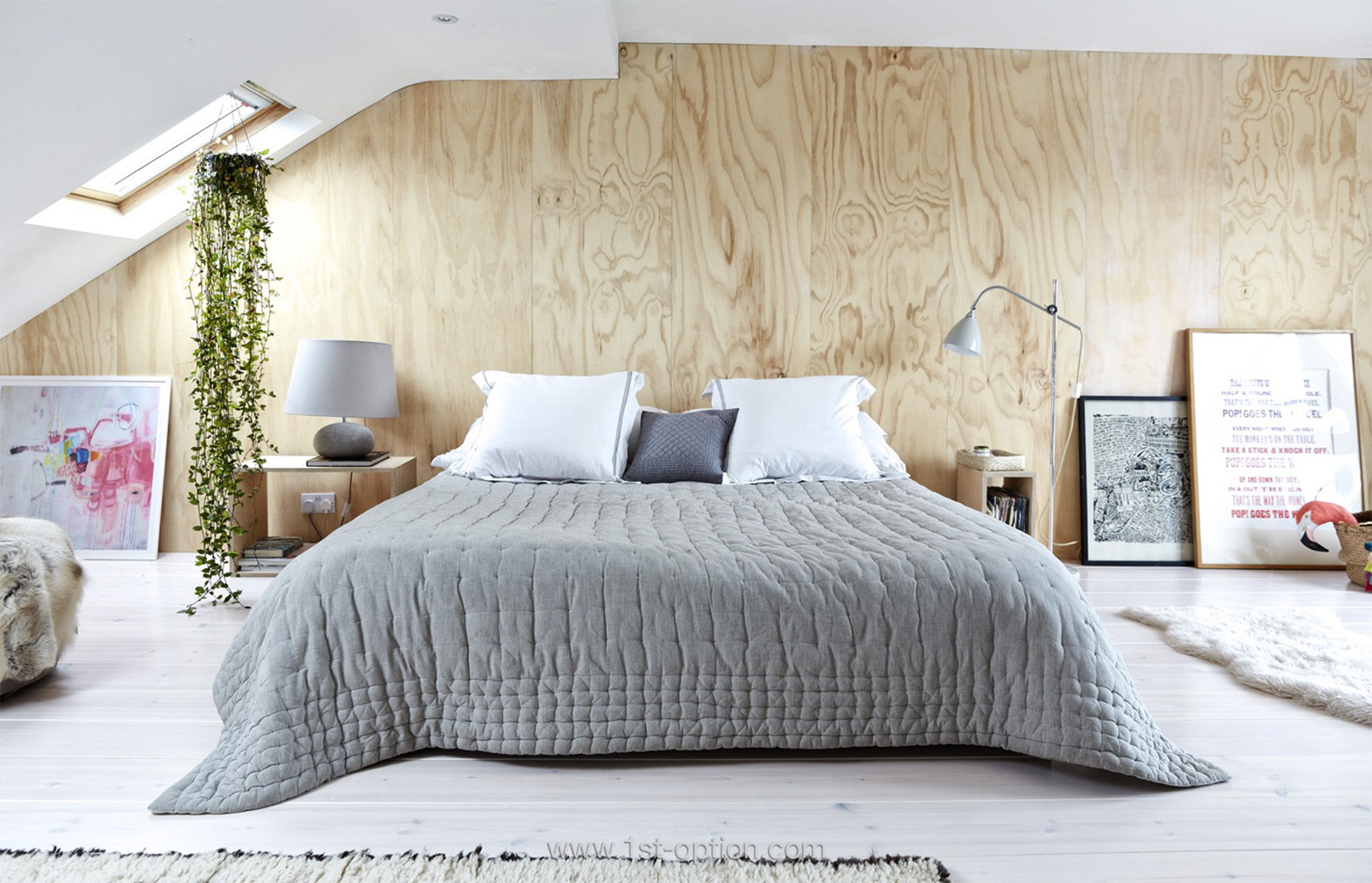
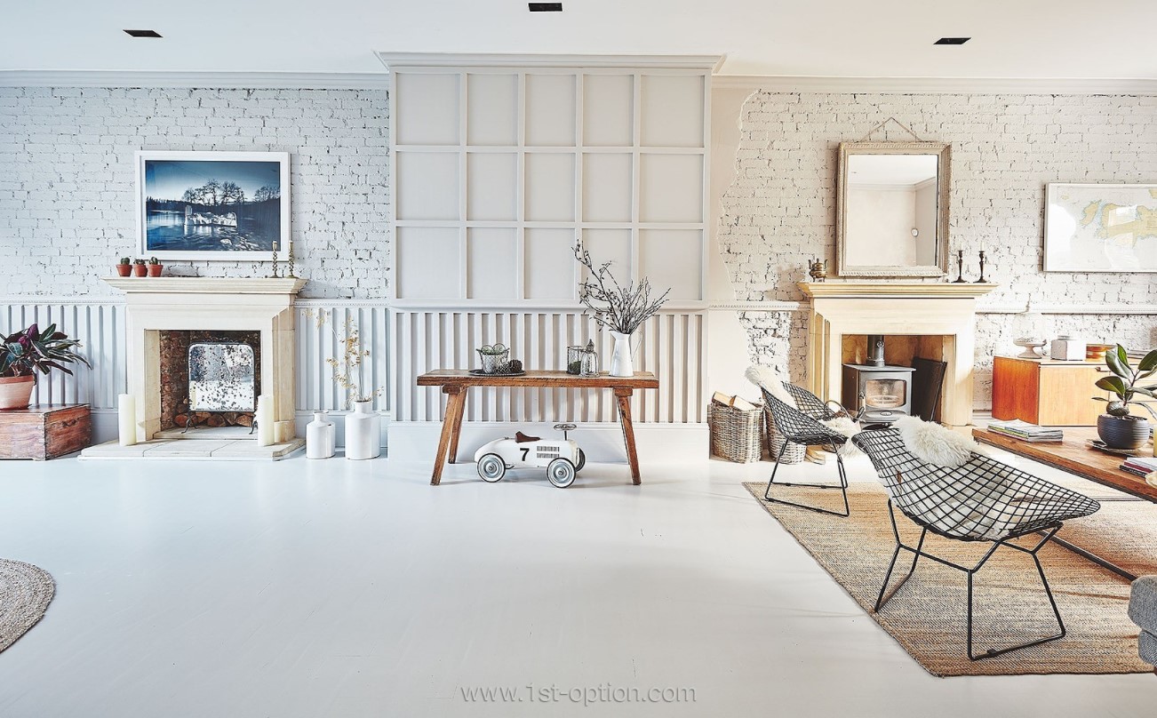
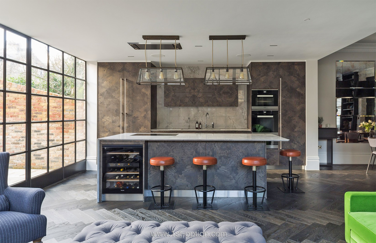
Clean lines at Drays Gardens

If we take this concept further it is generally thought that, thanks to the influential work of biologist Edward O. Wilson, when we interact with nature, humans gain satisfaction, inspiration and peace. By connecting with nature we, therefore, improve our well-being. Explore this within design and it is fairly self-explanatory that if we bring elements from the natural world into our homes such as plants, wood, stone and water, it in turn improves our health and well-being through reduced heart rate variability, decreased blood pressure and increased activity in our nervous system. 
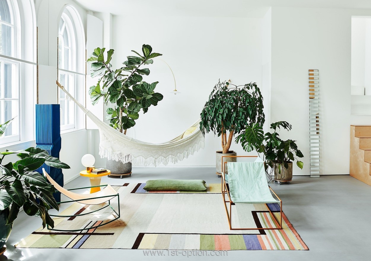
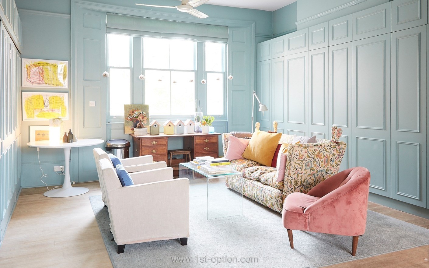
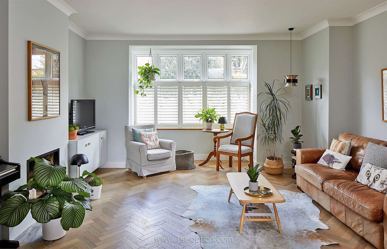
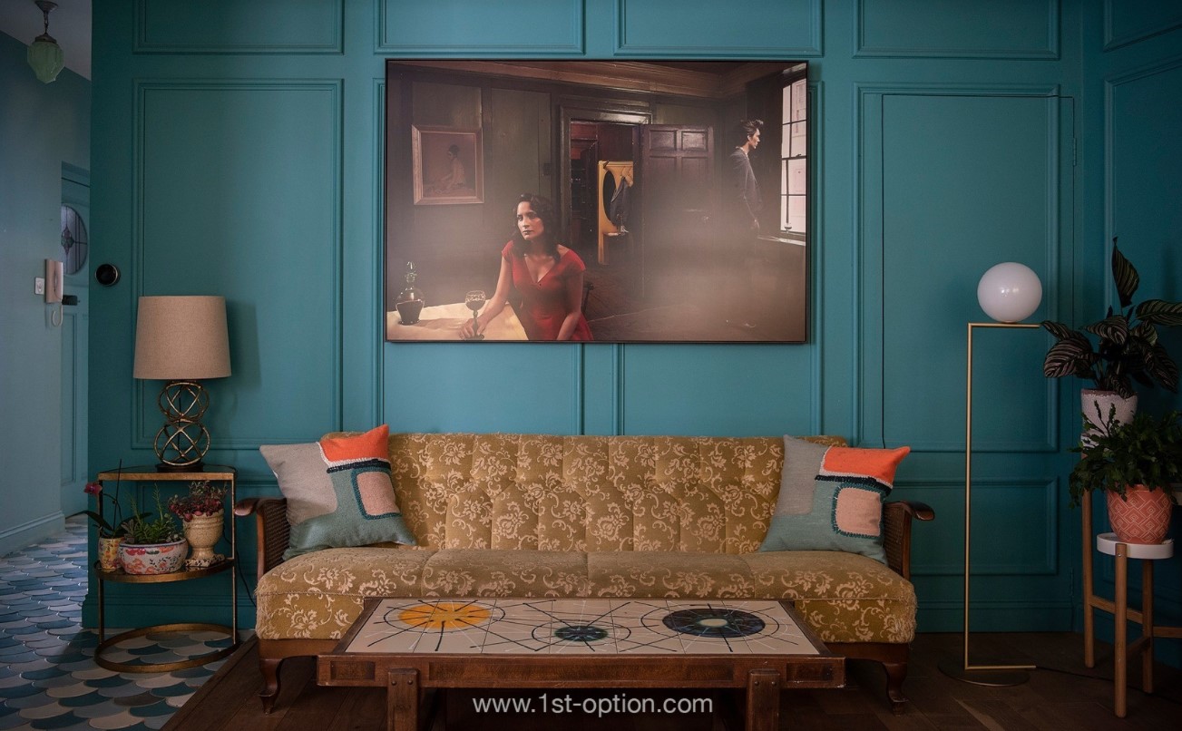
Fresh and motivating design at Blue

The popularity of biophilic design in recent years has arrived as a direct backlash against technology and the urbanising world. Since the boom of technology and industry in the 19th and 20th centuries, human connection with the natural world took a diverging path and we saw people start to build more and shelter themselves from the elements we once loved so much. This has culminated in over half the world now living in urban settlements, this is expected to rise to around 68% by 2050 and within this urban world, people now spend almost 80-90% of their time indoors. 
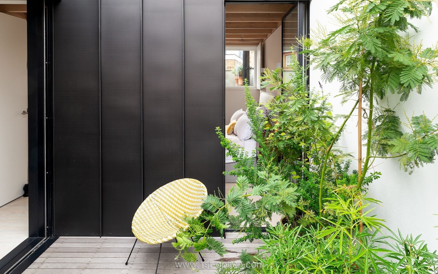
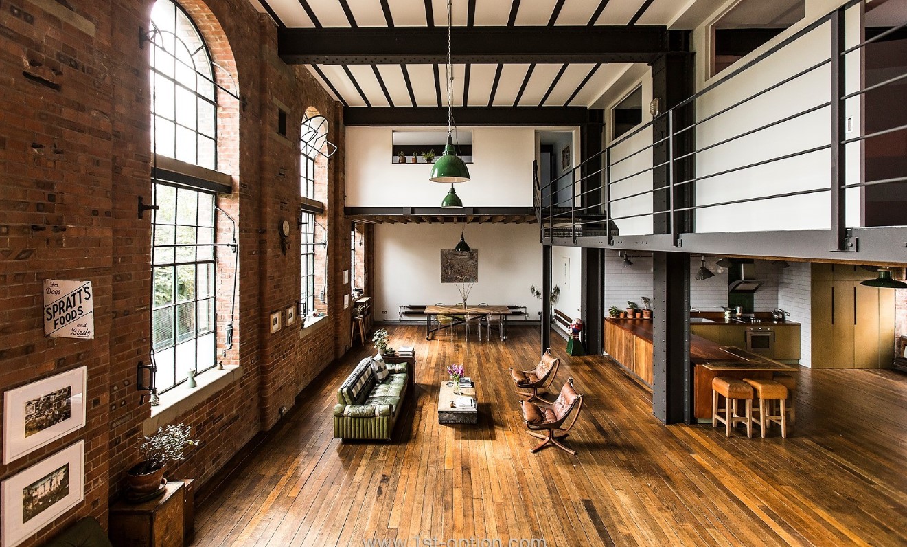
Biophilic design at The Distillery

As stated above, this is why designers have started to embrace nature and bring the natural world into the home using biophilic approaches to interior design. This can be achieved through botanical forms and shapes, biomontage walls, subtle usage of house plants, clean spaces, implementation of materials such as wood and stone and an abundance of natural light. By using these elements and features within your home, the connection to nature is again visible and so helps improve wellbeing. This is comprehended by humans through three ways, direct experience (light, air, weather), indirect experience (natural materials from nature) and experience of space (where we place things).
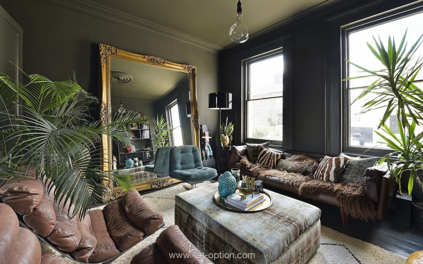
Multi-sensory space at Jarvis

By using biophilia you can create multi-sensory spaces that resonate across all demographics. Connect to nature and you will see the boost in productivity, wellbeing and inspiration as well as enhancing creativity and your mood. In a world that is quite apparently becoming more and more urbanised biophilic design is an approach to design that celebrates human nature and our innate connection to nature and how we live, act and work within it.
Top five for November

Over the past few months we have been lucky enough to take on some of the most gorgeous and eye-catching properties we’ve seen this year. With an array of new locations ranging from vineyards to hotels and private members clubs to family homes, November has seen some truly remarkable locations enter our books. Read on to see five of our favourites.  

Alleyn

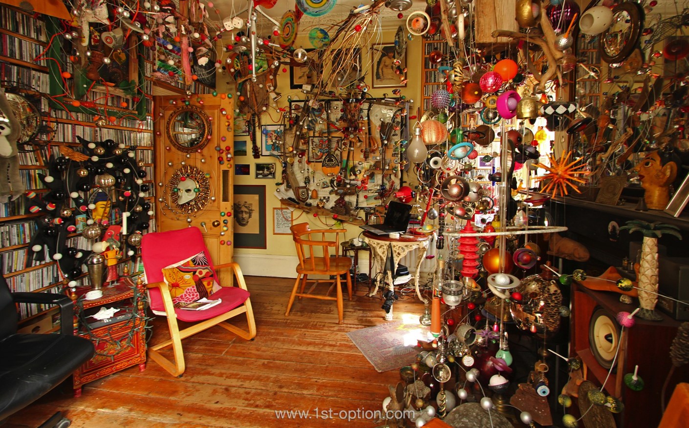
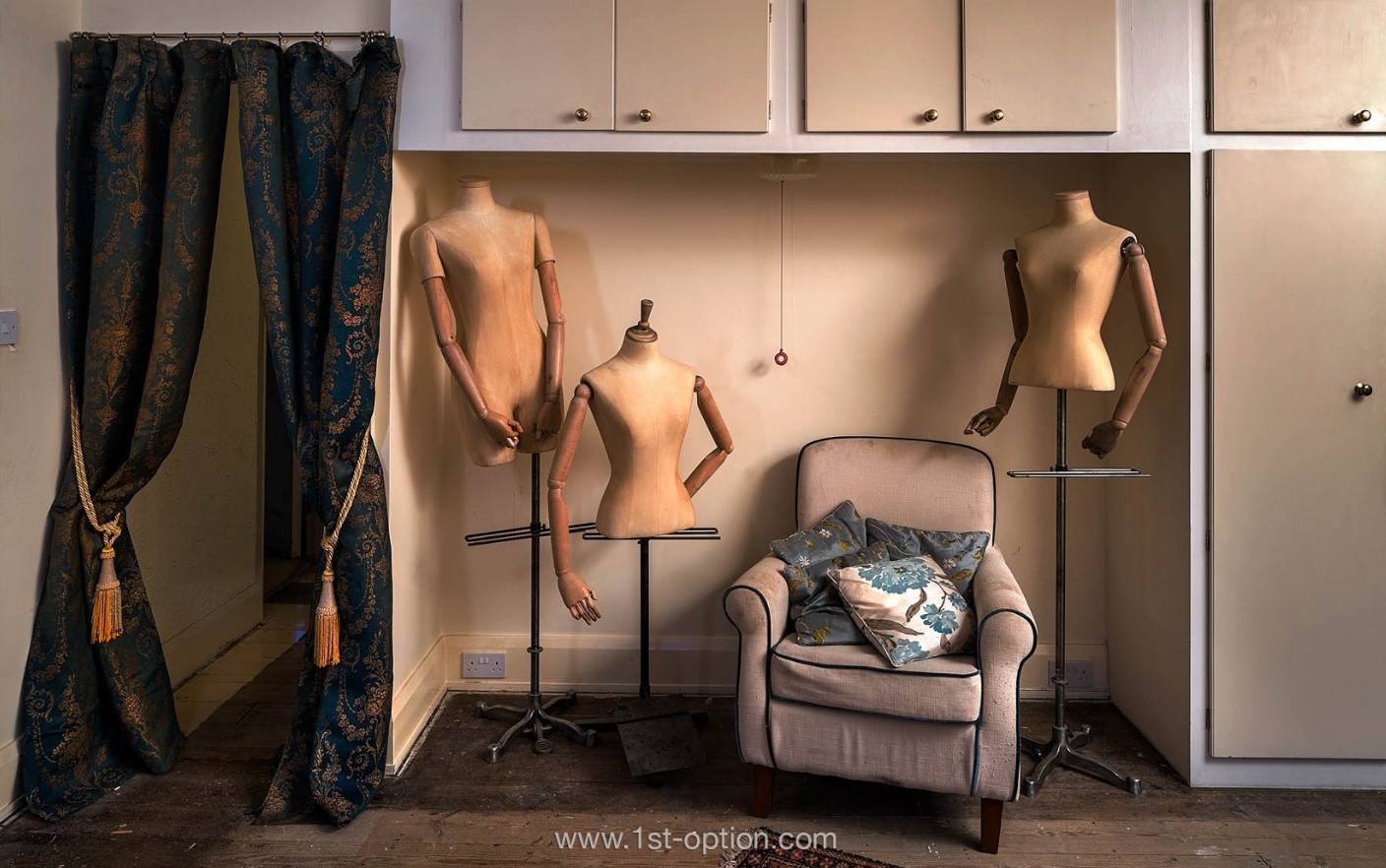
First up we give you Alleyn, a 1930’s red brick detached house that screams personality, character and unique authenticity. With Interiors that look like they have been set in a time warp from the 70’s you are never going to be short of unique and striking shooting opportunities. Every room offers something different to the next with standout features that include a truly eye-catching set of table and chairs that wouldn’t be out of place in the middle ages, classic furniture that can found all around the property and a set of remarkable headless mannequins that look like they were transported straight from a 1970’s shop floor. As if all of this wasn’t enough, the downstairs hallway and staircase has been purposely distressed which adds tons of texture to a house that is already full of diverse variety and character.

Quirky furnishings of Alleyn

Greek Street

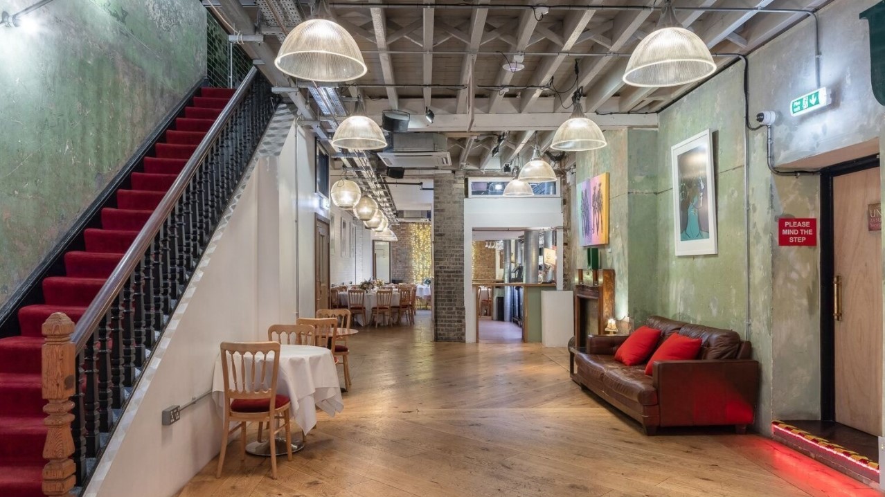
Moving to the opposite end of the location spectrum is Greek Street, a Georgian town house that has been fitted as a Private Members Club with a 1900’s industrial loft space to match. This large and versatile event space features a variety of areas including a large downstairs dining area that has a distinct industrial feel to it, this is accented by a foyer or lounge area that is reminiscent of the Private Members club it has been designed to look like. There is also a dining room and ground floor bar that wouldn’t be out of place in the East End in the 90’s. To top it off there is also a library, a writers room and an elegant roof terrace. So if you’re looking for a location that offers tons of diversity while keeping some of the alluring charm of the 20th century,  then Greek Street is certainly the location for you.

Industrial Lobby at Greek Street

Parlour

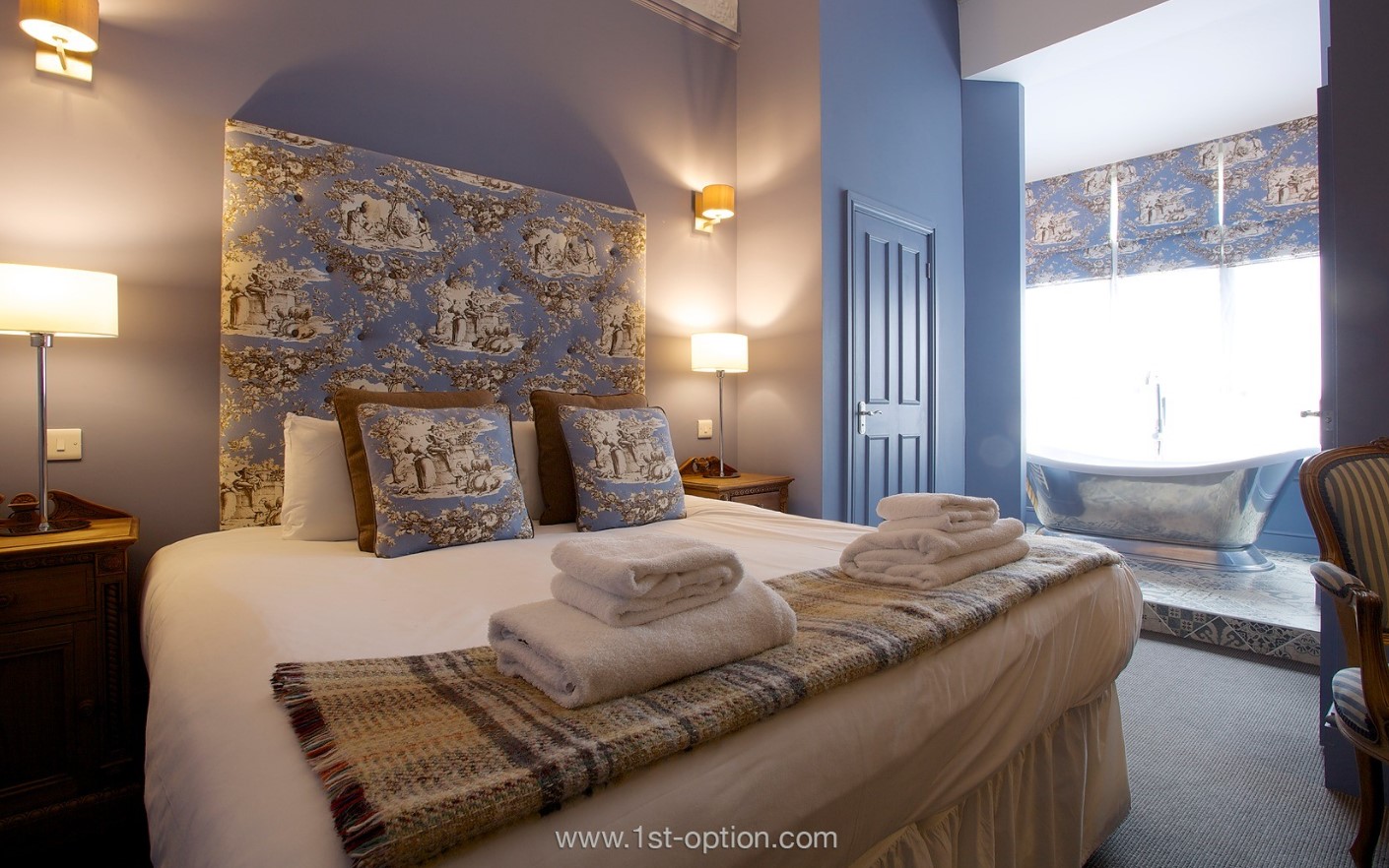
Next up is the sumptuous Parlour, a grandiose Georgian house, hotel conversion just a short walk from Victoria station. Built in 1851 by William Chinnery Mitchell, the Georgian house is comprised of 45 individually designed rooms that boast an eclectic mix of period heritage and contemporary design. While each room is original and different to the next, they all feature glorious design elements like freestanding baths, patterned walls and period furniture. The foyer also features striking furniture and an bold all over tree print wallpaper that really grabs your attention. This truly is a must have shoot location!

One of the 45 individually designed rooms at Parlour

Poulton Farm 

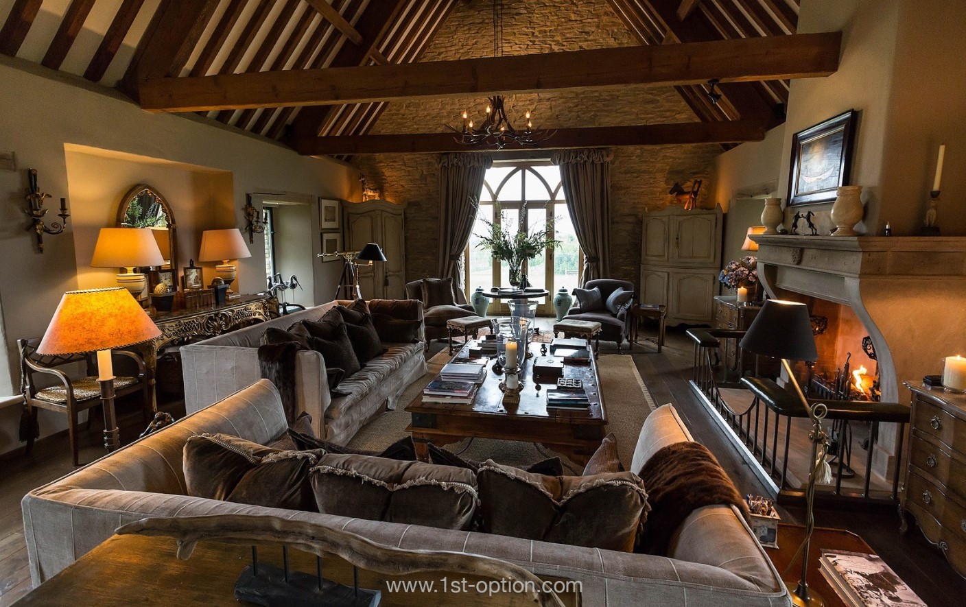
Where to start with our next property? Poulton Farm is actually a first here which we always love to get at 1st Option. This Truly remarkable shoot location is an imposing house that is made up of a number of large Cotswold stone barns that have been brought together through a gorgeous French colonial interior style that gives off a strong eclectic feel. The actual property is a vineyard and so has extensive gardens that are large and incredibly beautiful. Standout features include a handful of glorious working fireplace, tons of grand mid-century furniture and a tennis court that’s found in the comprehensive grounds.

French Colonial design at Poulton Farm

Maker  

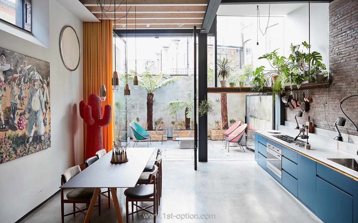
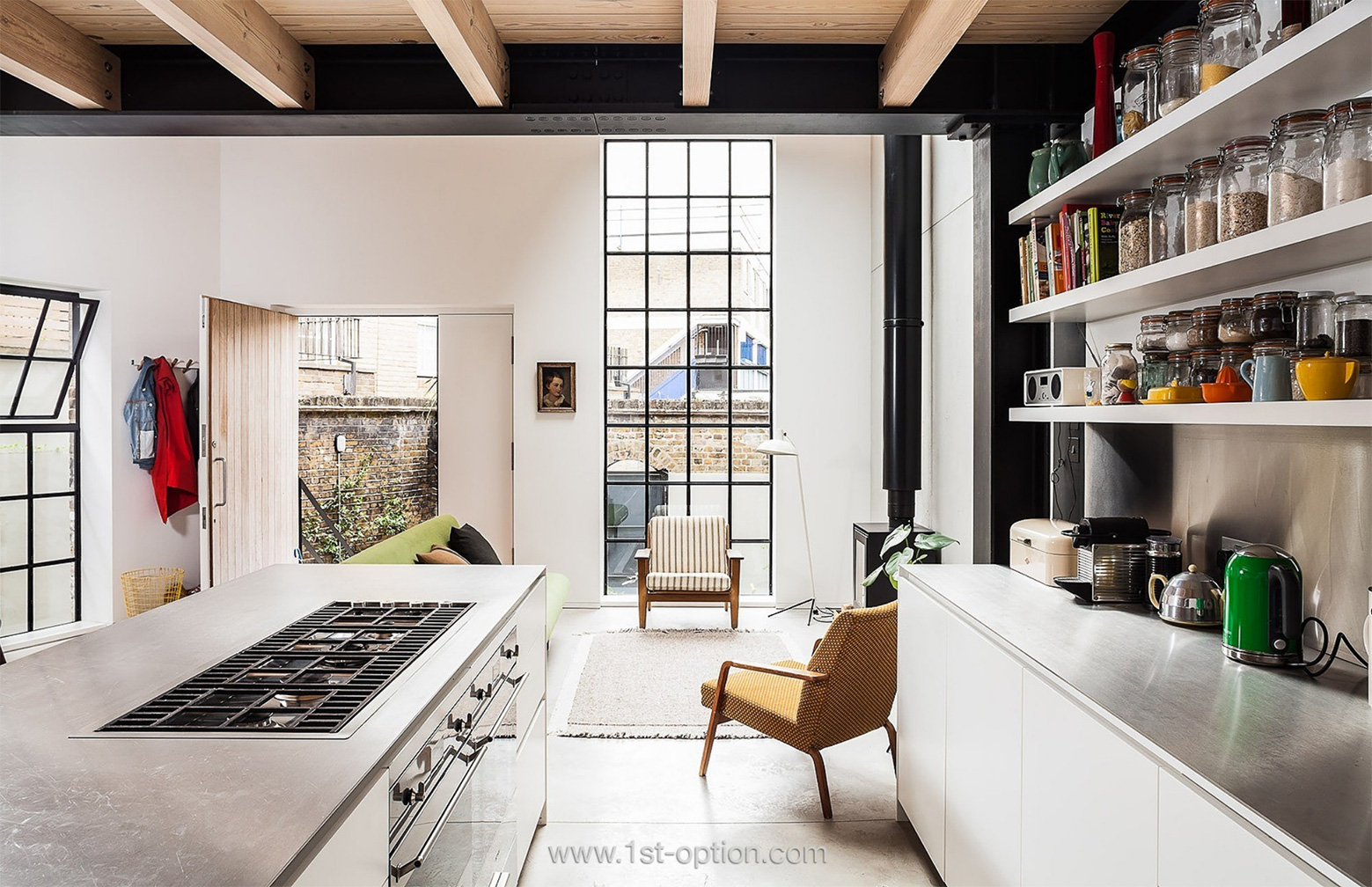
Last but by no means least we give you Maker, an East London family home that really grabs your attention. Designed in an industrial style, the impressive property features a cool open plan downstairs that looks out onto an equally impressive walled garden terrace. Notable plant features and some interesting chairs really give the space a Mediterranean feel that can’t be matched. However, when you look inside, you move away from the Mediterranean feel and are met by a distinct New York loft design matched with industrial wooden beams, a house long wall of exposed brick and a whole host of quirky and abstract art and furnishings. If this wasn’t enough to get your juices flowing, there is also an interesting home cinema room finished with a large sofa that is covered all over in the star spangled banner.

Open plan space of Maker

In the Spotlight: Grandmillennial Style

Grandmillennial or ‘Granny Chic’ style may be a new concept to many above the age of 40, however, thanks to the ever cyclical nature of trends plus Instagram’s ability to show you the same monotonous things over and over again, many millennials in their 20’s and early 30’s have dipped into their grandparents living rooms for inspiration and created a new interior design style that has taken the world by storm. Beautifully falling between minimalism and maximalism, Granny Chic perfectly juxtaposes antiquated with contemporary and since its creation, House Beautiful have dubbed the style Grandmillennial thanks to those who have so eloquently adopted this design style. 

Most trends go out of style, whether that be in interior design fashion or anything else for that matter, however, thanks to the repetitive nature of style and trends, many do in fact make a return to the forefront of what’s ‘cool’. I doubt many saw their stuffy grandmother’s living room ever becoming cool, trendy or popular though, however this is because this new modern spin incorporates these textures and patterns from a time gone by, with a contemporary sense of comfort, charm and consistency. Where perhaps in the past your grandmother’s living room may have been seen as cluttered and chaotic, we are now seeing a measured, selective and thoughtful approach that shows off the owners individuality and above all their personality. 

Thanks to being raised in the 90’s and early 2000’s when mass market furniture exploded around the world, the millennial generation set upon a classic generational rebellion against their parents and the monochromatic style evolution that they adopted. Seen as the antidote to the same minimalist spaces that have dominated Instagram and interior spaces for so long, millennials have now reached out to styles and trends of the past for their inspiration rather than glossing the modern equivalent of a glossy magazine or catalogue, i.e. Instagram. 

Grandmillennial style as mentioned above is about individuality and an expression of your personality, however, there are some inherent style cues to execute it properly and to a high standard. The starting point is to keep the colour palette tight and consistent with the overarching theme of the space. Pastels are a great foundation as they offer a subdued hit of colour that doesn’t swarm the room or take away from the other elements that bring the room together. Bold colours can be used, however, the main hit of colour should come from your furnishings, patterns and components that add texture. Monochromatic grey based colours can also be used but again they have to act as a platform to showcase the rest of the room. Whites and blacks as a rule of thumb don’t tend to offer very much to this unique interior design style. The key to achieving this look effortlessly and eloquently is the use of classic prints like chintz, toile and plaid, which are generally adorned upon curtains, upholstery and wall furnishings. Other elements that are crucial to a successful grandmillennial room are floral patterns, ruffles and pleats as well as a strong grasp on how to add texture to your room. If you want to take it one step further and really add your individual spin, needlepointing has made a massive resurgence in recent years and adds tons of character as well as texture to your space. The best furniture to utilise would be dark stained wood such as walnut as it adds a third dimension to the room while again not stealing the attention from the other elements. And if you want to bring the room into the 21st century, accenting the furniture with some abstract modern art adds that added touch of class.

The key to the style is to create a look that evokes a sense of comfort and home, one that welcomes people in while saying something about you. It’s a way of escaping the same looks that fill Instagram feeds, but creating a space that’s timeless rather than antiquated. It’s an expression of you and your personality, so decorate with what you love but remember to accessorise carefully and selectively and you’ll be left with something that’s cosy rather than chaotic! 

In the Spotlight: Scandinavian Interior Design

Typified by its use of muted colour palettes, wooden floors and furnishings, minimalism and a clutter free aesthetic, Scandinavian design has been at the forefront of interior design for many years now. The style may have evolved over the years, however, this is by and large down to the contributions from a handful of Scandinavian designers: Alvar Aalto, Hans Wegner, Arne Jacobsen, Eero Arnio and Ingver Kamprad (the founder of Ikea). While the style came to worldwide prominence in the 1950’s and then again in the 90’s, its causation goes a long way back and is steeped in history. 

Following the industrial revolution, machines started to take over most aspects of life. Because of this, many prominent voices in the world of design made impassioned pleas for humans to make a return to nature where possible. However, in spite of this plea, Art Deco and Art Nouveau movements started to sweep Europe taking inspiration from modern styles, fine craftsmanship and rich materials, a polar opposite to what these designers had been pleading for. By the end of World War I, however, this Nouveau Riche design style had ground to a halt due to a shattered continent, both mentally and financially, and following the great depression there was no place for fine craftsmanship and rich materials. 

If WWI made the cracks of societal structures apparent, WWII broke them wide open. Whether or not it was wholly the Art Deco and Art Nouveau movements that were the cause of change, something had most definitely shifted people’s ideas and thoughts around design. Where bigger had always meant better before, as a direct correlation and reflection of social structures, we now started to see ideas around design take new forms. The discourse that was now being spoken, in light of what had happened over the last half century, was that humans were doing something wrong. Through looking for an antidote to the totalitarian ways that had preceded us, designers and architects started to reverse the old conventions of beauty. For the first time in history we started to see beauty and functionality come together as one. 

In Scandinavia, due to the harsh winter climates, they had long prized utility and functionality over beauty and decoration, however with the emergence of modernism in the 1940’s, Scandinavian designers started to combine beauty, simplicity and functionality together. By the 1950’s this new design style was starting to gain real prominence around the globe. The aesthetic was uncluttered and simple, giving the entire space a cosy and content, homely feeling, something the Danish called Hygge. 

From this point on, Scandi design went from strength to strength, largely because it was such a stark alternative to Nazi-era design fascism. Natural, minimalistic and intimate designs, that focused on the family and home rather than the state, were making their way to the pinnacle of design, becoming an internationally recognised commodity with particular prominence in the US. Though popularity declined between the 60’s and 80’s, cream will always rise to the top. Thanks to a shift in focus on sustainable living in the 90’s and 2000’s, Scandinavian design was catapulted back to the forefront of interior design. 

In the 21st century Scandi design has slightly evolved and now features white walls to emphasise light with natural colour palettes that tend to include a pop of colour here and there to bring the room to life. Textures that are utilised, again, are natural, such as wood or stone and the layout of the room tends to be pared back, no fuss and simple, to emphasise an elegantly minimalist aesthetic. Carpets tend not to feature and instead you can expect bare wood floors perhaps with a rug for added soft texture and white painted exposed brick to add hints of rough texture while maximising opportunities for light. 

In addition to shaping the ways in which we design our homes, Scandi design has also left a marking impact on the way in which we fill our rooms. And at the end of it all, furniture design might end up being the part of design that leaves the most enduring mark on its legacy. After all, few western homes lack a piece of furniture from Ikea and everyone has at least seen one of Alvar Aalto’s curved wood armchairs, Eero Arnio’s Cognac chairs or Arne Jacobsen’s Egg, Drop or Swan chairs. 

Scandinavian design may have evolved since its introduction in the 1940’s, with new emerging styles in 2020 seeing a darker and moodier version come to the fore, but one thing that certainly isn’t changing is its popularity and place at the top of interior design. Check out our full portfolio of Scandi design shoot locations here

Top Tips – Decorating Do’s and Don’ts

Decorating a property to the specific needs of your shoot can help transform it into something eye-catching, spectacular and completely unforgettable. What’s more, if you are trying to showcase a product, having the ability to decorate your set as you wish can be invaluable and make all the difference. Many location owners allow painting and decorating, especially if their properties are versatile enough to allow crews to dress up and style as they please, in the knowledge that it shouldn’t be difficult to return the space back to its original finish. To achieve this however, there are some rules that must be adhered to before jumping in hammer and tongs! If you’re interested in some do’s and don’ts we have our short video explaining some of our most asked questions here, however, read on for a more in-depth analysis.  

Always hire a professional  

This is the most important factor when it comes to decorating as this essentially impacts the location owner as well as the client. If you are paying top dollar to decorate the space, you’ll want to make sure that the standard of work is immaculate. This is your shoot after all and you probably wouldn’t have sub-par work done anywhere else. Just because you may have painted your child’s bedroom five years ago, doesn’t necessarily mean you’ll be able to do it on a set. Furthermore, at the end of the day, it is your responsibility to make sure that everything is exactly as found when you leave, so rather than having to pay extras to fix a shoddy job, it’s best to make sure it’s done perfectly to start with. 

Always check the finish

If you are granted the responsibility of painting someone’s walls within their home, it is essential that you ensure that a smooth finish is left on completion. Don’t just trust your eyes, make sure it’s smooth to touch. As mentioned above, you don’t want to be called back to finish the job and incur an extra fee, especially as this may be a flag against you being able to decorate locations in the future. Moreover, this also relates back to our first point, a professional painter will always make sure these simple mistakes don’t happen. They will know the difference between various paint finishes and how this can affect the wall underneath. 

If you are painting a wall a dark colour then make sure a base coat is applied to bring the original colour back

This is fairly self-explanatory, however, yes, if you do apply a dark colour to a wall that previously had something lighter, the only way to bring back that lighter colour is to prime it with a base colour beforehand, which is something that would be second nature to a professional. 

Allow enough time for the coats to dry properly

A lot of these points may revolve around topics that you’d think are quite self-explanatory however, in the middle of stressful shoot, while you have a million other things going on, the ‘simple’ things are going to be, and often have been in the past, the things that are missed or not done to a high enough standard. 

Protect the floor from paint splatters

You may find that the original colour of the wall is simple and plain to allow you scope to decorate as you see fit, however, the majority of our locations have very expensive flooring and if you were to start work without taking protective measures, it will be you as the client that may have to compensate for damaging the floor. Always think about potential consequences before you do anything!

Make sure to use non-toxic paint

This, again, is why we keep stressing the value of hiring a professional. Not everyone is versed in the elements that make up paint, after all why would you naturally think to check what toxins are in it? You probably wouldn’t. However, knowing what’s in your paint is vital and picking a toxic paint could easily result in health issues. Many paint manufacturers don’t overtly disclose the chemical makeup of their paint, so having an in-depth knowledge of what you’re doing is crucial. Toxic paints can cause unpleasant symptoms such as dizziness, nausea, fatigue, asthma and even allergic reactions. If you are really unlucky however, you could end up with some severe long-term damage such as recurring headaches, nerve damage and problems with eyesight. If you knew exactly what toxins were in the paint you probably wouldn’t paint your house with them, so best not to do it to someone else’s house. 

Over the years we’ve helped many, many clients with their requests to decorate on set and the vast majority of these jobs go very smoothly, however, to head off any potential problems before they may arise, always, always, always ask either us or the location owner before you do anything

Check the requirements of your shoot are acceptable before starting, for example, just because you can paint a wall doesn’t mean you can drill a hole in it!

In the Spotlight: Industrial Design

It’s no secret that 2020 has thrown the rule book out the window on almost every aspect of life and society. And, while we haven’t seen a complete upheaval of ideas in the world of interior design, there has been a shift in focus. With more people spending significantly more time at home than ever before, due to the government enforced lockdown and subsequent working from home initiatives, we are now seeing interior design and home renovation projects pop up like never before. Because of this turn in focus, people who wouldn’t normally have the time or even be interested in transforming their home into a stylish haven, are now bringing a whole host of interior design trends to the fore that weren’t necessarily on experts’ radars at the end of last year. If you were interested in our design trend predictions that we put together at the end of last year then give the article a look here. We actually weren’t too far away, even with all these changes to everyday life. Nevertheless, one trend that we actually didn’t see rising to such resurgence over the past six months was industrial design.

Industrial design is the hot trend that takes a rundown warehouse, loft, barn or old derelict building and turns it into a liveable home, while keeping the raw and gritty elements, amidst a polished, high spec finish. At the heart of Industrial design is function, simplicity and of course innovation, while ensuring the aesthetic not only looks beautiful but is incredibly functional and so works efficiently. Let’s break this down a little bit further though and see how it can be incorporated into some of our different locations. 

When we say simplicity, innovation and functionality are the core elements of industrial design, does anything quite say it like exposed brick, converted factory windows and iron piping?. The art to doing industrial well is for the space to be effortlessly cool while keeping it easy to maintain, and one property that does this perfectly is Spratts Factory. The owners have exquisitely utilised the double height ceiling, transforming the huge factory windows into a stylish crittal, while the exposed brick and original wooden floors bring colour and life to the space. The iron rails and stripped back decor also create a really simple and pared back yet classy living space that can’t be matched. 

Moving on, dark and dreamy interiors can also create a real chic industrial feel and mood. If we take a look at Onyx, you can see the way different shades of grey and black marble, granite and wood for their countertops and flooring have been used, this immediately draws your focus and gives off the impression of wealth, style and candour. Pair this with the large crittal window frames, the modernised industrial stools and the metal framed light shades and you’re left with one of the most polished, functional and stylish bachelor pads you’re likely to find. 

Industrial living doesn’t have to be filled with dark interiors or exposed brick. You can achieve your desired look in a light and sophisticated manner just as easily, something that The Distillery has accomplished in an incredibly cultured fashion. Incorporating natural light, the owners have created a sanctuary of light, while keeping the aesthetic of the space true to its industrial roots. Large crittal framed windows throughout are the driving force of the light, while the polished concrete floor keeps things simple in a refined way. Pair these features with steel staircases, bolted steel frames and a standout Jetmaster wood burning stove and you have the core foundations of industrial living, simplicity mixed with durability.

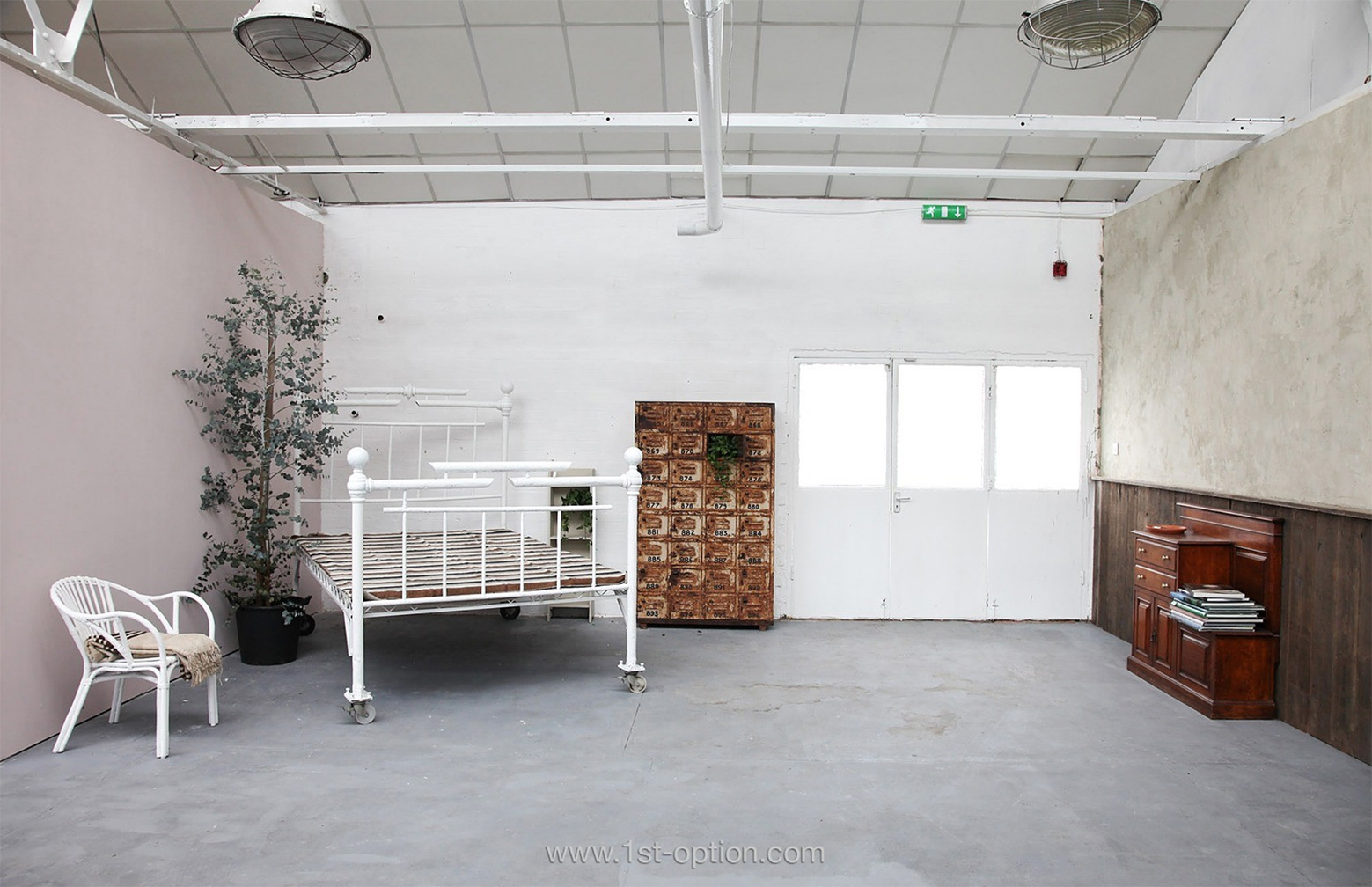
Store Cupboard also shows that crittal windows and natural light aren’t needed for that industrial feel and can be achieved through a clever use of furniture and props. Take a look at the large vent style light frames, the quirky and distressed bed frame, accompanying cabinet and the metal frames above the head. Once all these elements are combined, you are left with that classic New York loft industrial mood. They have shown you that you don’t need to break the bank and it’s actually pretty easy to achieve with a little bit of vision and understanding of the core concepts, simplicity, functionality and durability! 

Unique Spaces

Although traditional locations can and do often fit the shoot brief perfectly, there is sometimes a place and time for something a little more unusual. Fortunately, working in London, one of the most diverse creative hubs in the world, we are lucky enough to be able to represent some of the most interesting and quirky locations the capital has to offer. There’s always going to be the odd left field brief, so here at 1st Option we strive to keep our location library as diverse, unique and exclusive as possible. Have you ever been given a challenging brief and struggled to find the right shoot location, recce’d tons of locations but not found the right one, so had to settle for something more conventional? If this rings a bell, don’t worry, as we have everything from converted chapels to 70’s time machines. Why not sit back and check out our top 5 unique spaces right now…

Deerhurst Road

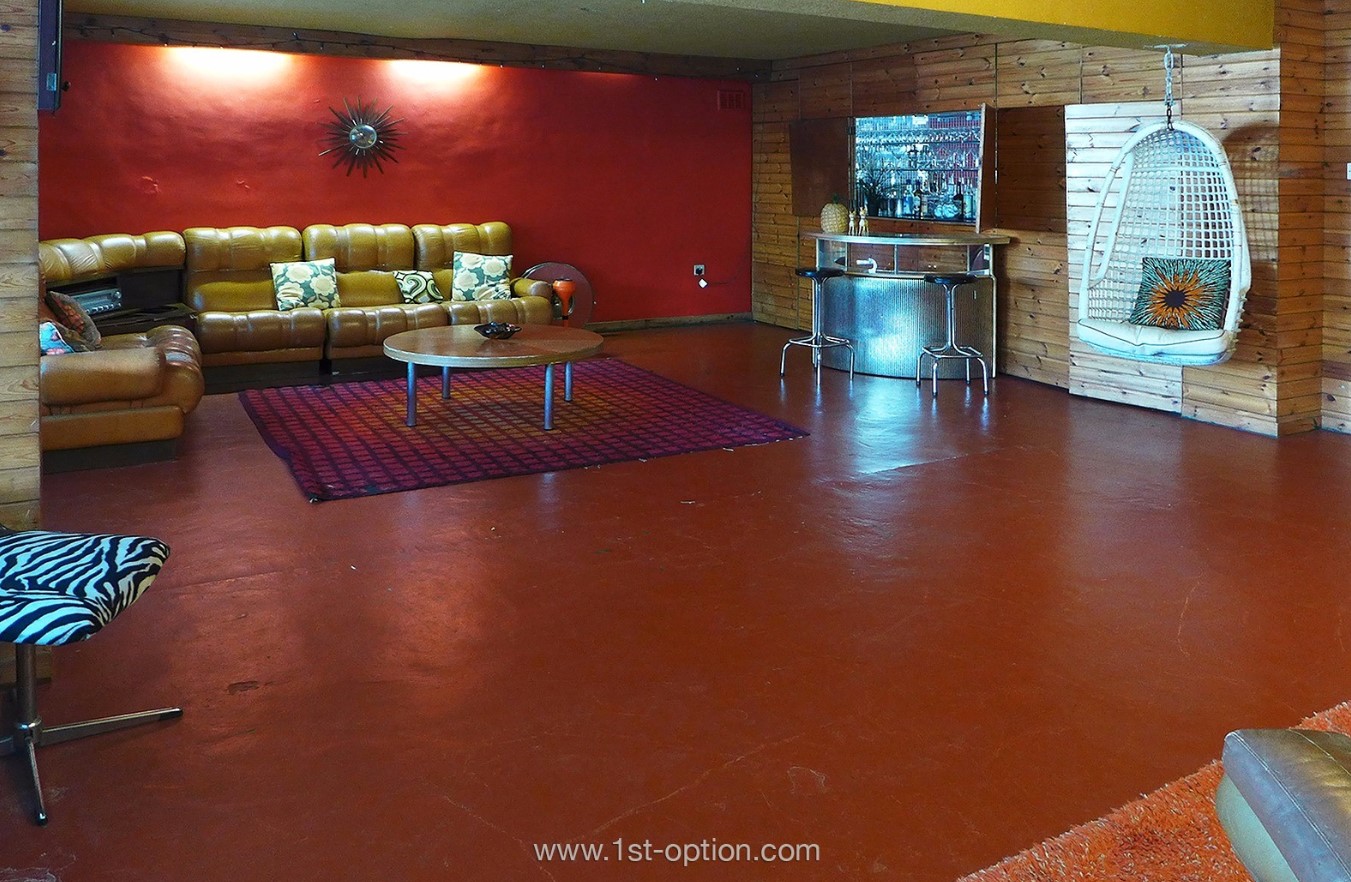
If you’re looking for a retro inspired shoot location, straight out of the 70’s, then Deerhurst Road is going to take some beating. Spread over four floors, this Streatham shoot location will have you in a time machine in seconds. Featuring classic folding and sliding doors, breakfast bars and a vintage lounge and bar that overlooks a swimming pool, you’ll immediately be hit with the 70’s vibe. However, the real time machine comes from the colour palette used. Browns and oranges, that were so popular during the era, run throughout and are perfectly accented by wooden panelling and loads of funky wallpapers. On top of this, there is also a brown and yellow bathroom with circular tub and an avocado suite to match. The owners  certainly hit the nail on the head with this one! 

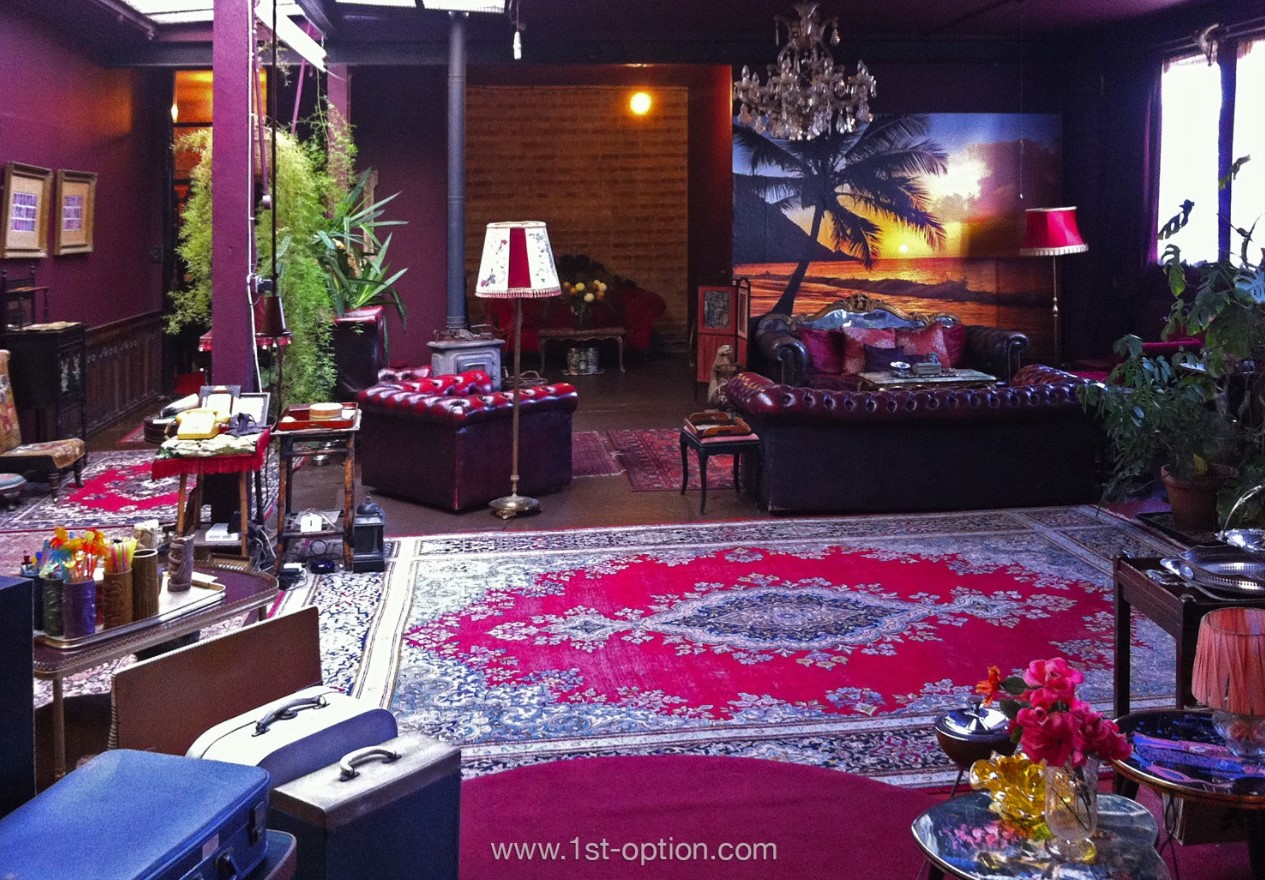
Kontiki  

If you were to look up ’quirky and unique shoot location’ on the internet, Kontiki would probably be staring right back at you. Offering two studios in East London, you’ll never be short of finding an eye catching shot here. While the space is split into two studios, North and South, there are tons of common features between the two. Both spaces are finished in a purple colour tone that catches your eye instantly and in keeping with the Asian aesthetic, they are both also adorned with many interesting and uncommon ornaments. With an unparalleled amount of striking backdrops including bath tubs, wall art and taxidermy, you’d be mad not to consider Kontiki for your next unusual brief. 

Ladywell 

It’s not that the properties on this list are becoming more unique by the second, but rather that when we said we truly do have the most diverse and interesting location library on the market, we weren’t joking, Ladywell takes unique and eye catching to a whole new level. This quirky Victorian, South London shoot location is set over four floors, including a cellar and is littered with some of the most remarkable and intriguing furnishings you’re likely to find. Step into the overgrown garden of ornaments that is Ladywell and you’ll be sure to end up with an incredible campaign. 

Ladywell’s overgrown garden of ornaments

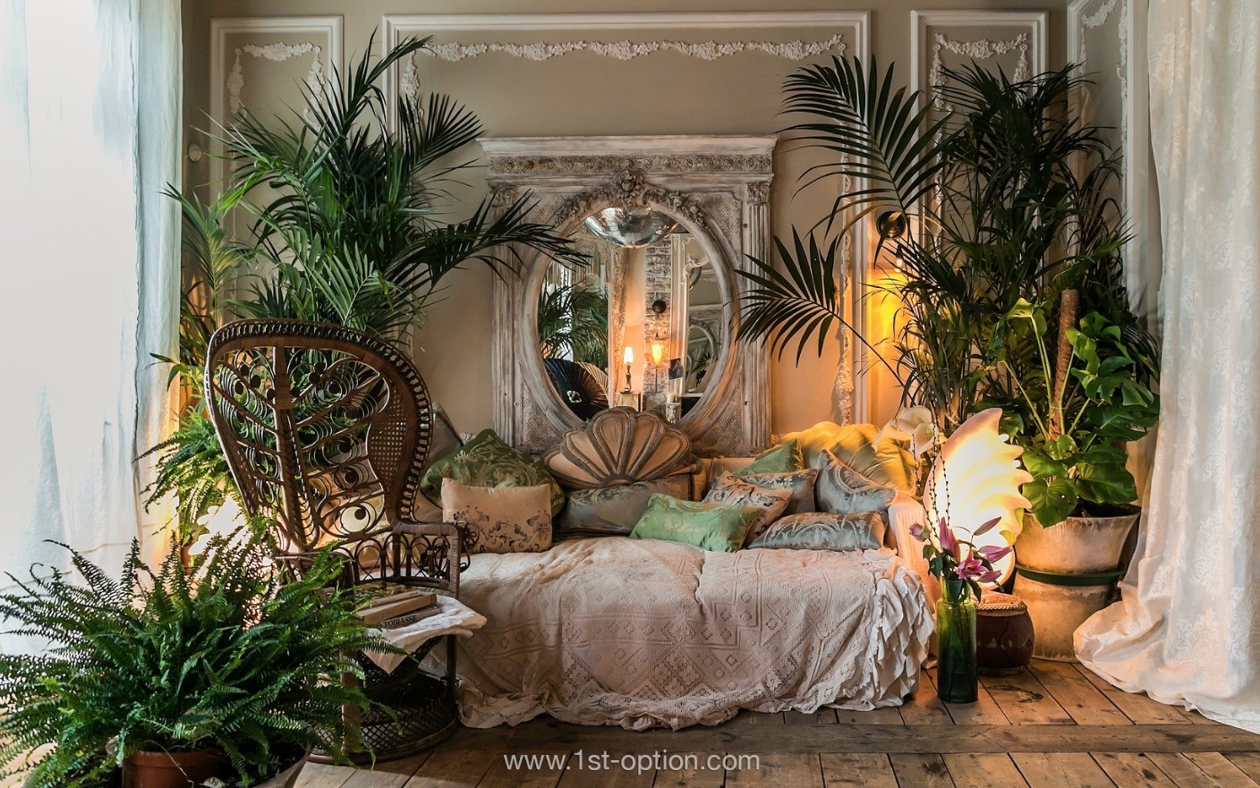
Little Venice 

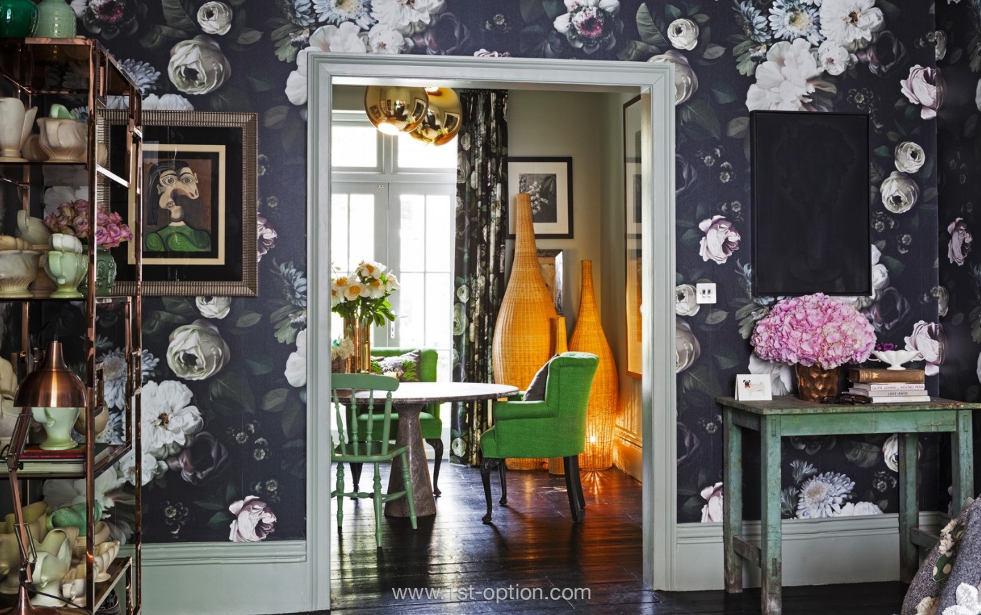
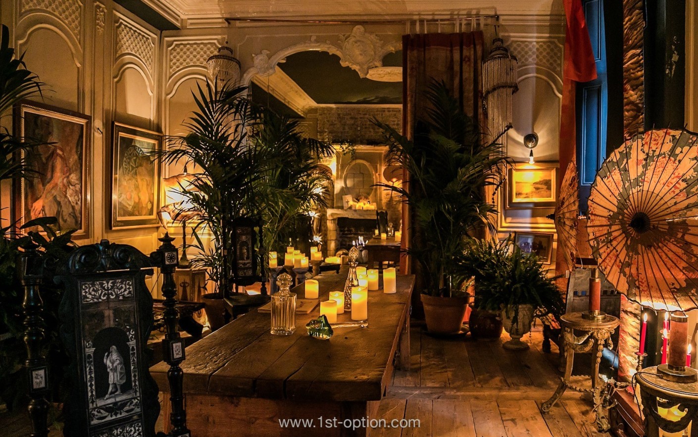
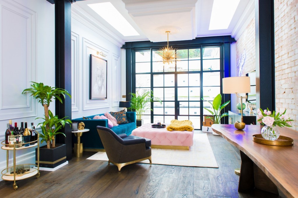
Would you believe us if we told you that this property was actually located in Maida Vale, West London and not Venetian italy? Well it is in fact situated in London, a short walk from the Little Venice stretch of the Grand Union Canal, which we imagine had some impact on the venetian styled interiors that comprise unique furniture, accessories and a ton of mediterranean plants, which all contribute to bringing this fabulous property to life. It’s also completely finished with original reclaimed floorboards and opulent fabrics and the blended use of colour really gives the place a touch of italian class. 

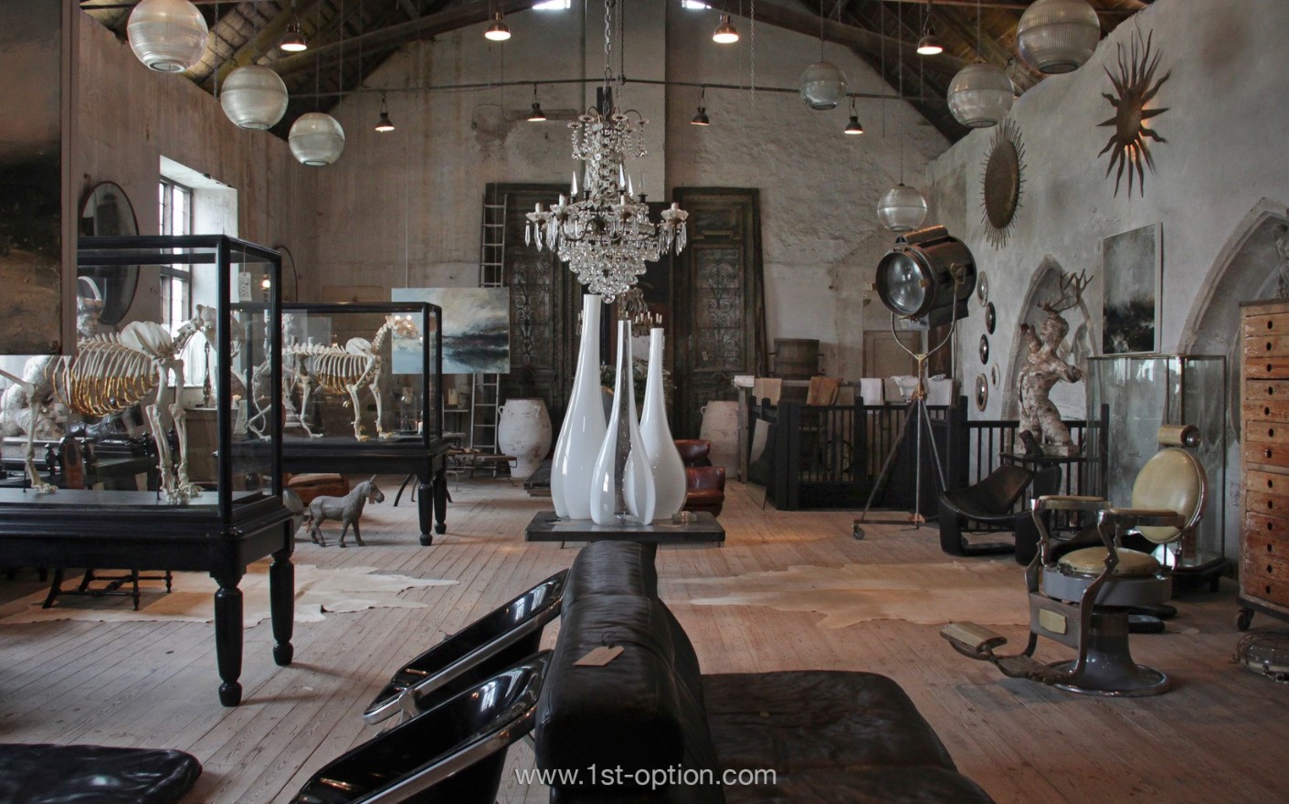
Monastery 

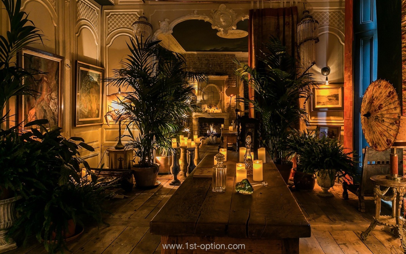
The last location on our list is Monastery, a 14th century converted chapel in Rye, East Sussex. If you’re looking for a unique property that you’d be highly unlikely to find anywhere else, then you’ve certainly come to the right place. Set over two floors, Monastery features a vast array of one of a kind antique furniture, quirky and unusual props and textured walls, all of which have been carefully selected to create a truly unique space that you won’t find anywhere else. 

So there you have it, 5 very different unique spaces that we absolutely love here at 1st Option. If you ever have a tricky or unusual brief, then be sure to give us a call at 1st Option as we do pride ourselves on having a location for whatever the need. Needless to say, if you happen to own an amazingly unique location, be sure to let us know and maybe we can add your space to our books too!

Scintillating Swimming Pools – 5 of the Best

With summer slowly leaving us for yet another year, the last couple of weeks of sunshine have left us dreaming of a few more weeks of sun before the long winter inevitably takes hold. Because of this, it got us looking back at our properties that feature swimming pools, hoping for one last day to be able to use them. Whether you’ve finished shooting for summer campaigns already and are perhaps looking forward to next year, or are still playing catchup due to the lockdown that stopped the nation from working for 3+ months, there is never a bad time to take a look at some of the best locations that feature swimming pools in London and the surrounding areas (especially while it’s actually still sunny out). 

Ambleside 

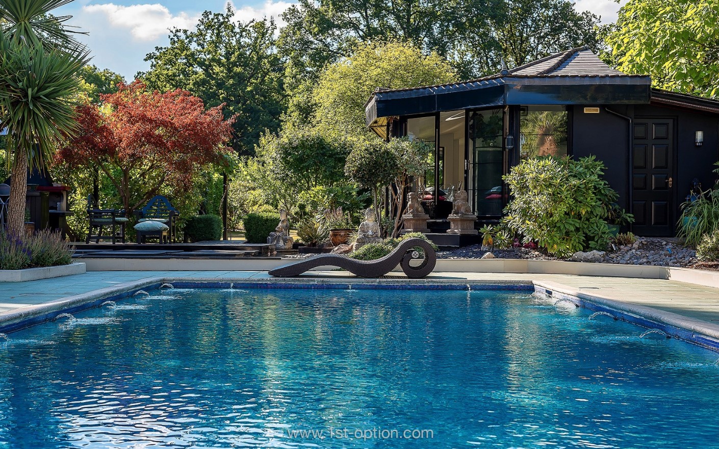
First up is Ambleside, as you can’t realistically write an article on swimming pools without featuring this beautiful garden. This large, modern and unique photoshoot location really does have it all, offering tons of striking features inside like marble flooring, huge windows that offer an abundance of natural light and monochromatic colour tones, however it is outside that really bowls you over. Most of the garden is finished with Oriental stylings that perfectly juxtapose with a huge outdoor pool that could be more at home in LA than the Orient. 

Cavendish Place 

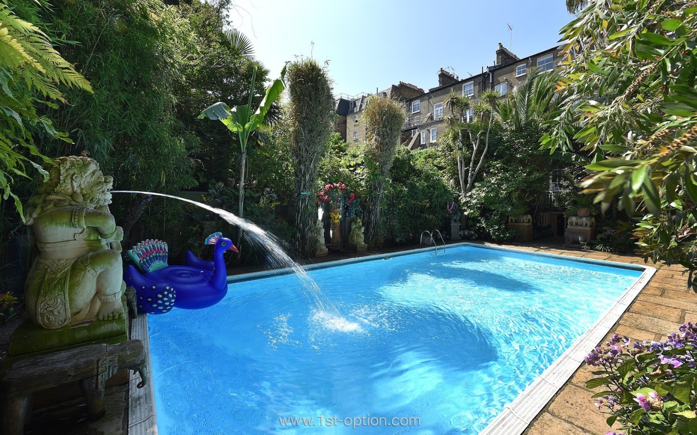
Speaking of Asian inspired gardens that can’t be left of this list, we give you Cavendish Place. This Earls Court shoot location really is one of kind and you can see why it has been so popular for so long. Featuring some unique and quirky interiors, again it is the outside that steals the show. The garden itself offers up an array of different landscapes, giving that much needed flexibility for shoots, however, again the pool is the centerpiece of the show, making waves front and centre. With a whole host of asian ornaments decorating the surrounding areas of the pool, Cavendish Place gives off an aura that could be perfectly placed in Thailand or Bali. 

Graphite 

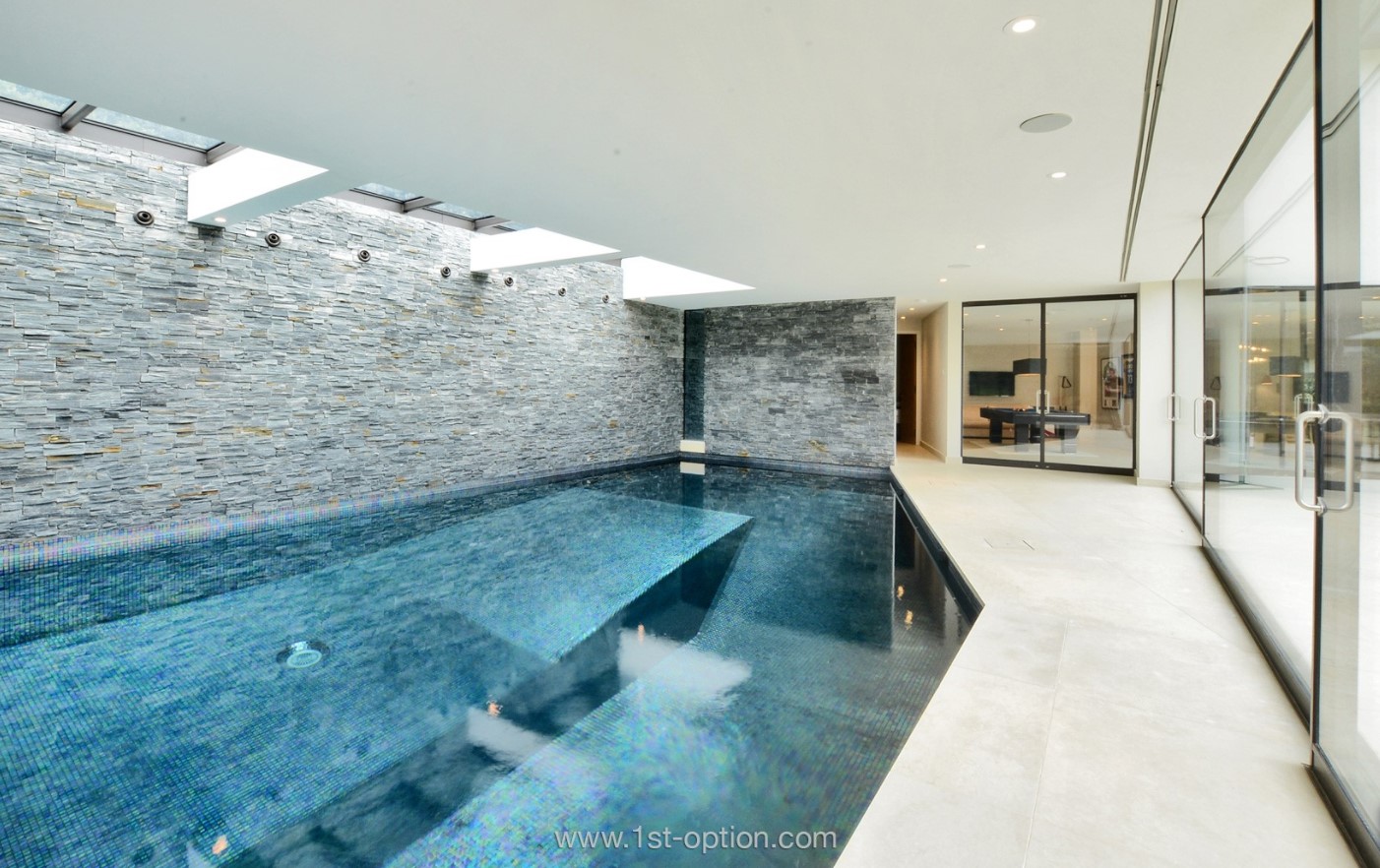
3rd on our list, and hanging out here you’ll really be feeling like one of your favourite superstars. Our first indoor pool comes from Graphite, a fantastically modern shoot location in Kingston-Upon-Thames. Featuring a unique and eye-catching pentagonal shaped pool, Graphite offers wall to wall views of their beautiful landscaped garden, an adjoining games room and gym and a gorgeous stone brick wall that offers the perfect backdrop for shoots. 

Capri 

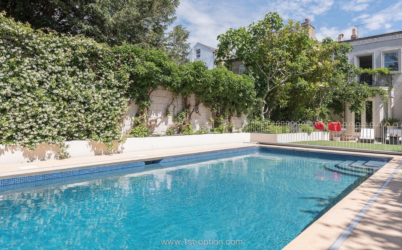
Capri is a villa style family home that you probably wouldn’t believe is actually situated in Wandsworth, not Italy. The large heated outdoor swimming pool gives off an unashamable aesthetic of lounging by the pool on a hot summer’s afternoon in Italy, before heading down to the local village to pick up your bits for dinner. Decorated all around with a beautiful array of flora, Capri will have you itching to go on holiday at any time of year. 

Woodhaven 

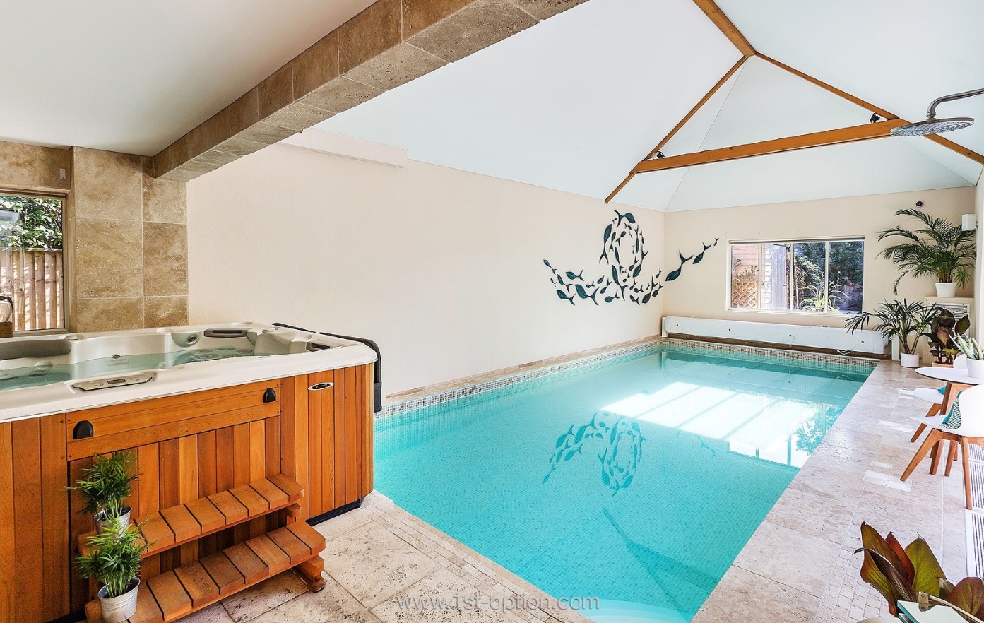
The aptly named Woodhaven is last on our list of the best pools you’re likely to find in London and the surrounding areas. With wooden furnishings quite literally running throughout the entirety of the property, the Surrey based location offers a very modern and polished take on the New England design style that is so popular around the world. When we say wood runs throughout the property, we’re not joking. The pool is even decked out with many wooden panels including on the roof and on the lavish hot tub that sits at one end. The space also benefits from tons of natural light that really elevates the luxurious aesthetic brought forward by the wooden panelling. A set of elegant tables and chairs and some well placed plants also add to the opulent character the property gives off. Due to the indoor nature of the pool, Woodhaven is perfect for a pool shoot all year round and is available now! 

Open House 2020 Our Top 5 (that you can actually visit)

Over the years, The Open House London Weekend has become the highlight of the architecture and design calendar. For the past 30 years London has opened its doors to nearly 800 buildings, inviting around 250,000 people every year, giving them the opportunity to snoop around some of the cities most spectacular architectural landmarks. While this year, the event has had to run a little differently, with social distancing precautions taking precedent, many of the landmarks and tours you would see in person have had to be moved to online, there is in fact a wide range of astounding architectural and cultural landmarks that you can still visit in person. 

Sit back and read on as we go through our top picks ranging from buildings of historical significance to modern architectural influence. If you are looking to reconnect with the city that has a special place in all of our hearts, then grab your face mask, be prepared for queues and get out there. 

Van Gogh’s House – Stockwell

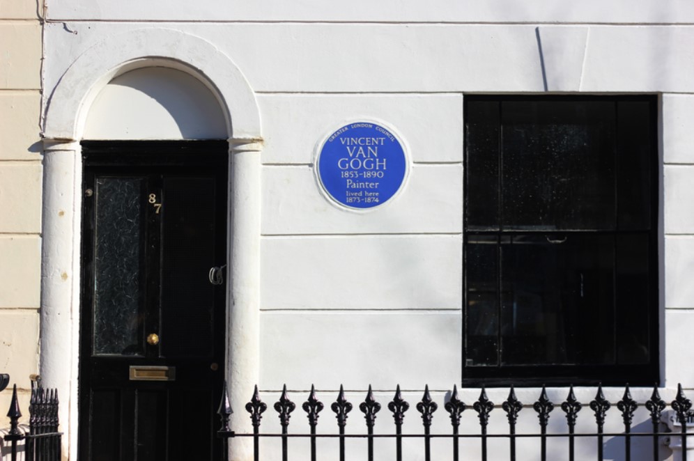
Rather than become a time capsule of the time Van Gogh spent in South London, the owner of the property, Liva Wang, in 2018, decided to renovate the house at 87 Hackford Road so they could share the history of this culturally significant property with the rest of the world. Despite the ceiling nearly collapsing due to water damage, many specialist structural engineers managed to repair and reinstate existing structures and features such as windows floorboards and cornicings leaving a finished restoration project almost exactly as it was when Van Gogh lived there in 1873. “I now have a room, as I’ve long been wishing, without sloping beams and without blue wallpaper with a green border” Van Gogh. 

The Royal Opera House 

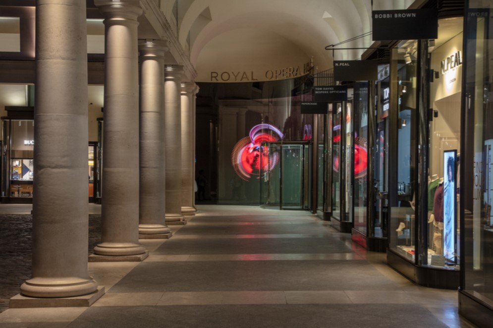
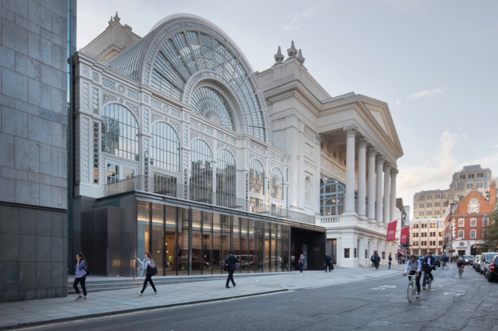
The Royal Opera House is one of THE cultural hubs in London if not the country. When you think of Covent Garden, the opera house is synonymous with it. The house is open for members of public, most normal years as its currently closed due to Covid-19, for regular ballet and opera performances from some of the most critically acclaimed schools in the world, however, have you ever wondered what it’s like to step out and walk the stage where the dance and music companies do on a regular basis. Well for the first year ever the Opera house is offering a unique thirty minute experience aptly named Take a Bow where visitors are given exclusive access to the house’s world class stages and what’s more they are even allowing guests to step onto the iconic Main stage that is so well known for its velvet curtains. If this wasn’t enough they are also showing a brief film highlighting some of the highlights from the ROH’s ballet and opera productions. More info can be found here.
15 and a Half Consort Road 

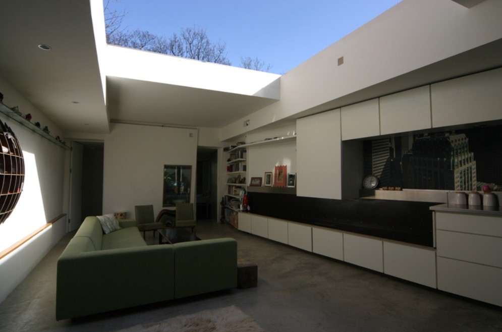
As seen on Grand Designs, the architectural wonder piece that is 15 and a half Consort Road is being opened up to the general public this year. The innovative house typifies architectural progress with tons of sustainable features and clever design elements offering features like an opening roof, retracting loo and sliding bed-bath. The house that was shortlisted for the 2006 RIBA awards was built on an extremely tight budget and shows how to build properties on otherwise ‘unusable areas such as the brownfield site that it was built on. If you are thinking about a renovation, grand design, or restoration project, then definitely go and check out one of the nation’s favourite houses this weekend! If you would like to check out the renovation then click here for more info

Trellick Tower 

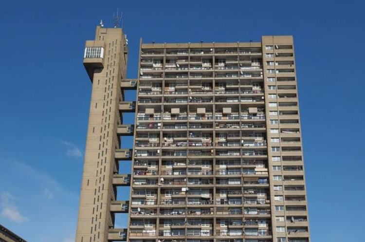
The Tower that was once derided as an eyesaw is now one of London’s most iconic and desirable addresses. The grade II listed building with its free standing service tower and unique boiler house was built by Erno goldfinger in 1972 and has since gone down in history as one of London’s most recognisable buildings. Trellick tower was the ultimate expression of Goldfinger’s philosophy of high rise planning and it embodies the best ideas of the time of high rise housing. If you want to see a striking example of unique architecture with 217 flats, 6 shops and an office, Trellick Tower should definitely be on your list of buildings to visit this weekend. Check out more info here

Ex Council house transformation 

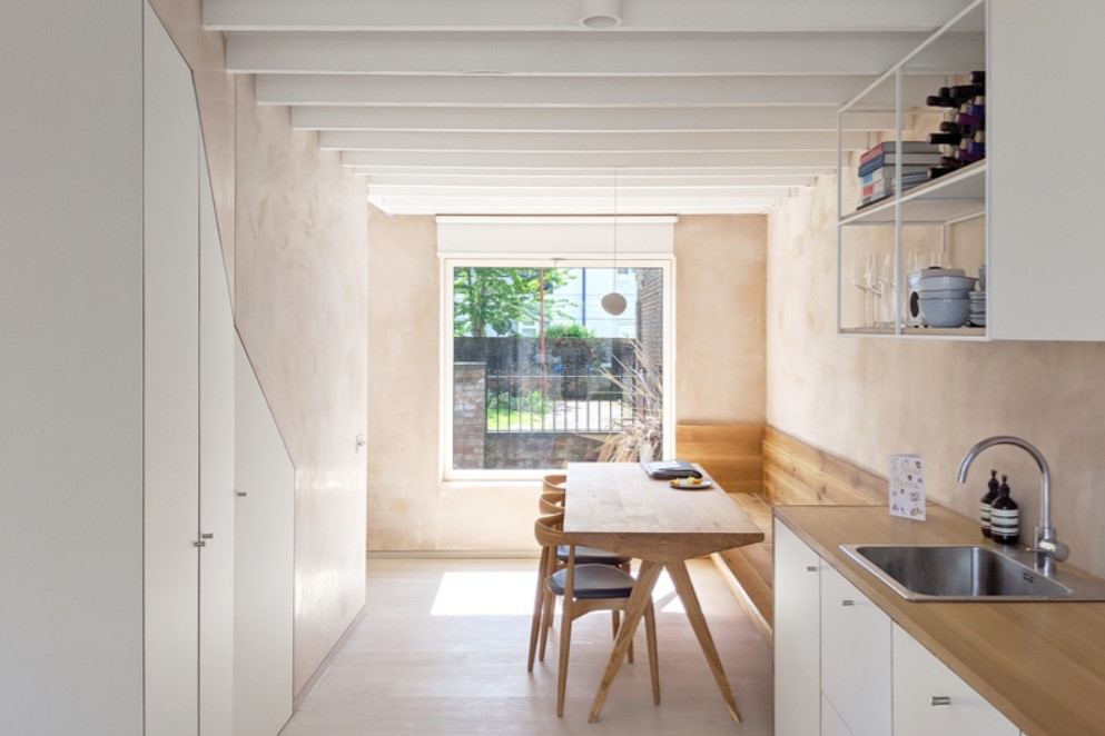
Our final pick for Open House 2020 is something a little different, but if you are keen on modern renovations, then this is a must see. Designed with a modern sustainable twist on the Scandi aesthetic that has become so popular over the years, this middle terrace ex council house in Bermondsey was shortlisted for ‘Home Transformation of the Year’ 2020 at the british home awards and through the use of modern architecture the home tells a fabulous story through the use of tons of natural light, sustainable materials and neutral colour tones. If you are looking for inspiration for your home this year then definitely go check out this property. More information can be found here

Home Cinemas – 5 of the Best

With the latest announcement, from our Prime Minister Boris Johnson, stating that any gathering of more than 6 people will be reprimanded and is illegal by law, it’s going to remain difficult for us to do our favourite activities and pastimes for the foreseeable future. One such activity that millions of people used to do on a regular basis across the world was visit the cinema with friends to see the latest blockbuster. There’s also a real lack of new movies right now due to recent filming restrictions, for example the latest James Bond blockbuster was purposely halted by a year after Covid-19 took over the world. Despite cinemas reopening, they are at reduced capacity and social distancing is still being upheld, so watching the next big film with your friends is looking very different right now.  The film industry is a multi billion pound industry, but with this on-going pandemic who knows when we will be able to return to the cinemas in a normal fashion. So with all that in mind, we thought we’d take a look at some of the most incredible and lavish home cinemas that we currently have on our books. Maybe you’ll be inspired to set up your very own home cinema where you could hang out with your friends and family, strapping in for a winter of film watching, at a maximum of six people of course…

Crystal 

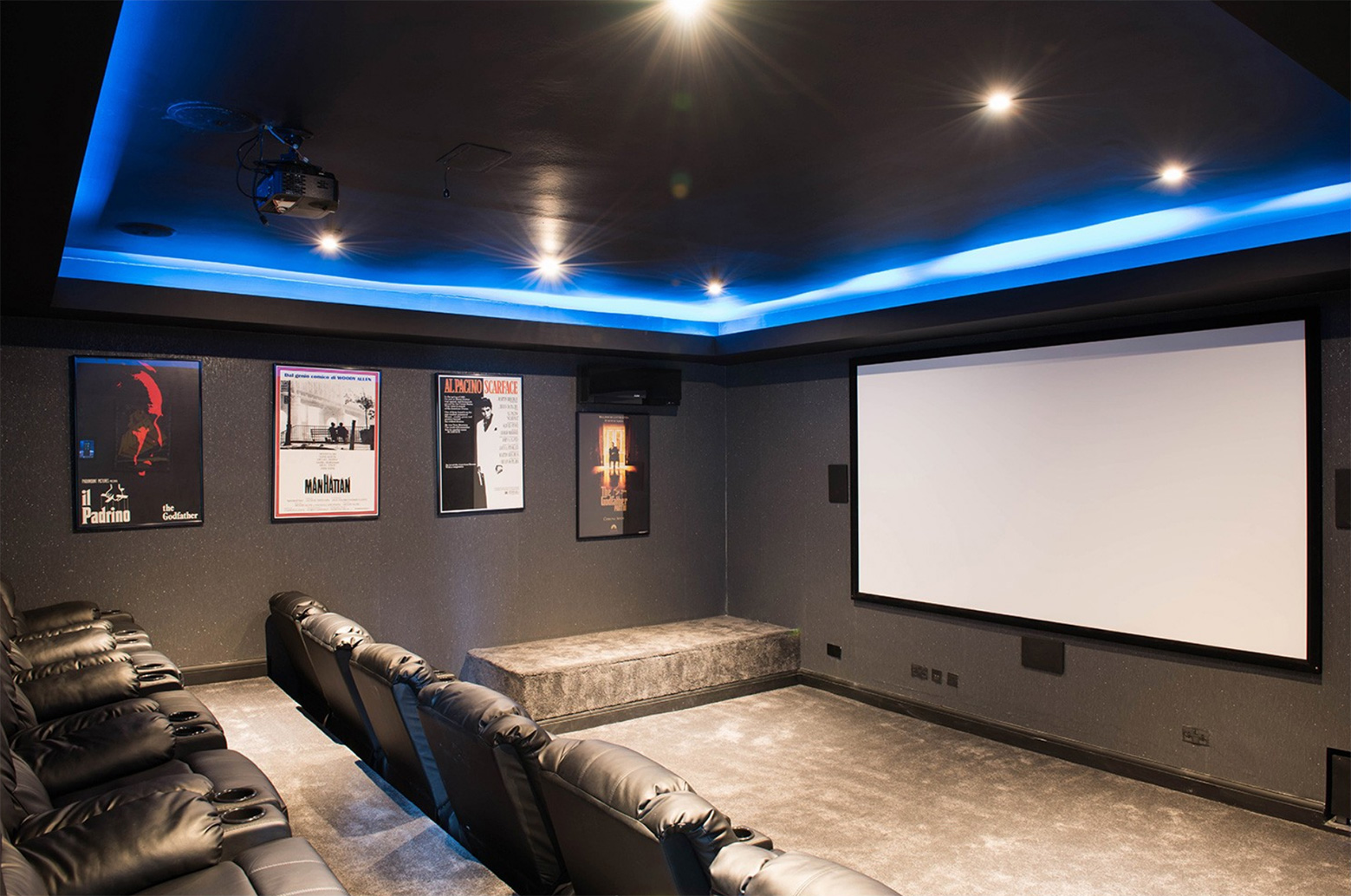
A slightly different kind of home cinema to the rest on this list, Crystal will have you feeling like you’re back in an Odeon thanks to their luxurious, padded cinema seats complete with drinks holders, blue lighting and classic movie posters all around. Thanks to those little touches of class like the velvet flooring and studded wall we know we’d rather be sat in Crystal’s home cinema than the local Odeon. Oh and with twelve luxury seats, you’d be able to socially distance with your 6 friends. 

Crystal’s Cinema style seating

Curious 

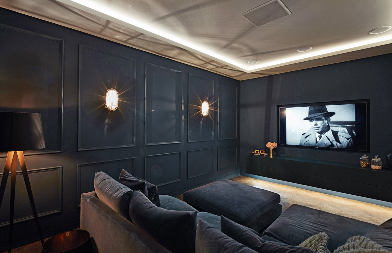
Curious has been one of our most popular properties since the moment we signed it and its very easy to see why. On top of the gorgeous interiors found throughout the property, they have a home cinema to really top the property off. And this home cinema is as deluxe as you could hope for. Elegantly styled in a midnight navy throughout, the eye-catching artwork and art deco style lights really bring out the palette in a classy way. Curious’ home cinema really does have a premium feel to it and we adore it! 

The elegantly styled deluxe home cinema of Curious

Ashington House 

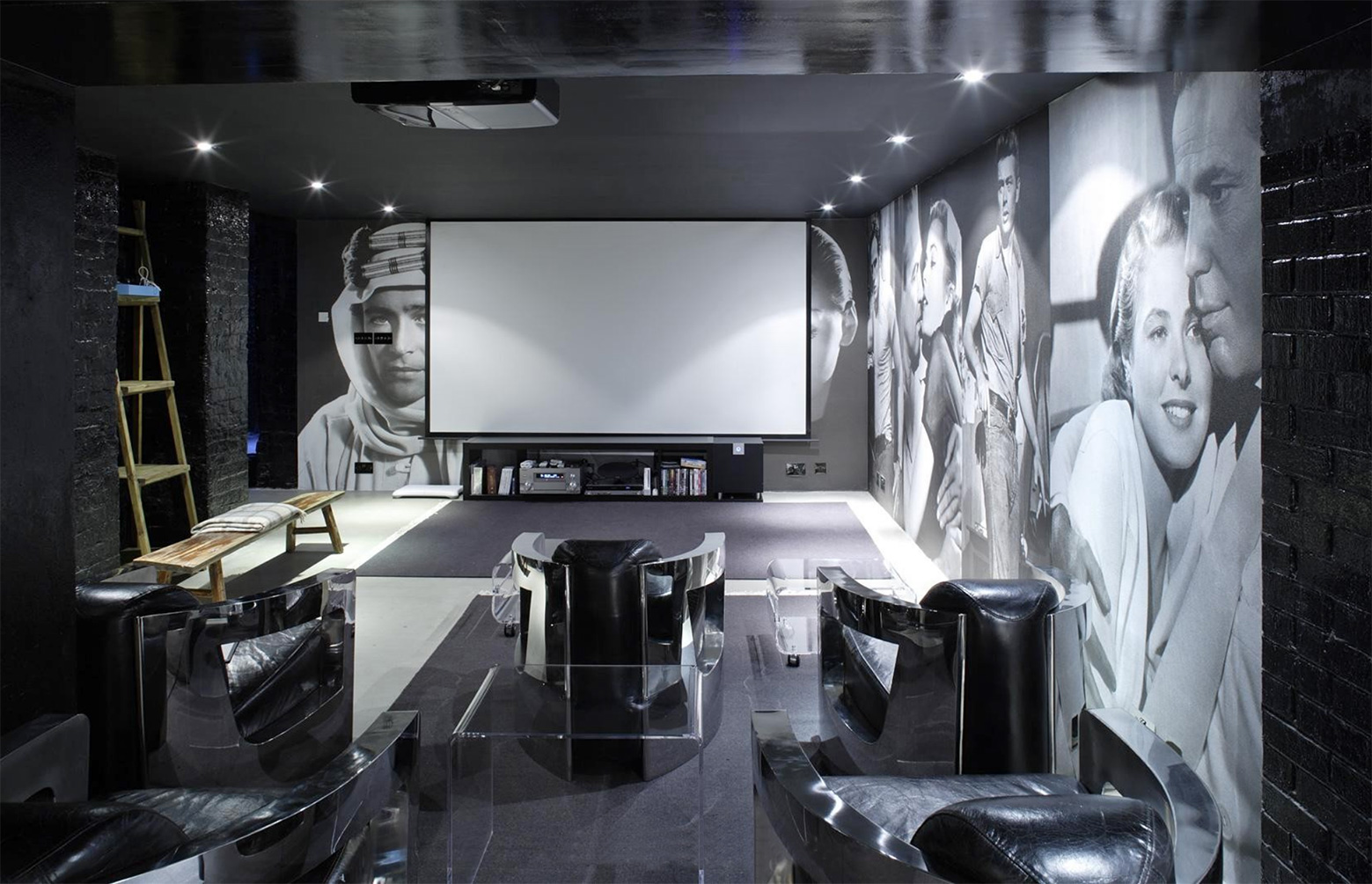
Ashington House is the ultimate home cinema! Styled lavishly with five black leather armchairs sat next to a black painted brick wall, you’ll be feeling like a bond villain watching your favourite film. If this wasn’t enough to entice you, they have also put up two floor to ceiling murals featuring some of Hollywood’s golden era’s most famous and prestigious stars. You can’t help but feel like a movie star when sat in Ashington House’s home cinema! 

Hollywood’s golden era at Ashington House

Millbrae 

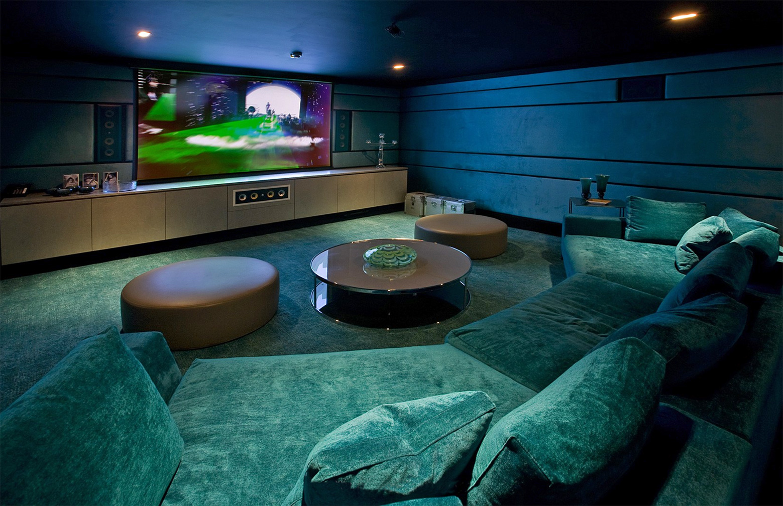
With a distinct art deco green, just with a modern twist, running throughout, Millbrae’s home cinema certainly stands out amongst a crowd. The surround sound, matched with sound proof walls really gives the space that authentic feel. And to top it off, the large and luxurious sofas with leather foot stands are certainly turning us green with envy over here. 

Millbrae’s home cinema certainly stands out

Prospect House

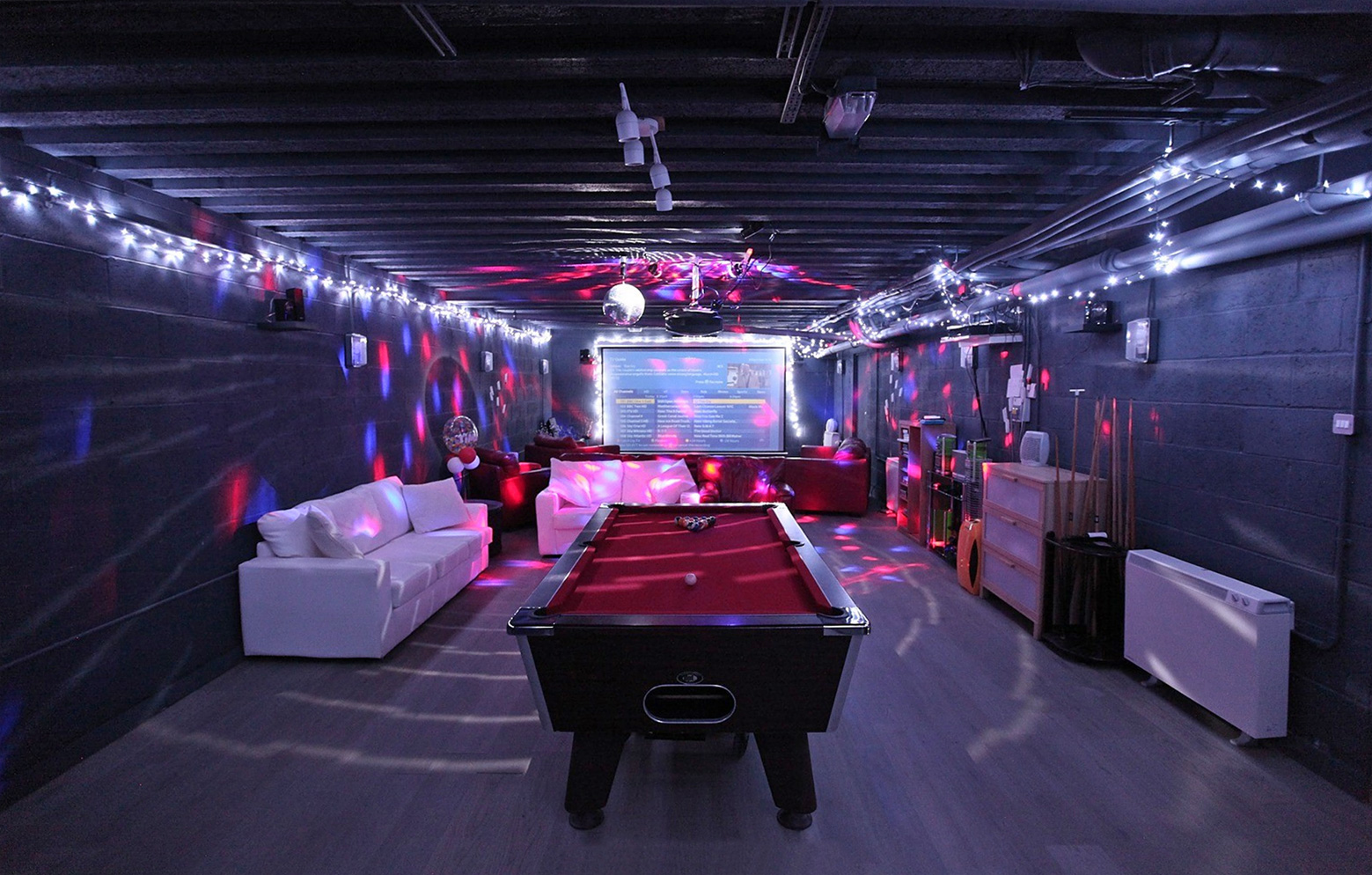
Offering up something completely different from the rest of the list, take a look at Prospect House and its home cinema / games room / bar. With plenty of seating, disco, as well as black out lights and a pool table to match, you’d certainly never get bored in this cave. If that second lockdown does happen you’d be sure to keep yourself busy there. With the beach also on the doorstep and swapping between playing pool and watching your favourite films, we know where we would have chosen to quarantine. 

Party time in Prospect House’s home cinema

So if any of these gorgeous home cinemas have given you the needed inspiration to turn one of your rooms into a home cinema then be sure to let us know and show us the finished product.