In episode six of our series ‘Ask the Location Owner’ we chat with Nikki over video call to learn all about her home ‘Tierney’.
Ask the Agent: Episode 4

In episode four of our series Ask the Agent, we switched things up by joining together over zoom to discuss how you can register your property with us.
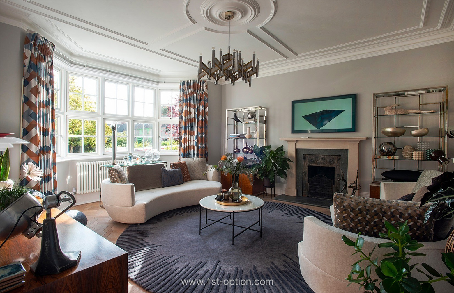
In the Spotlight: Art Deco
In the 20th Century, Art Deco was one of the most exciting, ground-breaking and influential design styles the world had ever seen and as so, still has a huge influence on interior design in the 21st century. As a design style, Art Deco is elegant, opulent, functional and modern and although it was actually first developed in the 1920’s it is still as popular as ever, this is why it can be perfect for any contemporary home. It’s adaptable nature means you can add Art Deco elements to any space, furnishings mix well with modern pieces and are abundantly found in antique markets, thrift shops and online. If you are looking to bring a touch of old school glamour and flair to your living space, then Art Deco style interiors may well be the way to go.
Art Deco first came to prominence in the 1920’s in France with its name officially coming from the ‘Exposition Internationale des Arts Décoratifs et Industriels Modernes’. Following this, the style became very popular and between 1925 and 1940, Art Deco started popping up all over the world. Its adaptability was one of the main reasons it became so popular as you could use it across all design disciplines.
The inspiration for the movement was very obvious, advances in technology meant that people were constantly trying to come up with the next big thing, smooth lines, shapes and patterns characterised the Art Deco aesthetic. Luxury was also at the heart of Art Deco and this was accentuated by the use of jewels, silver and ivory. The style was elegant, glamorous and functional and because of this has stood the test of time.
In the 21st century, interior design has seen a modern and updated take on Art Deco which is decidedly more playful and modern giving you a really standout look. Check out some top cues below to see how you can achieve the look in your own property.
Opulent Materials
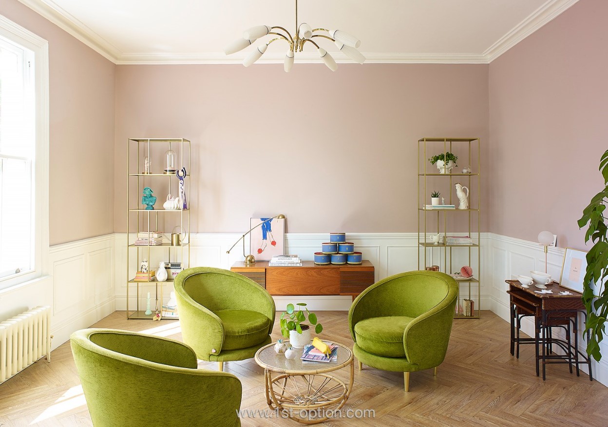
Materials used today in Art Deco interior design are slick and often feature reflective elements for everyday glamour in the home. Think metallics like gold, silver, stainless steel or chrome. Metallics like the aforementioned lend any room an elegant and luxurious feel and can be utilised anywhere. Imagine a living room with a glass topped gold coffee table, stainless steel lamps and a geometric patterned rug in black and white. Another element often used in Art Deco design is glass, whether it be through mirrors, glass topped tables or sculptural pieces like a vase, glass adds a really elegant dimension to any room. While metals and glass are normally the first thought when it comes to Art Deco, wood can also be used giving the opulent feel needed. Dark woods such as ebony are often used for flooring and furnishings as they give off a real vibe of wealth. The idea here is to show off lofty extravagance as this was what Art Deco was all about in the 1920’s.
Bold Furniture
As with all elements of Art Deco interior design, furniture in the 1920’s was incredibly unique. Pieces in general were developed on the larger side of the scale, so with the progressive nature of interior design, in the 21st century, don’t be surprised to see imposing pieces of large furniture crafted from rich materials, such as ebony, that can take up considerable floor space. On the other side of the spectrum, Art Deco design also incorporates curvaceous furniture with smooth lines, bold colours and materials like pink velvet and the classic geometric symmetrical designs laid onto smaller pieces.
Use of Colour
When you initially think of Art Deco, perhaps Great Gatsby styles come to mind, a mix of black, white, silver and gold? However, deep jewel tones also have a big part to play in modern Art Deco design. Their rich and comforting nature as well as their deep hues, which is key for Art Deco interior design, make for the perfect blend between soft and opulent. This is in great contrast to the black and white you might initially think of. Jewel tones that work perfectly are bright and deep yellows, reds, blues, greens, pinks and purples accompanied by lighter colours like beige and cream to soften up your look. The use of softer colours in places like your bedroom and dining room will enable you to bring the room to life through the use of other elements.
Geometry
As touched on, you can’t have an art deco space without geometry displayed in some way or another. In the 1920’s production in geometric shapes represented the changing of the times and so shapes such as chevrons, zig zags and trapezoids were utilised to great effect. Sunbursts are also a great addition to an Art Deco room as they add an elegant edge, other elements that can achieve this are fan shaped mirrors as they provide perfect symmetry.
Premium fabrics
The final element needed for a perfect Art Deco space is the use of premium fabrics, whether it be a solid colour or geometric design, quality fabrics are a must to achieve the opulent feel. All furnishings should be bold featuring block colours and accessorised with throws and cushions in geometric prints or vice versa. The key is to blend subtle and bold prints adding that touch of luxury to your room.
Top 5 for February
Following on from the impressive end to 2020, the start of this year has been no different when it comes to taking on new properties. We have been incredibly lucky over this past month taking on some incredible new residential properties, bringing a fan favourite back to your screens and seeing the takeover and revamp of an ever-popular studio! If you would like to check out our whole portfolio of new properties you can see them here, but in the meantime let’s get into our top five for February.
Artspace
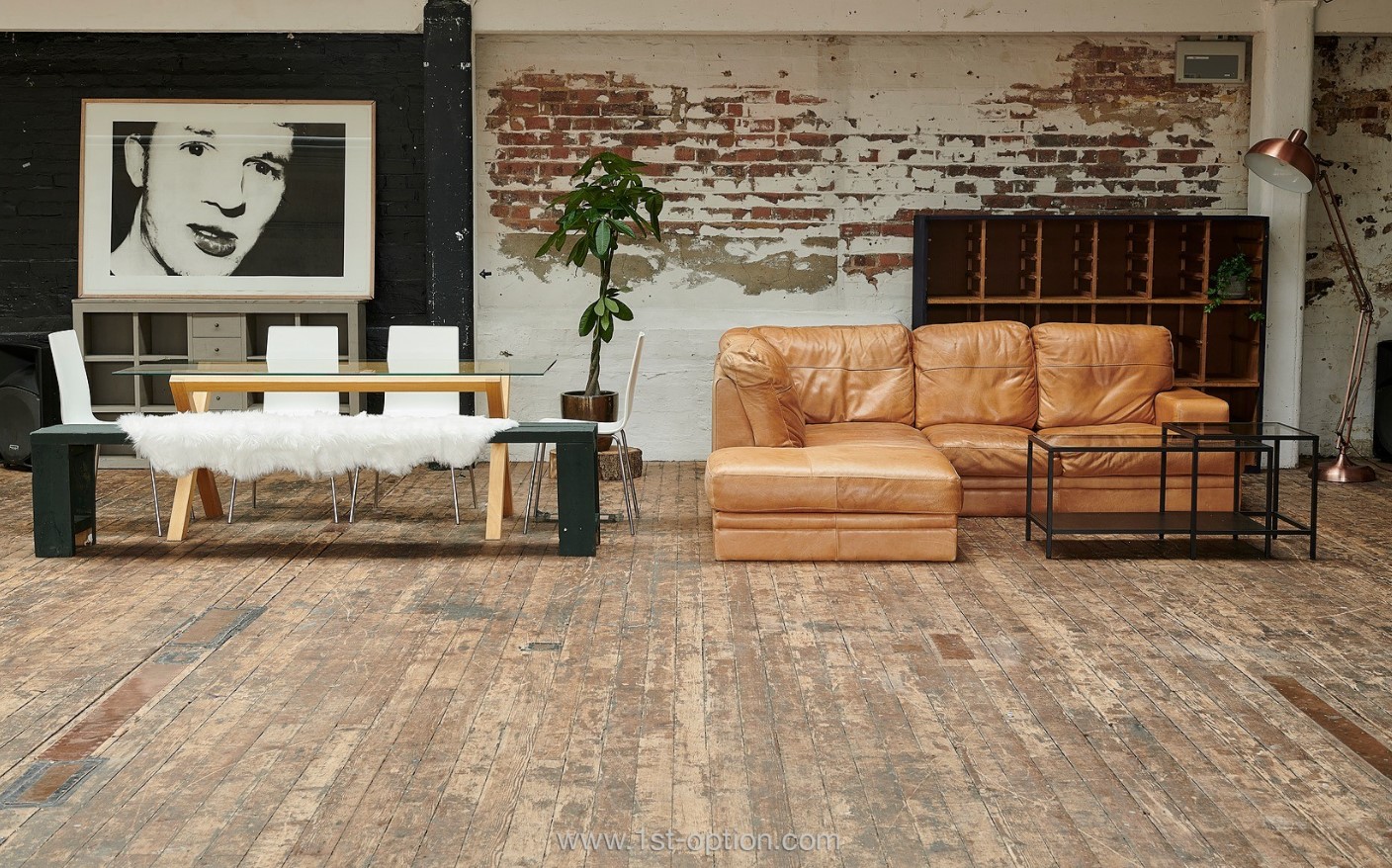
Artspace is back! The property that has been shot at by half of London over the years is on our books again and we couldn’t be more delighted. The wonderfully unique South London property is owned by a photographer and it’s easy to see why. It’s been set up to look like a shoot location with the pure intent to be hired out, featuring antique furniture throughout, including vintage beds, some ornate chairs and a gorgeous chaise lounge to name a few. All of these touches, as well as a premium finish across the whole property are why the location has been so popular for so many years. Its structure may be fairly traditional with high ceilings, washed wooden flooring and giant Georgian windows, however, the fresh, premium colour palette with tons of natural sunlight gives the space a delightfully modern feel.
Dalston Heights A & B
Dalston Heights A & B, formerly known merely as Dalston Heights, was full of props and furnishings, however, has now been taken over by new owners and since the turn of the year they have been hard at work revamping the studios turning them into two separate entities. The ever-popular studios have been emptied to create a blank canvas, leaving you with a space to get creative and fill as you like. One has a side pitched roof while the other is filled with skylights, the former cardboard box factory is rich with texture and photographic opportunities you can’t find anywhere else!
Melrose
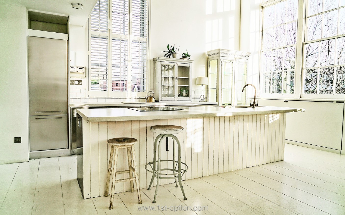
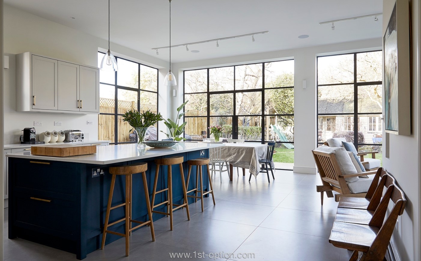
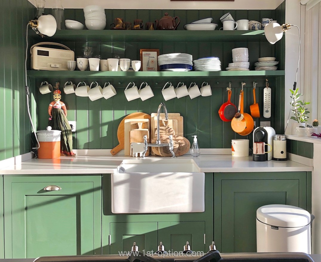
Up next is the first residential property that is completely new to our books, Melrose, a gorgeous family home situated in South West London. The standout features within this superb property are it’s exquisite parquet flooring, large spaces for shooting and the premium crittal windows. Furthermore the kitchen has an elegant minimalist feel with shades of industrial about it, which you won’t be able to get enough of. This impressive property gives off a real charm and without doubt will become one of our most popular shoot locations over the coming years.
Lotus
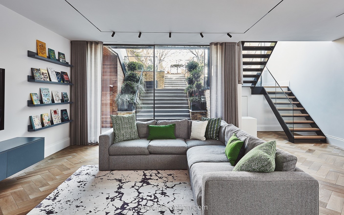
Where to begin with our next property? Once you see Lotus you’ll be clambering to shoot there! The South London family home is packed to the rafters with truly immense standout features that make for a perfect shoot location whatever your needs. Set over four floors, the property is finished with a striking parquet flooring throughout, however, the main attraction points come from the crittal windows and dividers found across the extension at the back, the lavish wine cellar and the striking differences in palette from room to room. If we move to the original front of the property, there is a completely different style, nevertheless, it works just as effortlessly. Check out the juxtaposition between the tiled landing that is set against a pastel green colour palette and the modern minimalist kitchen with its clean and fresh white interior.
Pietra
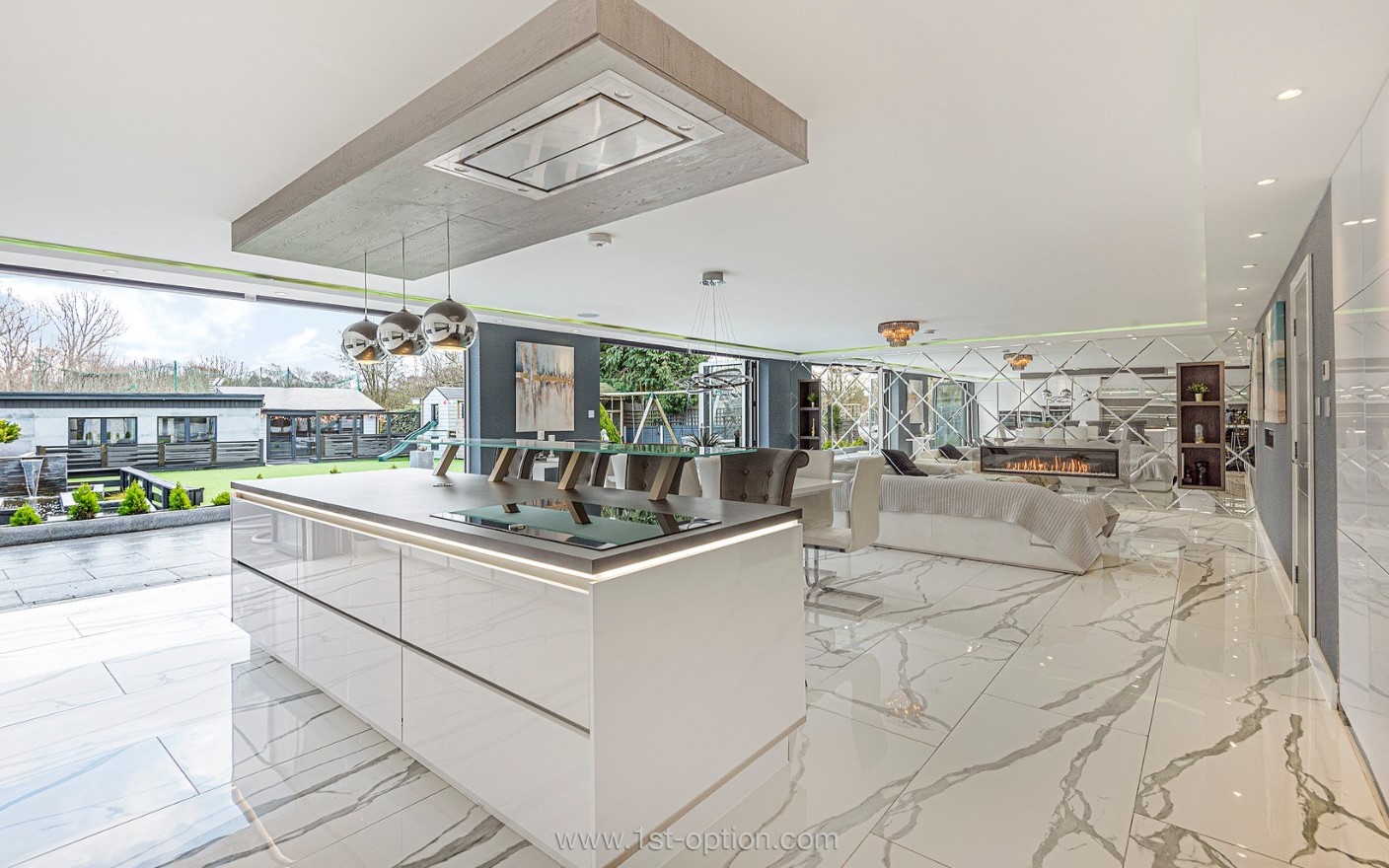
If you have used social media or in fact have read any of the mainstream media’s online channels over the past couple of months, then you will most likely have come across our latest shoot location, Pietra. The huge mansion style property, located in Bromley, features a marble flooring throughout giving off an opulent feel. Every space is vast, making it perfect for any type of shoot and if this wasn’t enough there is a small indoor football pitch, a hot tub and a large gym. If you are looking for a lavish mansion style shoot location, then Pietra is the property for you.
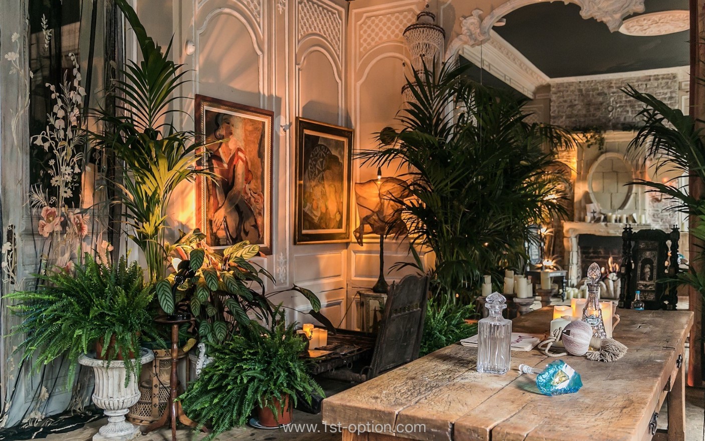
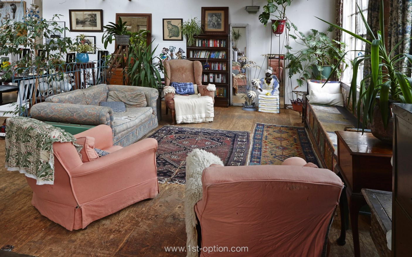
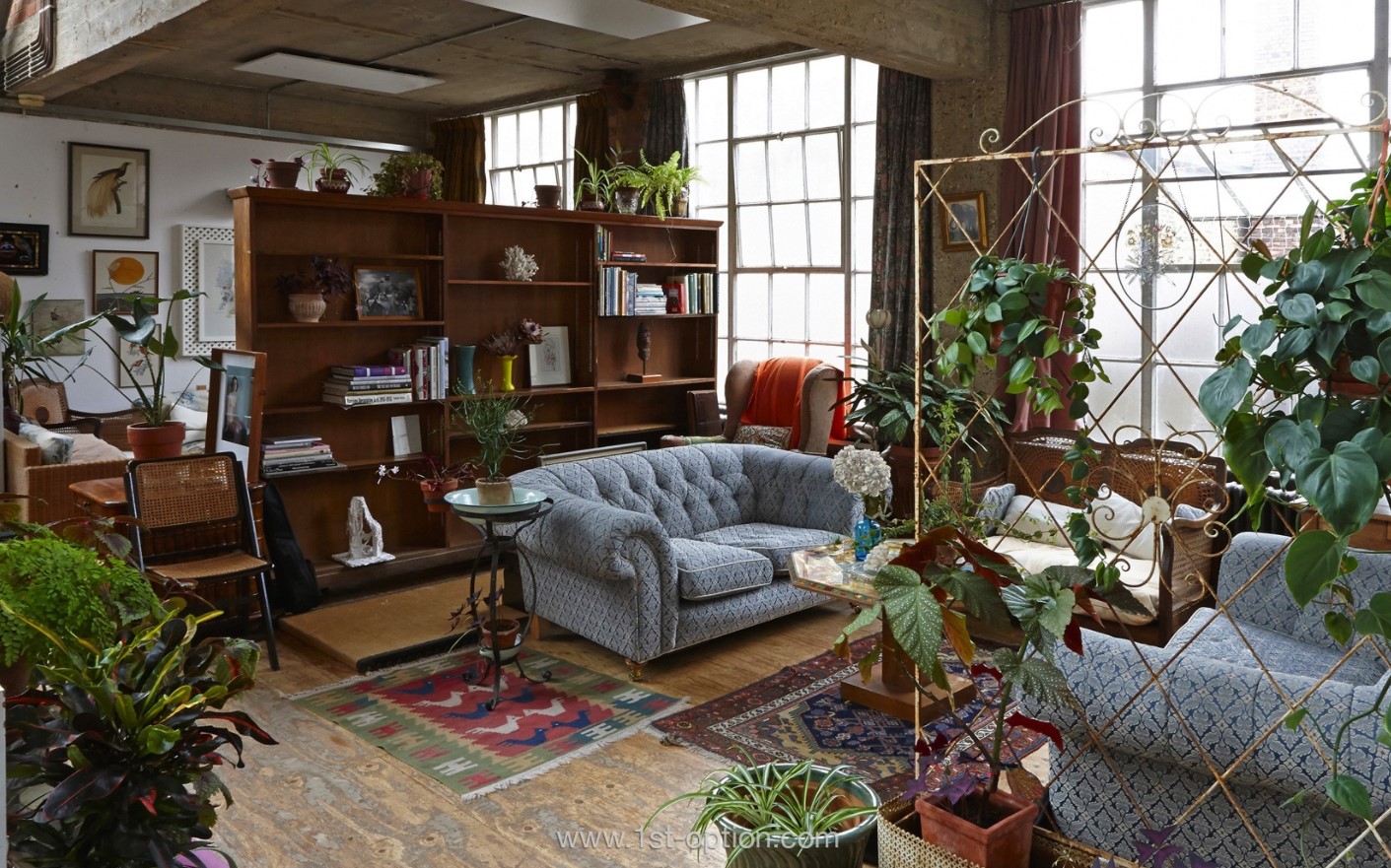
In the Spotlight: Bohemian Design
At some point in your life you will have come across Bohemian design whether you know it or not. Often referred to as Boho, the style is light and bright featuring many patterns and layers that will leave a lasting impression that you can’t forget. The word itself refers to someone who is typically socially unorthodox and goes against the grain. They are often rather arty and creative, all of which helps make them great interior designers and is perfect for an interior design option for a rich space full of visual activity and a carefree spirit. However, while we can talk about how relaxed and carefree the spirit of the design style is, there are some clear and distinctive style cues that are needed to get the look right without coming across as brash or heavy handed.
If you are interested in learning about different design styles, their heritage and how to perfect in your own home, then check out the rest of our in the spotlight series here.
Simple base
The start of any design style needs a solid foundation and Boho is no different. Bohemian style requires warm and earthy tones that create a perfect canvas for layering upon. Opting for a neutral base allows you to pile your creativity, expressive colour and most importantly pattern for the perfect Boho blend without it being in your face or too loud. The key to not coming across as too overbearing is to saturate the muted tones with colour, creating a harmonious and soothing space with expressive elements. Bright base tones can be applied to the style, however, you must make sure they aren’t too rich as it can result in a somewhat chaotic starting point. When it comes to longevity in a room, a neutral colour palette is always your best option.
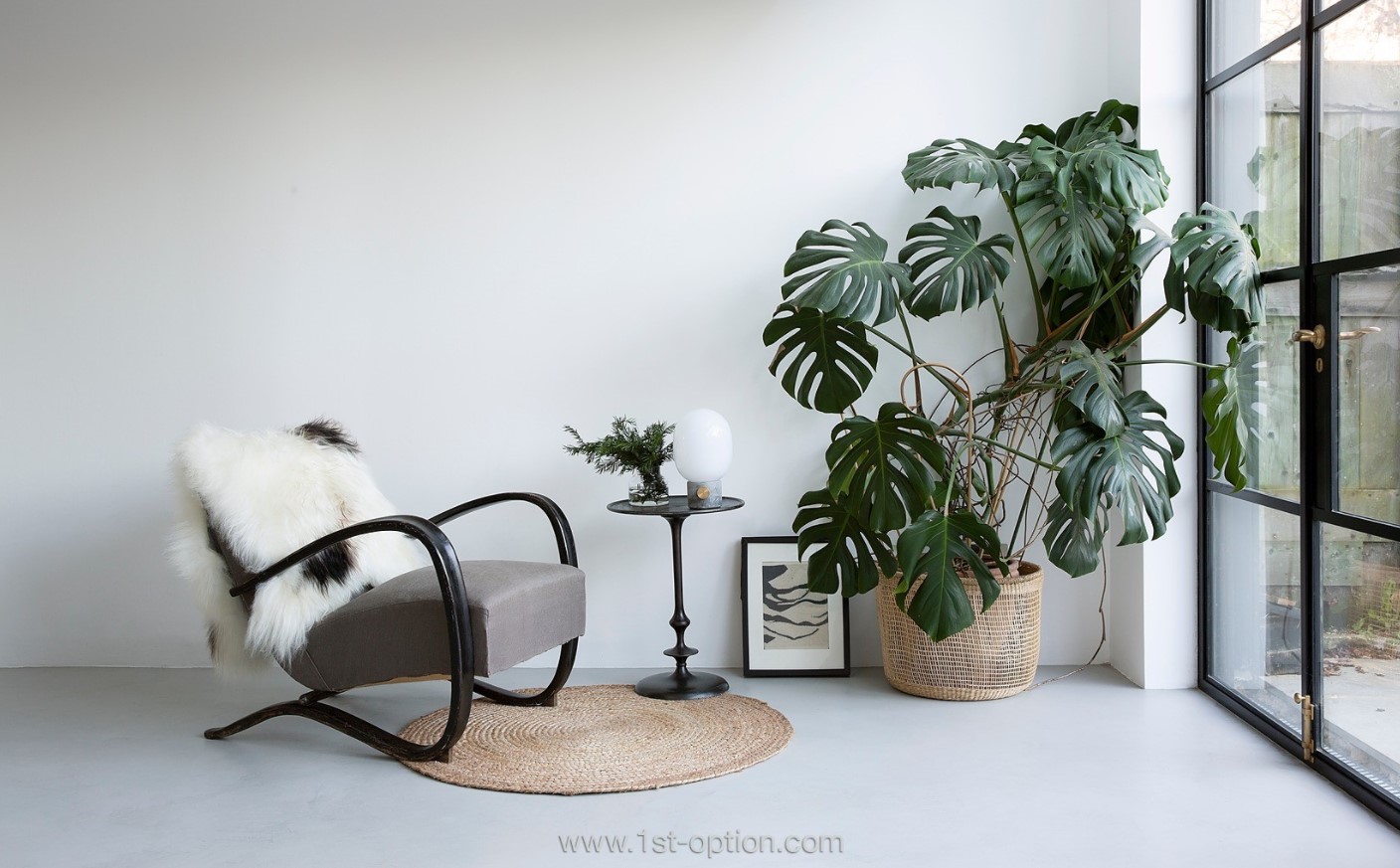
Botanicals
Botanicals are a great addition to a bohemian room as they are light, quirky and add a relaxed vibe while adding a dimension to any room. Furthermore, while we all know about the health benefits having plants in your room can add, they also add a pop of colour to your neutral base without interfering with the rest of the room. If you want to hang plants as well, it is a great way to add interest and depth to your space, the key to an excellent bohemian room is to be creative and expressive while adding depth and texture. Make sure your personality comes across in your space! From a simple hanging basket to something more ornate, having a variety of different plants in different sizes and shapes is a really striking way to bring a bohemian room to life.
Patterns
Layering is a must in any Boho room, it is simple, easy to achieve and adds texture to any area. What you are looking to do is contrast different patterns from rugs to cushions and throws to other parts of furniture. The key to layering with patterns is to have fun and mix and match your patterns, get a little wild and have contrasting shapes, scales and patterns to create the bohemian vibe you’re looking for. However, while we say go wild with patterns, do keep consistency with colour throughout, as you don’t want the room to be overbearing or disjointed. Choose a selection of hues that you keep coming back to, either choose lighter pastels and stay there or darker more luxurious colours like burgundy, emerald green and deep purple.
Bright Colours
When we think about bohemian decor, bright colours and hues are often the first things that come to mind, whether that be pinks or purples, oranges or yellows, the bolder the better when it comes to Boho design. Deluxe tones work perfectly in a bohemian room, instantly making a space feel comforting in a way that’s exclusive.
Say no to Minimalism
Boho style is one of the only top design trends that actually says no to minimalism, more is more here as you don’t want empty spaces or surfaces. The look is about being indulgent and airs on maximalism. With that in mind, the key is to keep the space curated and not just packed to the rafters with junk or whatever you can find. As stated throughout, expression, creativity and personality are at the heart of boho design, so be sure that everything you love and have collected over the years is on display. Make sure your collectables and trinkets tell a story, just be sure to make sure it’s not too overbearing, that there is enough space to highlight the rest of your decor and display your artwork. Make sure you stay away from looking like a hoarder but more of someone with a curated home of purpose.
Distressed Furniture
With shades of shabby chic, a boho room can really come together with furniture that looks like it has been lived in, it adds charm and looks like it’s had an interesting life before coming to you. Like it was sourced from a market in some far-flung part of the world. The key is to find pieces that appear to have a personal history about them, this can be achieved yourself through distressing, or by buying antiques. However, the more alluring the piece, the more bohemian the space will feel. The more eclectic the better!
Layering
The final element to a perfect bohemian space is layering with decorative items and textiles, whether that be cushions, throws or rugs. Boho style is all about layering! Different styles and patterns are key for a rich statement, layering one, two or even three rugs isn’t too much. Layers of cushions or throws will also add to the relaxed bohemian vibe that you are trying to achieve. The key to layering is that it should reveal more on a second or third look than it does on the first as layering colours, patterns and textures should add the creative and expressive element to the room.
Ask the Location Owner: Episode 5

In episode five of our series ‘Ask the Location Owner’ we chat with Claudia over video call to learn all about her home ‘Burlotti’.
Working from Home
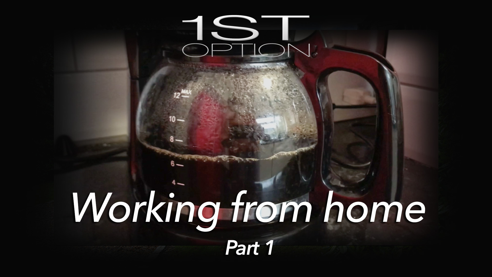
The winter months can be a challenge with most of us working from home. Here at 1st Option, we thought we’d share some of our top tips for overcoming the morning blues!
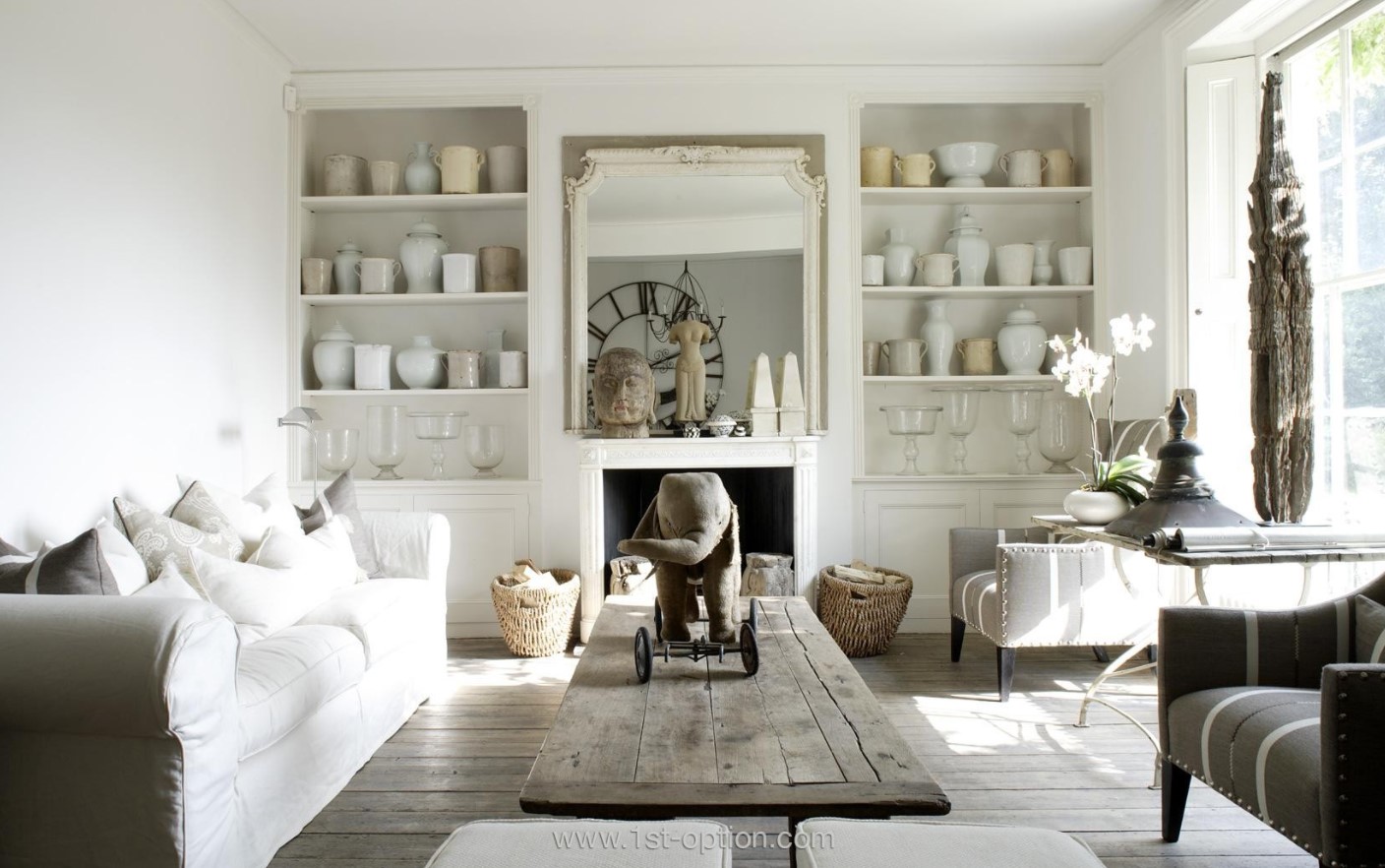
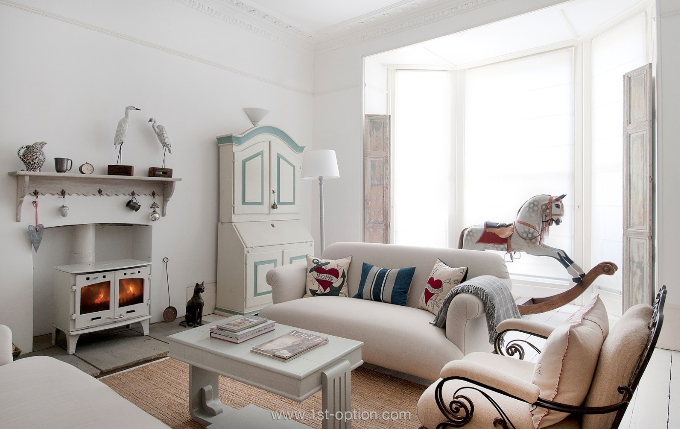
In the Spotlight: Shabby Chic
Shabby chic, also known as vintage or country chic, is one of the more interesting design styles around grabbing your eye through its use of mixing a lived in worn look with elegance, charm and beauty. It may seem like a bit of a juxtaposition, fusing elegant and beautiful with worn in and stripped back, however, this is exactly why it does work. Throw in some soft colours with feminine accents amid a mixture of new and vintage decor and your shabby chic picture begins to materialise.
Shabby chic interior design is a fairly modern design style and has only been around since the 1980’s, during this period opulence and decadence were the trends that were taking centre stage. Wherever you looked you would never be too far from marble filled lobbies, lavish penthouse suites and extravagant furnishings as far as the eye could see. Following this era of vulgarity, it made sense that something polar opposite would emerge and people started looking back in history to find pieces of furniture that were perhaps a bit chipped or worn down. From modern and opulent, to worn in, steeped in history and character, shabby chic was born.
While we have touched on some of the elements that make up a gorgeous vintage chic space, there are many other elements that bring an area together in this style. Worn furnishings are a must as this creates the antique look that we have been speaking about. History and character are everything, so whether you choose a newer piece of furniture and distress it yourself or find an antique that is already worn down with under layers revealed, this is a great starting point for any shabby chic space. Distressing yourself, however, isn’t the easiest of tasks and requires sanding down furniture to give it that aged look, and then sourcing special glazes that give the piece that sense of history that you are craving.
Accompanying your distressed, antique furnishings should be comfy and cosy fabrics with a feminine edge. Floral patterns are often utilised as they tend to showcase the vintage fabrics acting as a glorious accent to the centrepiece. If floral patterns aren’t necessarily up your street then slipcovers work equally as well and are a key trait of the shabby chic style, bringing that sense of aged beauty.
Moving from the furniture to the palate required to nail a country chic interior, it seems quite self-evident, when you look at the furnishings, that soft hues and fresh colours reign supreme. As a starting point bright whites, beige and creams are ever-popular, however, pastels are equally as at home with many designers opting for shades of pink, lavender and light blue as well as some soft yellow‘s. On the other side of the coin, vivid tones like turquoise and navy can also be found especially when painted on furniture.
Don’t forget accessories, when you think of a room, perhaps furnishings and colour scheme are the main points that come to mind, nonetheless, with shabby chic, accessories play a huge part in bringing the whole space together with a sense of character and charm. Whether you opt for something vintage or true antique like a chandelier or a china set, or perhaps you prefer something more modern like some cut glass decanters, finishing off your space with some eye-catching accessories gives it an overall effect of charming yet accessible and welcoming.
Shabby chic is possibly one the most popular trends ever and is still going strong some 30 years after the term was first coined. If you’re feeling the eclectic style that mixes antique and distressed furniture with fresh whites, pastels and feminine florals then check out the rest of our amazing portfolio here. Whether it’s for a shoot or purely some home renovation inspiration we have everything you could wish for with some of the most incredible shabby or vintage chic properties in England.
Ask the Location Owner: Episode 4

In episode four of our series ‘Ask the Location Owner’ we catch up with Amy over video call to learn all about her home.
Interior Design Trends for 2021
With 2020 finally behind us, I don’t think anyone is looking back with particularly fond memories. With the ushering of a new year, however, we do say goodbye to what went before and with that comes new trends to look forward to in the coming year. While 2020 said hello to biophilic design, maximalism and sustainable living to name a few, 2021 seems to have taken many concepts that have gone before and adapted them giving us new trends like Japandi, the evolution of earth tones and the rejuvenation of Beauhaus. While we have seen some rejuvenation and adaptation of trends that have gone before, due to the cyclical nature of trends, 2021 is also seeing some styles that have gone before like green and pink making a return to the forefront of interior design. So without further ado let’s check out the top interior design trends to look out for in 2021.
First up, expect to see green making a big return this year, green is in and it’s here to stay. It is no secret that biophilic design has been growing in popularity over the past year or so and it makes sense that with people utilising green in aspects of their home so much that the colour is starting to rub off on people in their interior design choices. Similar to what we have been seeing with biophilic design, science has shown us that just by looking at something green it can alleviate stress, decrease your heart rate, aid productivity and boost your mood. With people perhaps missing the connection that humans intrinsically have with nature, thanks to this pandemic, people are finding as many ways as possible to find that connection at home, this is coming through decorating with the colour green. In keeping with the earth tones that have been at the forefront of design for so long, expect to see muted greens and olives everywhere in 2021.
Ever heard of the word Japandi before? Well not to worry as you won’t be alone in learning about it for the first time today. This new trend that is starting to really gather pace, as you may have guessed, blurs Japanese minimalism with the pared back, functional Scandi style. With designers always looking to adapt on popular styles it was inevitable that we would eventually see a blend of the zen type minimalism of Japanese design and the functional pared back aesthetic of Scandi, this has culminated in searches for Japandi skyrocketing over the past few months. Expect to see more earthy hues, timeless simplicity mixed with a peaceful zen aesthetic that really boosts your mood.
Speaking of earthy tones, we come onto our next trend to look out for in 2021. You may be thinking earthy tones have been trendy for a long time now, but as touched on earlier this year we are seeing many adaptations on what has come before, so in 2021 expect to see earth tones become a lot warmer. Where we have seen shades of grey dominate the interior sphere for many years we are starting to see warmer sandy and pinky shades come back to the fore. With the bleak year we have all been through people are becoming more and more drawn to these warmer shades perhaps to shine a bit of light on their lives, expect to see more washed linen’s, oatmeals and fleshy tones. If you are a fan of the greys and slightly darker tones, not to fear as the Dulux colour of the year was Brave Ground, a modern take on taupe that is slightly lighter and warmer. This actually perfectly blends with the darker hues that have been so popular for so long.
With the majority of the country currently working from home, it seems inevitable to have this next trend feature, yes you guessed it, this coming year, UK homes are going to see an influx of home offices. Because many people are working in small private corners of their home, with makeshift work setups, creating a fulfilling workspace has never been more important and vital to day-to-day life. The pandemic may be nearing its end with the roll out of the vaccine, however, working from home is here to stay and so are home offices. Companies are cutting overheads where possible and according to Forbes by 2025 70% of the workforce will work remotely at least five days a month. As a result of this, expect to see more dedicated areas of the home as chic work spaces, perhaps where houses used to have guest rooms, we will now see them turned into classy office spaces to garner more space in other parts of the home. Where homes are that little bit smaller, we are also seeing more people create office corners within bedrooms or living spaces by merely adding a chic desk. So expect to see people getting creative with home offices over the coming year!
Pink is really having a moment this year and it is popping up more and more in people’s homes, whether that be accenting darker colours in your living room, slates in your bathroom or marbles in your kitchen it is here to stay. Towards the end of 2020 pink kitchens and bathrooms were dominating Instagram and Pinterest feeds and since then have gone on to become one of the most promising trends for 2021. Perhaps it has something to do with the warm and cheerful nature that they exude, or maybe because it is so versatile; it can be paired with blacks and greys, slates or tiles and you have that quirky edge to any style room.
Honourable mentions this year must go to Bauhaus most certainly making a return to the interior sphere, dark kitchens taking the place of white and lights and crittal style branching out from merely doors and windows to being utilised throughout the house on all kinds of furnishings.