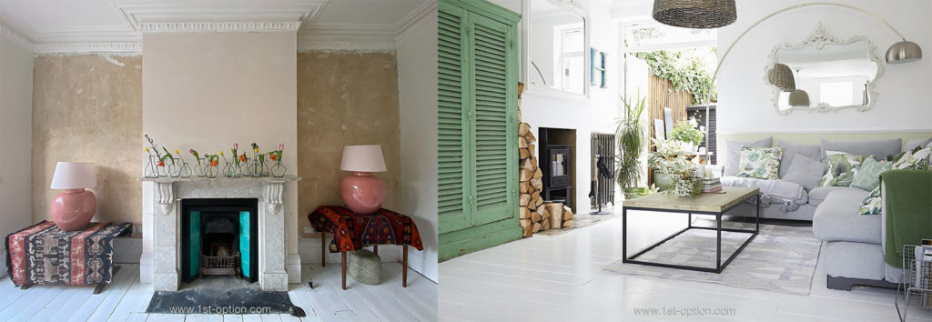
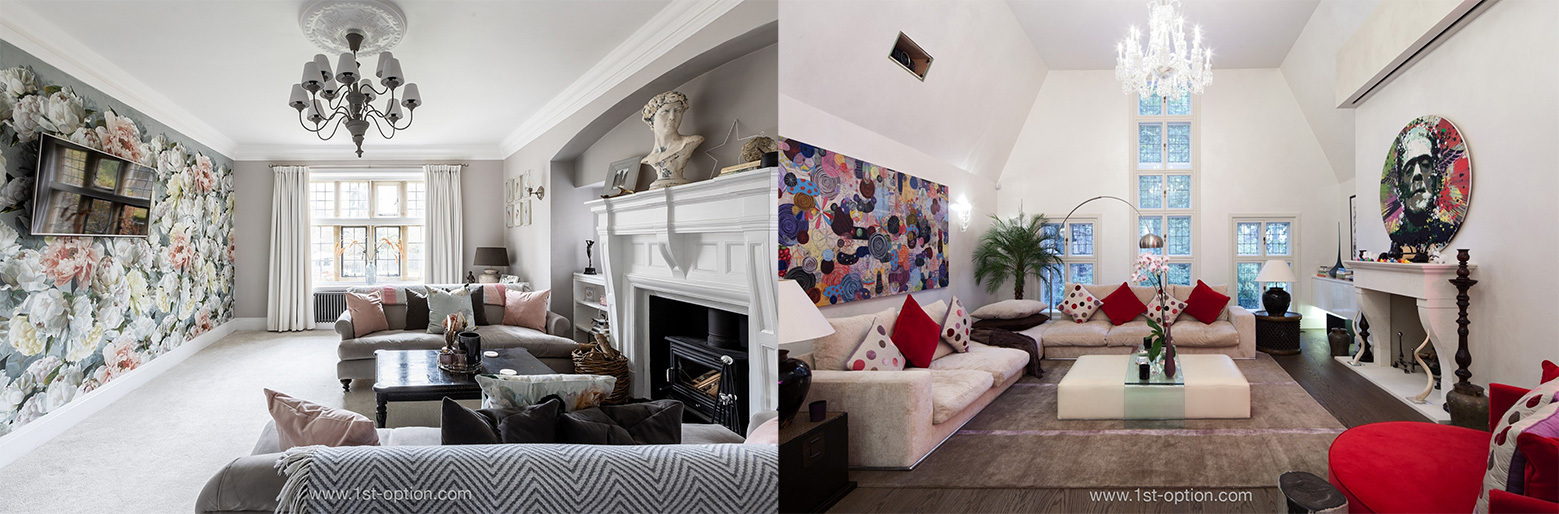
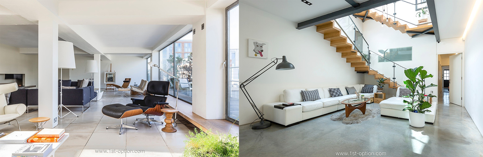
In the world of interior design, the word ‘texture’ gets thrown around a lot; design styles can’t be spoken about without using this buzzword in some way or another. There is a precise art to adding texture to a room, it encompasses a lot more than adding a frilled pillow here or some aged wood there. The key is to blend the rough with the smooth, understanding visual texture is just as important as physical texture. If done correctly, texture will tie the room together, however if done wrong or with no consideration, you will fall significantly short of the mark. Read on as the answer to what texture is and how to implement it within your home awaits.
What is texture
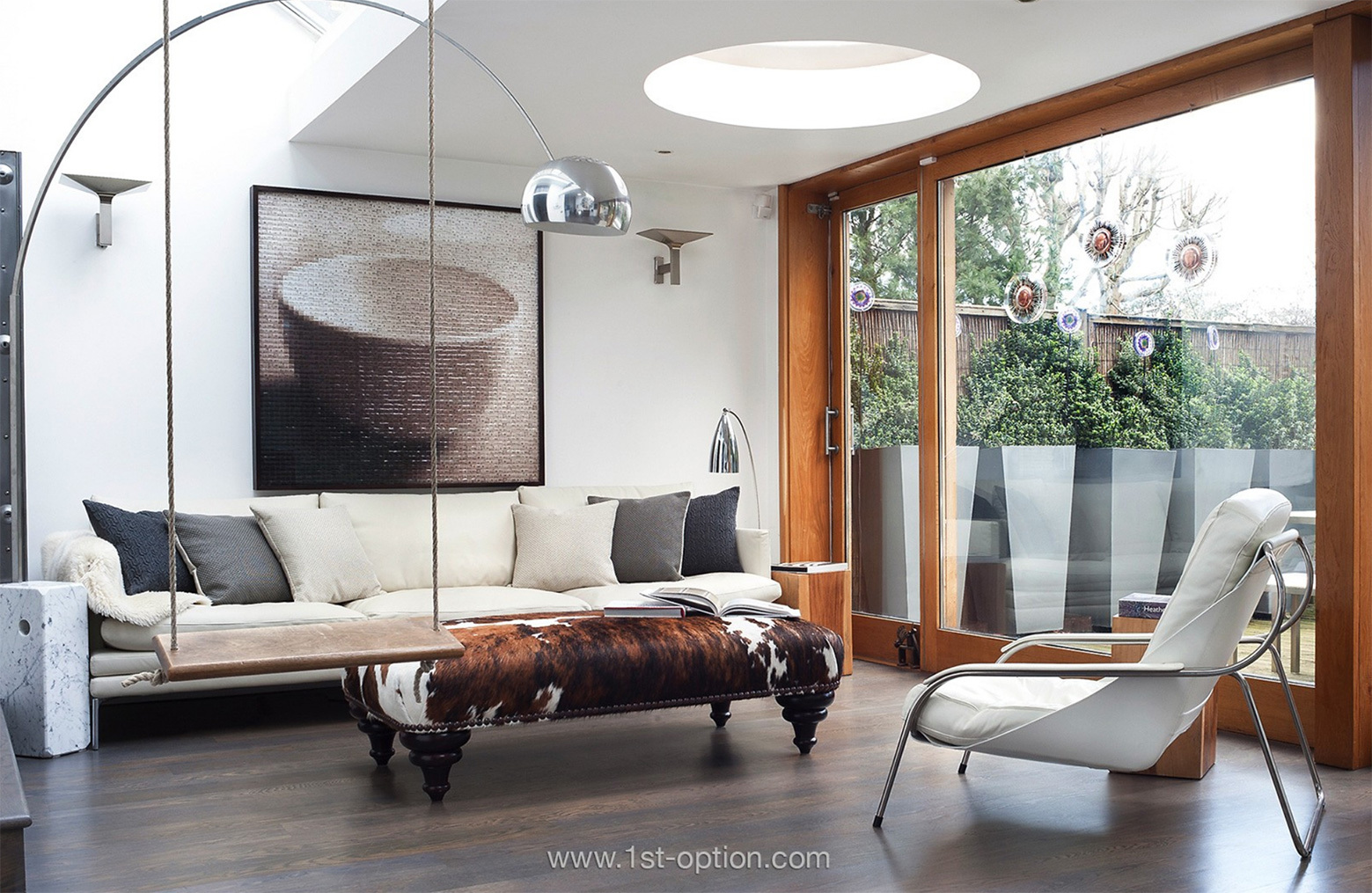
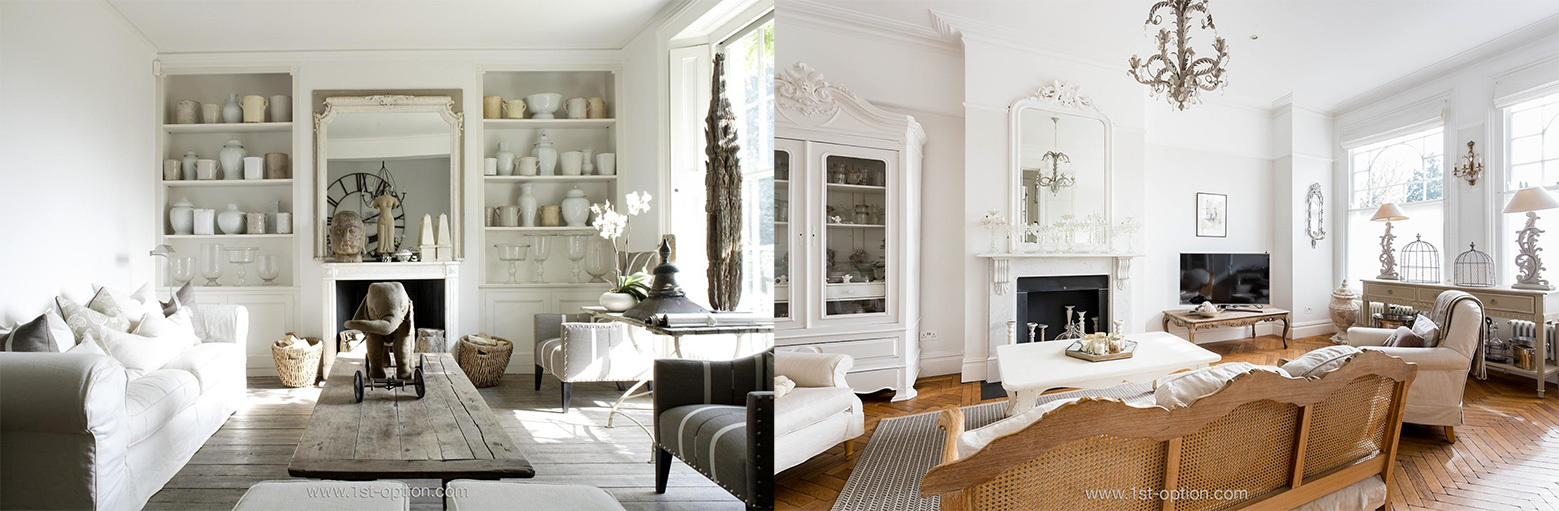
In its simplest explanation, texture is an object’s physical feeling or visual appearance. Essentially, texture is anything that adds dimension to a room. This could be anything from a fabric throw or stone feature wall, to carefully positioned lighting, which can transform a room with a soft glow or harsh spotlight. Texture is also a way of creating accents, designers refer to it as ‘visual weight’ – how an object or area draws attention to itself. Contrast these accents and that part of the room will stand out, while matching materials will make a space recede. To achieve real depth, think about contrasting smooth, more premium materials, with rougher, more tactile ones. The intricacies of texture can sometimes be easy to overlook; given that every material has a texture of some description, it can quite neatly weave its way into your decoration. However, there does need to be a level of consciousness in your decisions. You think about the paint that goes on the wall, making sure it flows, so do the same with texture. Make sure there is a balanced theme and flow to every room.
How to add it to your home
Layering with different textures
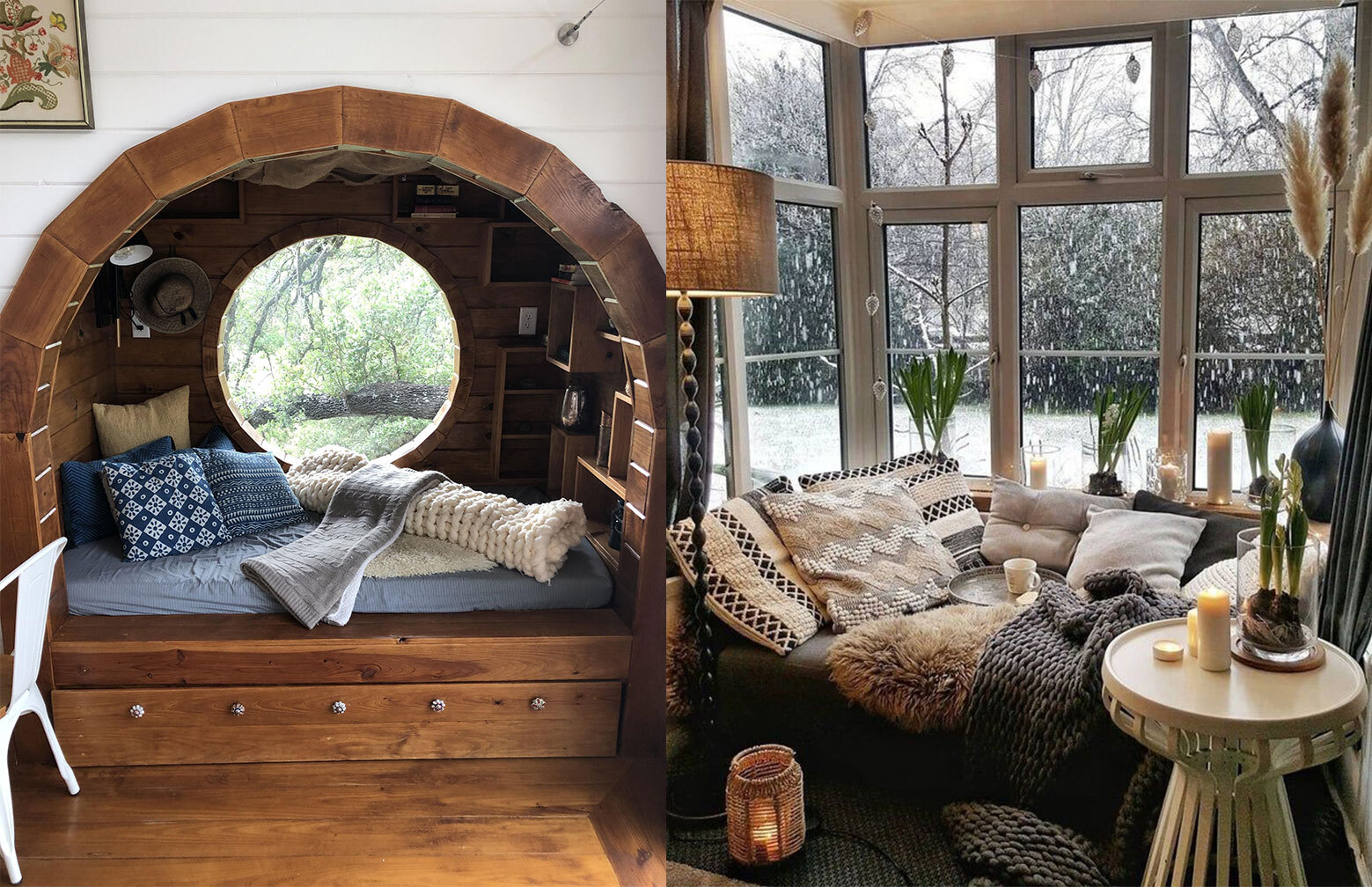
Layering is potentially the simplest way of adding texture to a space, but it is also vital for adding depth to a room. The key is to mix things up and not rely too heavily on one element or source of texture – blend multiple sources to add multiple dimensions. Think: fabric throws and silk cushions upon your sofa, juxtapose a smooth granite fireplace with a tasselled rug and play around with multi-dimensional artwork on your walls. The whole room has a part to play; as you form layers, the result becomes immersive and arresting.
Use contrasting fabrics
Contrasting fabrics and materials also add balance to a space. Rooms can often be one tone, by adding contrasting textures you are able to interrupt this. You may be thinking “what if my room already has multiple shades of colour?”. Well not to fear, even if there are different shades of colour in a space, adding different fabrics and textures proves that colour isn’t the only way to achieve variation. Make sure you are going beyond the normal avenues of texture; curtains, blinds and lampshades are out-of-the-box ways of adding texture and depth. What is great with this is you can change the contrast to fit the season – in summer you could use cotton/ silk throws and cushions, in winter, faux fur and velvet.
Play with accessories
Accessories are great additions to any room; vases, mirrors, ornaments and sculptures are perfect for adding texture. They all come in a multitude of styles, looks and feels, creating the ideal run of visual and physical textures. Nevertheless, don’t go overboard, as there needs to be direction in what you are trying to achieve. The idea isn’t to add every texture known to man, but to welcome an assortment of styles and feels that are sympathetic to each other, adding variation and intrigue while bringing the whole room together.
Lighting
Light is actually the only form of texture that has a dual aspect to it. Firstly, there is the obvious look and feel of a lamp providing physical and visual texture, however, it is the rays of light themselves where texture actually takes on a more visual character. When warm light is used, it has the ability to give a room a soft and inviting glow; white light on the other hand is a lot sharper and therefore can make a room’s atmosphere feel a lot harsher. Furthermore, the position of the light can be key to adding value to a space. For example, a carefully positioned soft light in the corner of the room can create a beckoning reading nook, whilst angling your light to shimmer through your plants or a water feature, helps cast shadows upon your wall creating more visual texture. By mixing different sources, areas and levels of light, you can create wave upon wave of texture.
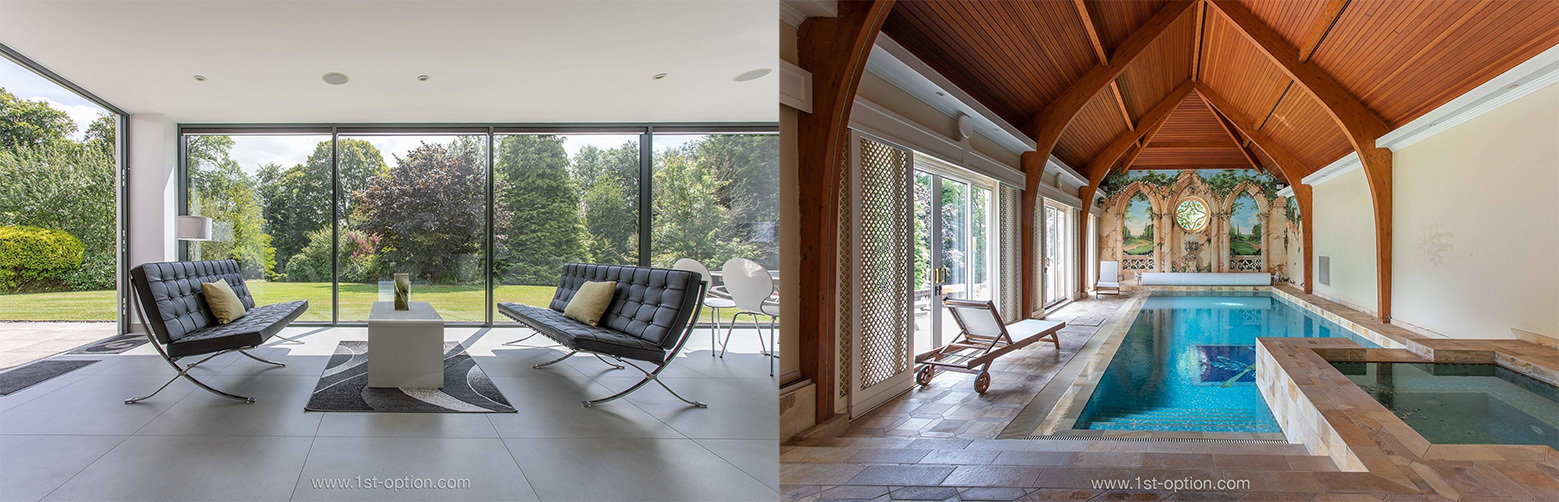
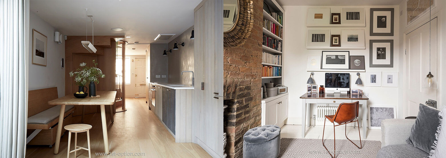
As always at the start of a new month, we like to give you a rundown of our latest and greatest properties. As we enter the second half of the year, the quality of locations coming through our doors has been immense! Throughout June, the influx of brilliant residential properties has been immense, with locations ranging from country houses to vast Neo-Georgian family homes. Read on to check out the full range of our top five new locations for July.
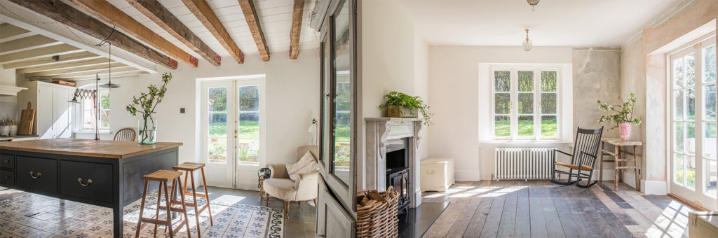
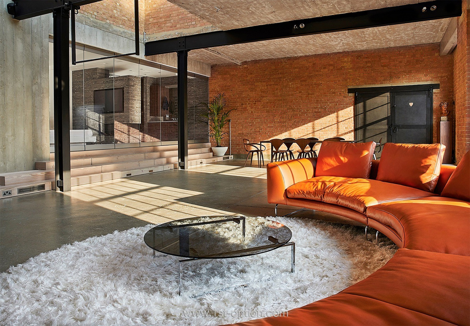
Brook Lodge
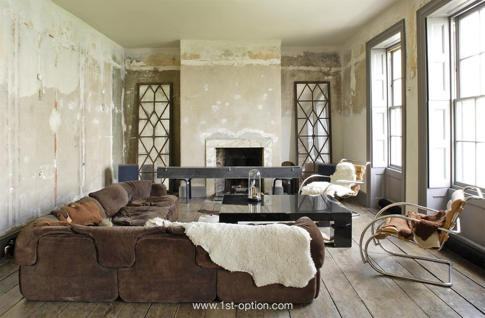
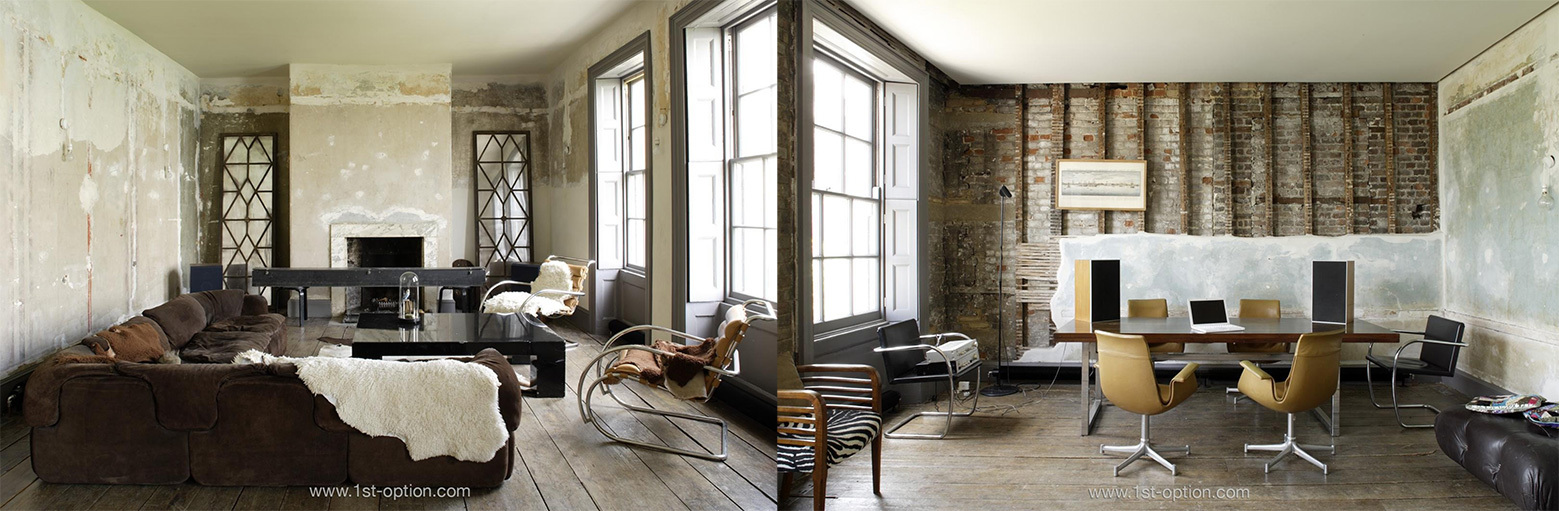
First up is Brook Lodge, a fabulous red-brick country house, set within 1 acre of glorious land. The property benefits from a breathtaking rustic aesthetic that is perfectly complemented by the sum of its parts – aged wooden floorboards, eye-catching wooden beams and subtle touches like the wooden table, dresser or log burner. Some of the other notable features come from the striking antique tiled floor in the kitchen and the distressed plaster wall found downstairs; two touches that give Brook Lodge its overarching country chic feel. We can’t talk about this property without mentioning the eye-catching tennis court, a staple for any country house, giving you endless eccentric shooting opportunities. Thanks to its size and range of areas to shoot within, we believe Brook Lodge to be perfect for filming as well as large scale editorial shoots.
Country chic interiors at Brook Lodge
Daytona
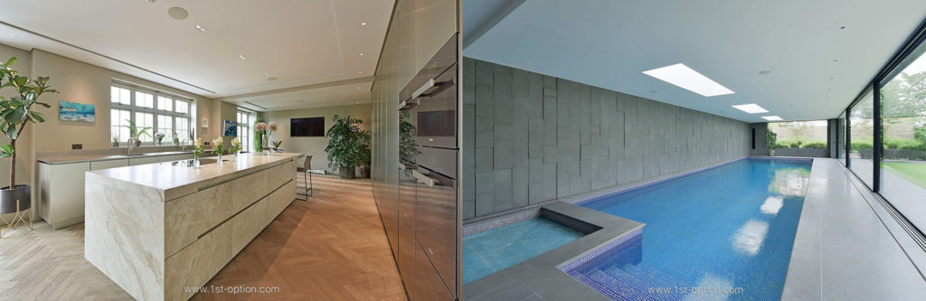
From the countryside to the city. Our second location to feature this month might not be exactly what you’d expect from a city house, but it will certainly make you stand up and take note of it. Welcome to Daytona, an immense Neo-Georgian family home, situated in the heart of North West London. Contemporary-luxe is the underlying aesthetic, with features ranging from a vast marble kitchen island, to parquet flooring found on almost every inch of the house. However, what sets this extraordinary house apart from other large family homes in London, are the one-of-a-kind details you’re not going to find elsewhere. These include the 4m wide marine reef tank that travels between two rooms, museum-quality fossils and a steam room. If this wasn’t enough to win you over, the curated South West facing garden is award winning and overlooks the 10m pool; thanks to its sliding glass doors, it has the ability to turn an indoor pool into a fabulous outdoor version. Similarly to Brook Lodge, Daytona would be perfect for small-scale filming and editorial campaigns.
Daytona and its luxe decor
Kombu
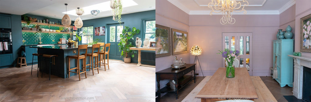
If country chic and contemporary luxe are the overarching aesthetics found at Brook Lodge and Daytona, colour would certainly be the main talking point at Kombu. This fabulous double-fronted Victorian family home, located in South West London is seeping with stylish and tropical details. However, the standout area comes from the open-plan kitchen/ living room; here you will find parquet flooring, a green palette including eye-catching pine green tiles and tons of beautiful flora. Nevertheless, as stated above, it is the abundance of colour that makes Kombu such an exceptional shoot location. The dining room is finished in a luscious pink tone, the pantry is vibrant orange and each bathroom has a different tropical wallpaper – ranging from lemurs and jaguars to pretty flowers. We would recommend editorial shoots at Kombu thanks to its versatility and striking shooting opportunities.
Colour is the overarching theme at Kombu
Pooky
What would you love more than a townhouse? A Notting Hill townhouse! Meet Pooky, a classic Notting Hill townhouse located in a colourful crescent, not far from Paddington Station. The exterior of the location is finished in a striking aqua blue, that is offset against a whole host of alluring plants and bushes, making for a truly unique townhouse. Inside, the interiors blend modern touches with period features, including cornices, wooden floorboards and a stone fireplace. On the upper ground floor, you will find a drawing room/ study that bears a distinct 70’s feel – with natural hessian walls, modern art and a great deal of mid-century modern furniture. With its range of design styles and assets, we would recommend using Pooky for off-the-wall editorial shoots.
Pooky, the Notting Hill townhouse
Hyde
Period properties are certainly dominating our top five this month, continuing with this theme is our next location: an Edwardian family home that has recently undergone a sumptuous renovation and subsequent rear extension. Check out Hyde, the last location in our top five for July. The standout areas within this glorious property come from the open-plan kitchen, the garden and the master suite – despite the rest of the location rounding up a beautiful house. Within the kitchen you will find exposed steel beams, a large central island and an eye-catching gable doorway that looks out onto the 70ft garden with patio and lawn area. Before you go, take a look at the sublime master suite, found on the top floor, with an office space and adjoining ensuite. Thanks to its ample space and premium feel, Hyde would be perfect for large-scale editorial shoots.
When choosing a location for a photoshoot, (whether that be portrait, product or lifestyle) there will always be tons of complexities that go into the choice. When clients get in touch with us, some of the elements to consider are lighting, space, sound, as well as specific styles and elements that are hard to come by. When it comes to choosing a location for a fashion shoot, it gets a whole lot harder – you have to think about how this will translate to a magazine, if the style of the location matches the concept behind the shoot, the ethics of the brand, the colours of that specific shoot, the season of the collection and much more. If sourcing a location in line with all of those values doesn’t make life hard enough, you also have to think about the location itself. The point of a lookbook is to make the buyer want the items before they go live in shops and on sites. The key therefore, is to make the shoot look aspirational; the location has to be trendy and cool. Read on to check out our diverse range of locations that are ideal for fashion shoots.
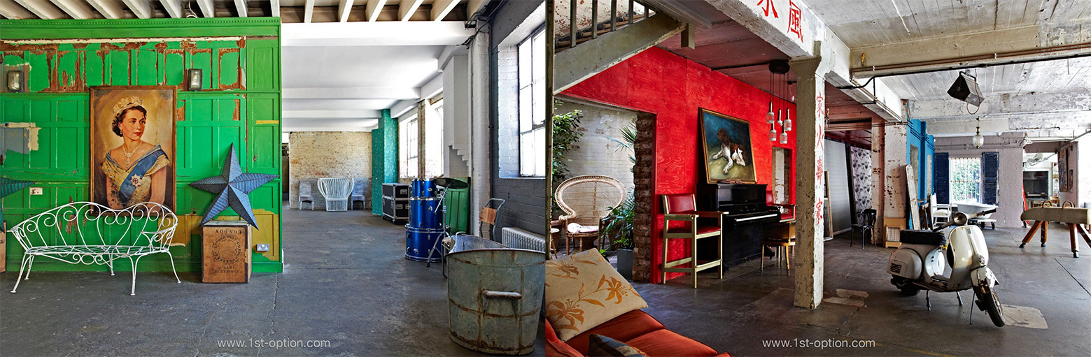
Friendly Place
Friendly Place is a warehouse studio, located in South East London. It not only has a dedicated hair and makeup area, but is also set over several floors, with each room offering a different set of quirky furnishings and backdrops. Thanks to its versatility, the shots you are after are provided in abundance. Some of the unusual props that can be found on the first floor include a bed, a green wall divider and a photo of the Queen. Following the distressed/ run down aesthetic of the first floor, other areas include vintage and retro furniture, a Vespa and a pommel horse. It is this versatility and array of fascinating furniture and accents that make Friendly Place ideal for fashion shoots, ranging from streetwear all the way to high end.
Looking for something slightly more grand? Then check out Henry VIII Boathouse, set on the banks of the River Thames. This Greenwich-based shoot location offers a beautiful blend of faded grandeur, with tons of distressed elements and wooden flooring throughout. Some of the standout features include the array of mid-century modern furniture, a grand piano and the large open-plan kitchen/ dining area. In recent times, higher end fashion brands, houses and online publications have looked towards grittier and more raw locations, as they tend to allow the pieces to stand out amidst the rundown elements – something Henry VIII Boathouse would be perfect for.
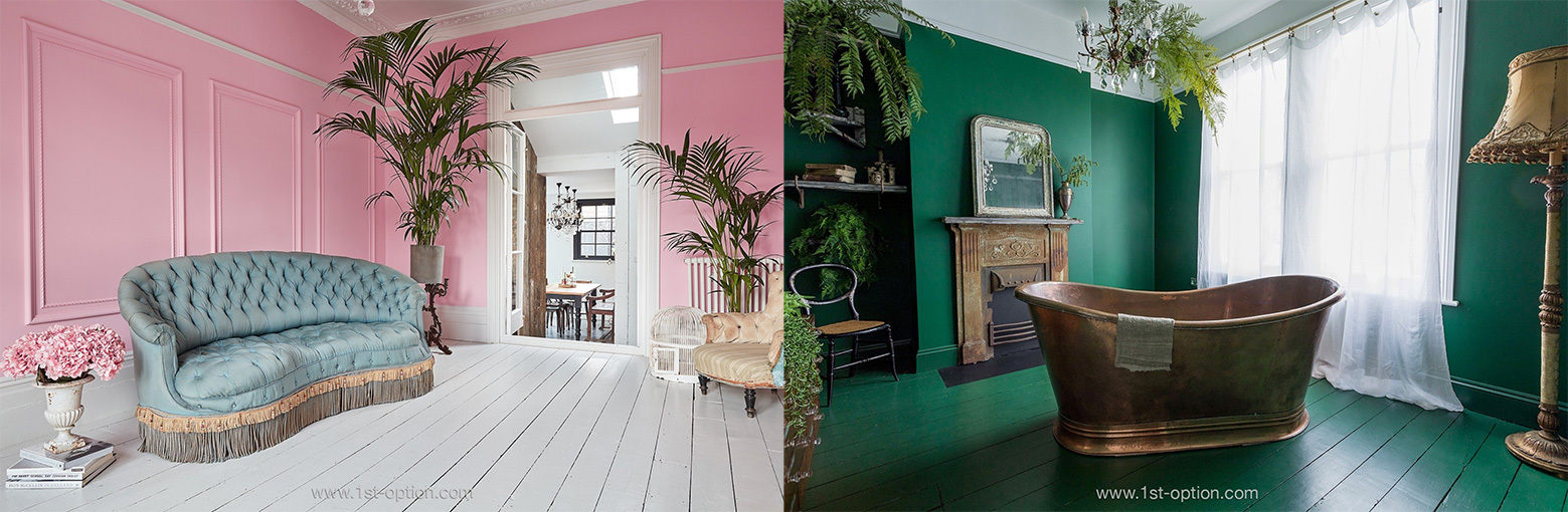
The next property could not be further from Henry VIII Boathouse; Kempshott Road is a five-bedroom Victorian family home, located in South West London. However it is not the type of property or where it’s located that sets it apart from the boathouse – Kempshott Road has been recently restored to an impeccable standard and being set over four floors, there are tons of breathtaking features that make it perfect for fashion shoots. The kitchen is more contemporary in style, with crittal style windows, a polished concrete floor and central kitchen island. It is, however, the other rooms within this outstanding property that really give it its edge for fashion shoots. Neighbouring the kitchen is a large pink living room that has a gorgeous antique feel to it, similarly the front living space, while finished in a royal blue, also has antique features. One room has been transformed into a unique purpose-made bathroom, with a green finish and a free-standing copper bath, while other parts of the house have a real ravaged industrial vibe. Compile all these elements together and the result is an extremely diverse shoot location that can turn its hand to any style of shoot.
For a location more specific with its style, check out Palm Springs in West Sussex. This unique shoot location offers a stark 60s/ 70s vibe within a modern build – thanks to its one-of-a-kind furniture it is perfect for a retro style shoot. The extraordinary mid-century modern furniture, the striking artwork and the open-plan flow of the space really emphasise the feel. If this wasn’t enough, there are also two swimming pools and a beautiful garden, allowing for summer shooting as well. If you are looking for a retro or quirky location with a specific concept behind the shoot, look no further than Palm Springs.
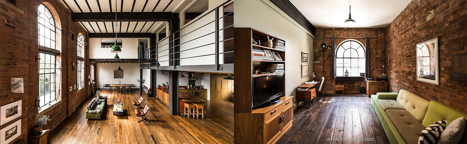
To round off our top five, we could hardly leave out Spratts Factory – an outstanding warehouse conversion, with a premium industrial feel. Exposed brick, crittal and polished wooden flooring are ever present features; thanks to its size, you will never be short of astonishing shooting opportunities. Industrial style locations are incredibly popular for streetwear campaigns at the moment, however thanks to its premium finish, Spratts Factory wouldn’t be out of place from an M&S campaign to a Calvin Klein shoot.
Spratts Factory and its incredible industrial-chic aesthetic
To many, coastal design encompasses blue and white everything – with seashells, glass bottles and anchors galore. If this is you, we can totally relate. Based on the name, it makes sense that coastal design incorporates these elements, however these elements are actually more typical of nautical décor. While there are a few features that crossover between the two distinct styles, coastal is another expression completely. Coastal is decidedly less kitschy than nautical design. In its simplest definition, coastal design is beachy. Soft tones, a clean aesthetic and tons of natural light prevail, to evoke the airiness associated with the beach. The idea is to take cues from the natural environment – this includes everything from the atmosphere at the coast, to the natural materials and the colour palette found there. Read on as we dig a little deeper into coastal design and its core principles.
Texture
Texture and layering are vital in creating that perfect coastal look; get rid of that tendency to over-decorate with blue stripes and ships in glass bottles, instead think about how to texturise with different fabrics and materials. Through the use of rugs, cushions, throws, baskets and wall hangings, you can easily create the comfort that is provided at the beach, whilst keeping the area incredibly stylish.
Concord showing how texture can tie a coastal room together
Colour
While many are inclined to picture bold blues upon a white base, a singular, crisp-white interior is actually far more accurate when it comes to coastal design. Train your mind’s eye to think of a minimalist aesthetic – as coastal design favours a far more neutral colour palette. Complement the area with tons of natural light, and you will be left with the airy beach look in no time. Nevertheless, this doesn’t mean accents of colour can’t be implemented; soft hues are perfect (there is nothing bold about coastal design). Think: tones such as pastel blues, beige, khaki and light greys.
If there is one imperative in a coastal home, it is an abundance of natural light; light brings all other elements together. Interiors should never feel cramped or dim, as we mentioned earlier, the key to this design style is to be open, airy and light. When in a beach house, the indoors and outdoors often will seamlessly blend into one space, therefore large windows, skylights and glass walls are fundamental. If you can’t implement all these features, try supplementing with soft interior lighting that isn’t too harsh on the eyes.
As touched on previously, the aim of this design style is to create a comfortable and relaxed environment, so the use of natural materials is the way to go. Furniture can achieve this look when incorporating wicker, rattan and light woods. Materials such as straw, seagrass and jute work well for rugs and smaller pieces. Though wood is a big part of the overall design style, it should generally be white-washed or at the very least, an earthy, pale tone. Steer clear of anything glossy, metallic or flashy and you should be fine!
While coastal and nautical are separate design styles, they aren’t as night and day as say, country chic and minimalism – it is okay to add a few seaside touches. Shells, woven baskets and glass bottles can be great additions, really tying the room together, just don’t overdo it. Clutter is a definite no-no, oversaturating with these touches creates a kitschy space, which is completely the wrong vibe. Stay away from anchor prints, rope and tacky signs pointing out where the beach is. Keep it simple and you can’t go wrong. A few glass bottles atop the fireplace is perfect, a striped feature wall adds great visual interest and woven baskets make the space feel a whole lot cosier.
Materials mentioned previously, such as rattan and wicker are great for giving off that natural, yet comfy and casual feel. However, too much can overwhelm and make the space feel very matchy-matchy. To avoid the place feeling too busy, add dimensions with cottons and linens, draped over chairs and sofas – they aren’t going to suffocate the space and they stop the room from feeling too samey. Slip-covered furniture is also another way to add your individual character, as the colour and fabric can always be changed as and when you see fit.
Following our last article exploring the best ways to maximise a small space, we are now delivering our top design ideas to utilise larger spaces. While larger spaces have many advantages, including space for more furniture and entertaining, they come with their own set of challenges and issues. So how to make the most of a large space? Read on to get your design cues for large rooms of all shapes and sizes and you’ll be a master designer in no time.
Designate zones
The difficulty you can find with larger rooms is that the space isn’t utilised. Large spaces have the ability to function as so much more than merely one room. Get creative and designate different zones – creating separate rooms within one space. One way you can achieve this is through adding different textures to different areas. For example, fill the living quarters with throws, pillows, rugs and a pastel colour palette; while the kitchen area could be finished in hardwoods and rich tones. Alternatively, get smart with furnishings, creating room partitions with L shaped sofas or wall partitions.
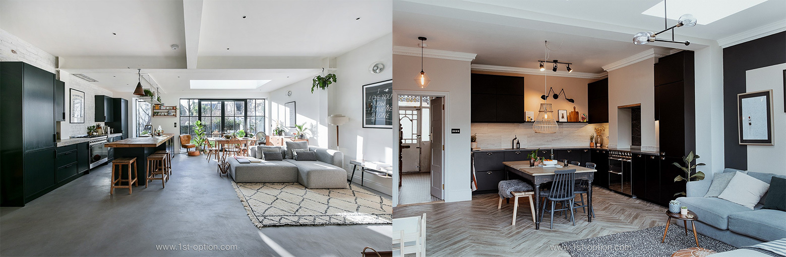
Nash using large pieces of furniture to create room partitions & Aldersbrook showcasing how texture can separate space
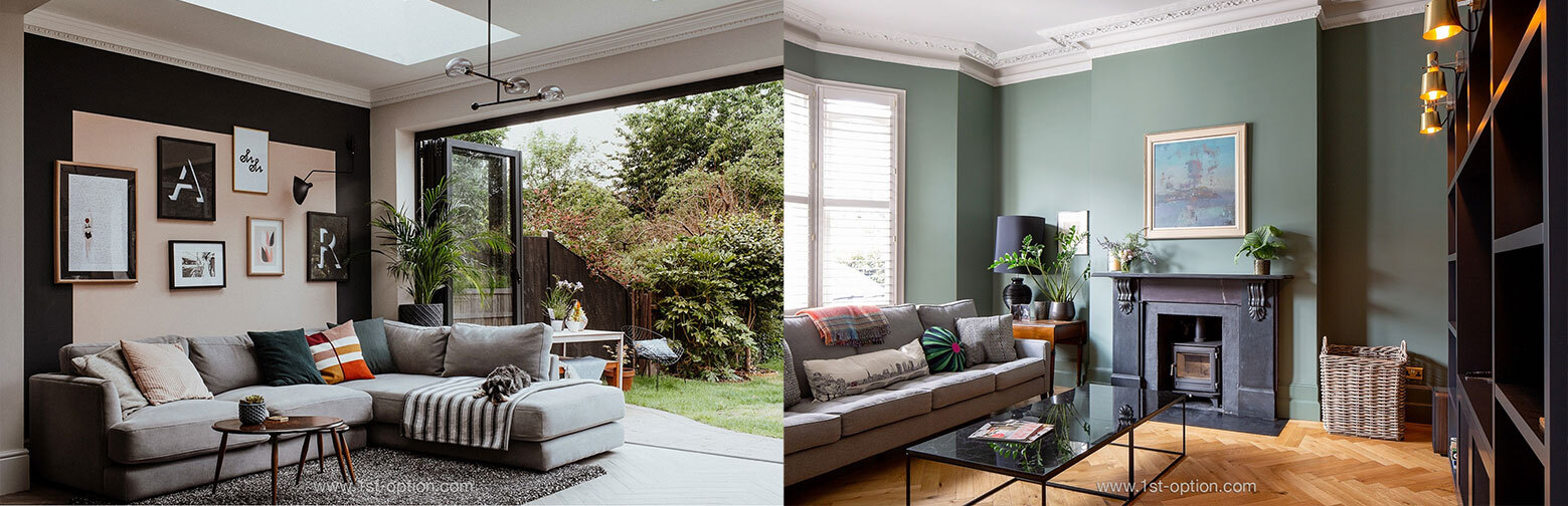
Colour is key
Colour is a great way to break up large expanses of space that would otherwise feel empty. Similarly, if you have high ceilings, colour and pattern can subtly bring the wall down to a more comfortable height. Paint your ceiling a shade or two darker than the rest of the space and you’ll be left with a far more snug room. Panelling also draws eyes away from the expanse and is a simple way of achieving the feel of an intimate environment. Other ways of using colour to maximise your room include partitioning zones, signifying a change of purpose with a splash of colour and creating a feature wall, drawing the rest of the space together.
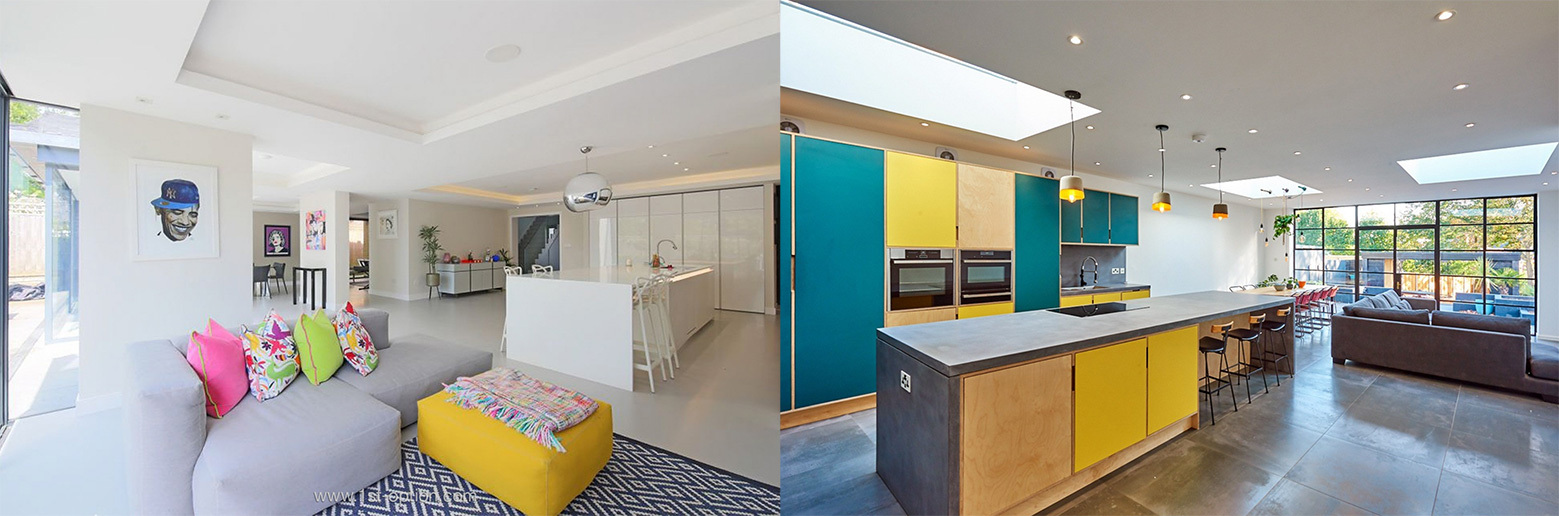
Colour is used effortlessly at Benson and Minton House to signify a change in purpose creating two separate areas
Scale is vital
One of the easiest ways to make a large room feel out of balance and vacant is to ignore scale – make sure your furniture matches the shape and size of the room. If tall ceilings are present, the furniture must match; small furniture will make the ceiling feel miles away. Taller pieces of furniture that can bring the ceilings closer include bookcases, tall cabinets and high-backed chairs. Similarly, with wider spaces, opt for larger units that cover more ground – think L shaped sofas, large coffee tables and long dining tables.
Scale is understood at Valentine and The Manor with wide and tall furnishings
Find an anchor
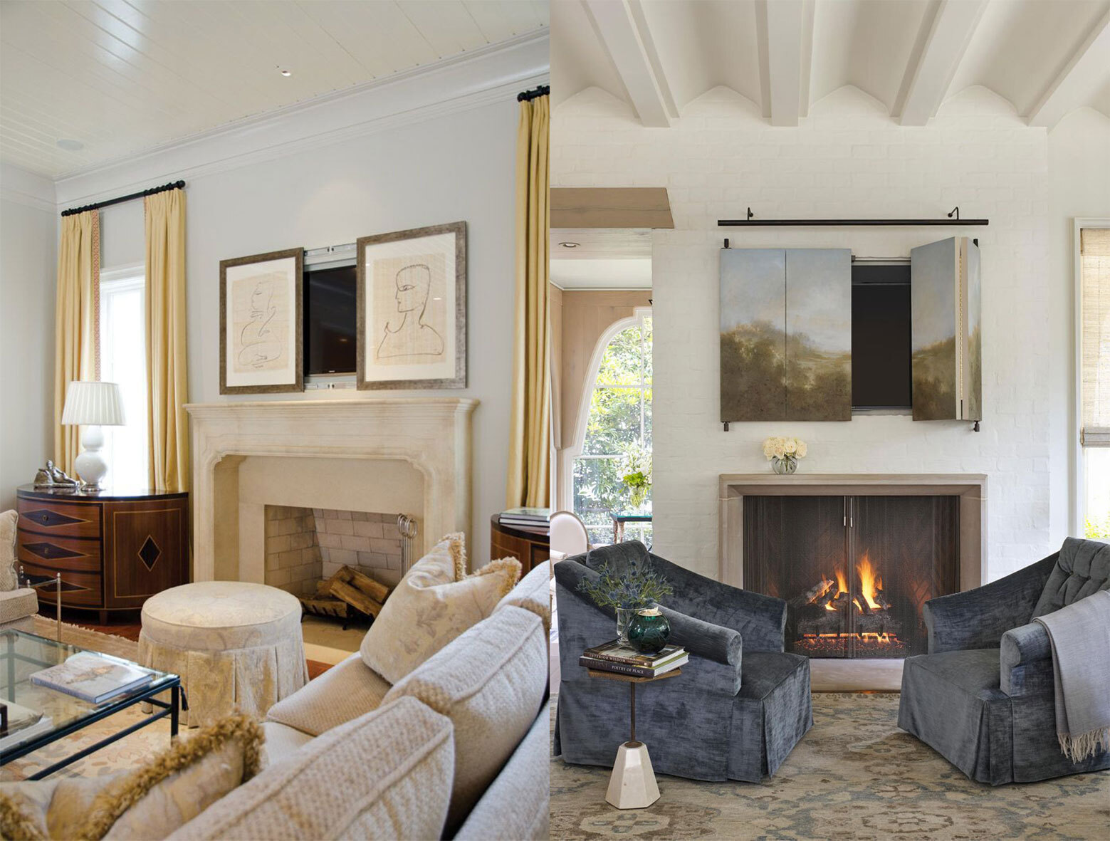
When it comes to dressing a large room, it is incredibly easy to oversaturate with too many pieces of furniture – resulting in clutter. Rather than overcompensating with tons of smaller pieces, find a few standout items and anchor the rest of the room around them. Furniture that works perfectly as anchors includes large sofas, which section off parts of the room, imposing coffee tables that grab your attention, pianos or perhaps a fireplace with built-in bookshelves on either side.
On the other hand, if you can’t find a coffee table big enough to anchor your room, perhaps look for two pieces that can bring a room together; place them side by side and that empty space is no more. Two Ottomans facing your sofa between a smaller coffee table could be an example of this. Rugs can also be used to create separate conversation areas, splitting up the enormity of a space. Chairs can be a less intrusive option than sofas – four chairs around an Ottoman or small table will give you the desired conversation area without swamping the space. Similarly, play around with the idea of doubling up on footstools, lamps and sets of chairs for greater impact and symmetry.
Purley uses two chairs either side of a small coffee table to bring the room together
Avoid wall-hugging
One of the worst decisions you can make when dressing a large room is to push the furniture up against the walls. By doing so, a chasm is created in the middle of an already large space and the room you are left with is soulless and cold. Don’t be afraid of bringing the furniture in and creating separate areas within the larger space. The idea is to create an intimate and cosy room, with character and charm. Once the furniture is off the wall, artwork, consoles, bookshelves and benches can fill the outer areas giving that desired character and life.
Half Acres brilliantly brings the larger furniture units off the wall to make the space feel more cosy
Bolder the better
The bigger the room the bolder you must go! Artwork is a great way to make a room standout without cluttering or oversaturating your space. Creating a feature wall from artwork is an awesome way to draw attention away from the middle of the room, producing a really standout area. Spreading decorative items around a room heightens the chance of them going unnoticed, whereas a feature wall will keep the focus in one area. Consider unorthodox pieces such as sculptures, antiques and art installations.
Carlo uses Artwork to draw your attention while Marilyn opts for bold colour
Repetition
Due to larger spaces needing more furniture, you run the risk of creating a haphazard feel, without any flow or rhythm. Implementing repetition in the space projects your unified style and as such, creates a welcoming and thought-provoking space. Repeating fabric patterns or colours upon chairs or throw pillows helps carry the eye around the room, making it more visually appealing. There is always the potential of creating a cold environment in a large room, so the key is to do whatever possible to make sure it feels as cosy as possible.
Koi and Collingham use throws and pillows for repetition to create a welcoming space
Texture, Texture, Texture
You can fill a room with as much furniture as you desire, but it still has the capacity to feel cold and devoid of personality. By adding texture throughout the space, you start to tie the room together, making it feel less empty and spiritless. Add area rugs, hang curtains and supplement with throws and pillows for more texture. Softer spaces feel much cosier and inviting, so be sure to have plenty of upholstered pieces too! As mentioned previously, texture is also a great way to create distinctive room partitions.
Think about your natural light sources, to keep the room light and airy – a large room can still feel cramped and claustrophobic if it is dark and dingy. Interestingly enough, by keeping the space light and vibrant, you have the ability to actually make the room feel even larger. See if you can implement bi-fold doors, glass walls or skylights to bring in as much light as possible.
Millbrae has a glass wall and Capri takes it one step further with a glass ceiling allowing for as much light as possible
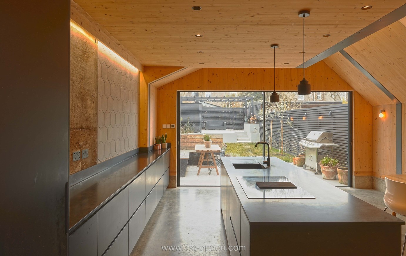
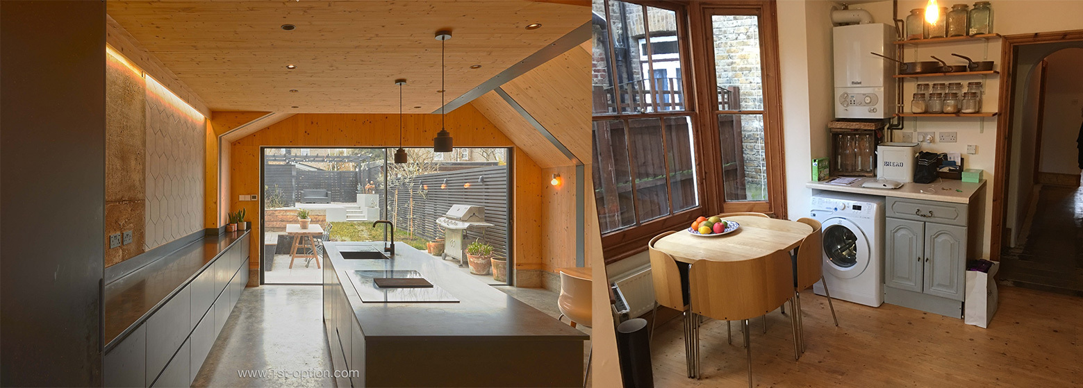
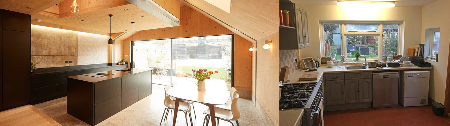
Rob – “Today we are here with Mark Dolan talking about his amazing property Honeycomb, what his experiences were designing it, any positives and negatives from the experience and his favourite features within the home.”
Rob – “Hi Mark, how are you doing today? Do you want to give us a little insight into your incredible home?”
Mark – “Hi yeah, really good thanks! So, diving straight in, what’s so unusual about our home is, lots of people in London have cybertone extensions that generally involve holding up old bits of the house and building out. However, we decided to demolish the whole rear and put in an entire three storey cross-laminated timber extension – which I do believe is only one of two in the whole of London. This for me makes it an incredibly unique building and the timber construction has some great environmental properties, as well as being the future of building in many countries.”
“Also building in timber allowed us to do some funky things. So for example, we have an internal void that runs up between the kitchen and the first floor. This would have been slightly harder to do in concrete…”
“What we now have is a non-traditional build, with a non-traditional look, but at the same time, it doubles up perfectly as a family home.”
Rob – “Yeah for sure, that’s amazing, it’s such an interesting and unforgettable property. Would you say you had a particular design style in mind before you started?”
Mark – “Yes, yes we did, I hesitate to use the word minimalism, as that’s slightly discredited. I’ll also try to avoid all the usual cliches, like clean and uncluttered, but I think broadly speaking it is modernist with a bit of alpine chalet thrown in (wink, wink). To be honest, it all came back to the construction method. In terms of our template, that was the starting point and then you begin researching what’s going to look good with this and what’s going to look good with that. It was then that we settled on a palette of timber, steel, concrete and black really aha.”
Rob – “So would you say you had any inspiration behind the build?”
Mark – “Well that came from our architects in a way! When we first went to see them, they sort of just suggested this build method and the rest is history as they say. We wanted to be adventurous and as good a client as we possibly could be, so without too much forethought said yes and ran with it.”
“You know, I’m a filmmaker, so if a film is a record of the relationship between the filmmaker and subject, your building is a record of the relationship between the architect and the client. For us that relationship was key, it definitely was a collaborative relationship! Right throughout the process, we took care of the interior spec because of the budget and our eye for what we wanted and let them come up with architectural elements.”
Rob – “Would you say that relationship was the most important factor that went into the design then?”
Mark – “Yeah, I think so. Without that harmony, you don’t have anything, but as a client it does depend on what your priorities are. I like to think we were open minded, with a strong idea of the way we wanted the building to go. Once we had settled on the construction method, we had a clear idea of what we wanted the end result to look like.”
Rob – “Was this your first design project?”
Mark – “Certainly on this scale yes! I mean our previous property was a bog-standard two bedroom, ground floor flat, with a fairly standard makeover. So no, we had certainly never done anything with an architect before – nothing on this scale or with this budget, so we were definitely first timers.”
“My family also comes from a construction background; I’ve grown up around construction and building my whole life, so that old maxim ‘a builders house is never finished’ applied to us with bells on. It took around 5 five years, from first meeting the architect to shutting the door on it, it was certainly a long process.”
Rob – “Do you think you would take something of that magnitude on again?”
Mark – “With trepidation ahah. Possibly not.”
Rob – “That takes me smoothly onto the next question – were there any negatives or setbacks you faced during the process and if so, how did you deal with them?”
Mark – “There were a couple, I wouldn’t necessarily call them setbacks, but mentally they were challenging. When we demolished a third of the old house, suddenly we lost our third bedroom, bathroom and kitchen; we were left with a big hole in the ground. Until recently, if you went on google earth, where the rear of our house is, there was just an expanse of nothing. So that was exhilarating and challenging to know we had to start from the ground up (well actually, under the ground up).”
“And I guess the other big challenge was financial. Like most of these things, you know the rule of thumb, double the time, double the budget and add 20% and you won’t be far off.”
“We now want to share the design with whoever wants to use it for artistic and commercial reasons.”
“The other thing is that when we set out on the project, part of our challenge – to ourselves, to the architects, to the builders – was to make a house that was worthy of being photographed, filmed and talked about. Not that I care about those things so much per se, but to use another film analogy: if you set out to make a Bafta-winning documentary, you’ve set the bar for yourself right at the start. Your aim has to be to meet that bar, the Bafta means less, it’s about achieving what you set out to do at the start.”
“We set the goals high, so in a way having people come to the house to film and photograph and hearing all the comments about the house is actually hugely rewarding in of itself. It really is so nice to hear people say how amazing your house is. It’s the fruits of our labour and if we’ve had a long week being in the house, tidying up after the children and largely getting used to living in it, having people see it with a fresh pair of eyes reminds us that we’ve done a good job and were lucky to live in a nice house.”
Rob – “What would you say is your favourite element within the house?”
Mark – “Definitely! I love my black kitchen, particularly the island; I always imagined it as this Anish Kapoor style black void, just a big black blob aha. We did the whole Pinterest thing, looking at a lot of similar kitchens and to be honest most of them were just renders. I had an image of exactly what we wanted in my head, but real kitchens often don’t look like they do in those renders. Nevertheless, it came out pretty much exactly how we wanted it to look.”
“The Kitchen was very much our design, we worked with a local cabinet maker, who was incredible – he built it and tweaked it all for us, exactly to our design. Obviously kitchens are the biggest areas that production teams look at, so having that island with decent camera angles and runs on the other side makes it particularly suitable for kitchen demos.”
Rob – “That brings me nicely to my next point – as a TV producer yourself, did you design the property with filming and photoshoots in mind?”
Mark – “I don’t think so, I mean ultimately you have to design it as a family home. But at the same time, because I have a photographic mind (in a way), I’m aware of the way things will look from different angles. If they are aesthetically pleasing from many different angles as a homeowner, they will look great on camera as well. We didn’t design it as a shoot location, or as a home that will look good on camera or Instagram, but essentially as something that would be aesthetically pleasing – and they go hand in hand really.”
Rob – “Digging into your job a bit more, have you found any difference between being on the production and the hosting side of things?”
Mark – “My top tip for homeowners would be: don’t be in the house when the crew are there. Without meaning to, you are going to take on some of the worries of the crew – where are they going to put this, how are they going to cope with that etc. As a host, you don’t need to deal with any of that, leave it to the crew and get out the house, or at least take yourself away to a designated room. Don’t worry about what they are doing, they have a whole team for that.”
“The crew are paying to inhabit and disrupt your space, so let them do that and they will put it all back. You don’t want to stress yourself out and you certainly don’t want to get on top of them.”
“Another tip, be as welcoming and helpful as possible; welcome the client if they want to come along and recce and be as co-operative as possible. Explain everything to the client and try to accommodate any of their requests. Ultimately good feedback from the client is key, as this means you will get recommended for future shoots. If this means leaving out tea and biscuits, so be it. The key is to be as nice and hospitable as possible.”
Rob – “You mentioned that you didn’t design the property purely to become a shoot location – what was your reason for registering with 1st Option?”
Mark – “Well as I probably alluded to, after a long period of sustained investment into the house, it was time for the house to pay us back. I had also previously used 1st Option myself, so you guys were always going to be my 1st choice. I’ve found the communication has always been amazing and you’ve been so friendly and keen to promote the house – which can’t be said enough, how great that is. Genuinely, out of all the agencies, you guys have been the most proactive, communicative and the most enthusiastic. 1st Option is one of the biggest names in the industry after all.”
Rob – “So you had your first big shoot the other week, what was your experience with it?”
Mark – “We had a crew of forty, so a large crew for a house our size, but they were great – super friendly and enthusiastic about the house. They left the house how they found it, despite having to cope with awful weather conditions. Genuinely it was really enjoyable, the neighbours were curious, but again the crew were great with them. We were very happy and it certainly didn’t put us off. If anything it was the opposite; to be honest that’s probably about as big as it gets. Luckily it was the day the pubs opened, so we were able to take the kids for some pub tea. It was definitely a positive experience and we can’t wait to see the results!
Rob – “Finally, if anyone was thinking of using Honeycomb, what would you want to tell them about the space, any special features or amenities?”
Mark – “Well the house is completely unique in terms of its look and its construction; we have the double-height space in the kitchen and that could be used in a dramatic and fun way. The garden is also coming into full bloom now, so we have outdoor space for shooting. We also live in a low traffic neighbourhood (so it’s very good for sound, friendly neighbours, lots of space and welcoming home owners) what more could you ask for!”
“The crew we recently had round were also looking for some spillover space as a second unit base and they found a hostel down the road who were more than happy to let them use the space.”
In contrast to the actual meaning of the word, modern or modernist design has its feet firmly planted in the evolution of the 20th century. Taking inspiration from movements of the time, modern design is a fuss-free design style that works on clean lines, a minimal aesthetic and function before form. Within this article we are going to take you on a journey through the history of this iconic design style, the influences upon it and the core components that it comprises of today.
Clean lines and a minimal aesthetic at Coconut
History of Modernist Design
This was a period of large-scale change throughout all facets of life, with people moving away from the traditional ways of looking at the world. This transcended into all walks of life and interior design was no different. Traditional materials like wood, stone and brick became less popular, with new industrial materials like glass, concrete and steel taking precedent.
During this period, Bauhaus was a school of design that was influencing much of the world. It felt that within a space, while form and style are key ingredients to a room, function must outweigh all – if a piece of furniture doesn’t have a clear function there is no need for it. These principles were then adopted by popular design styles, such as Scandi, minimalist and industrial.
Modern design embraced these ideals and as a design style, started to blend many of their key tenets. Because it has spanned over 100 years, various influences have been cherry picked – such as mid-century, rustic or glamorous for example. Nonetheless, there are some key principles that it has always stuck by: clean lines, geometric form, clear spaces. This allows you to easily create a modernist space if you please. Below we will explore these concepts, how to distinguish each approach and how to create the look in your own home.
Billie incorporates a mix of modern design traits
Influences
Industrial
One of the biggest influences on modernism arguably came from Industrial design. It came to prominence at the start of the 20th Century; coincidentally at the same time as the modernist movement. After the industrial revolution, globalisation led to scores of factories uprooting to cheaper places to do business. This left swathes of derelict factories behind, with an almost endless resource of high quality materials going to waste – such as concrete, glass and steel. This was a huge reason why industrial design had such an impact on modern design – not only was there an abundance of materials, they were cheap and fuss free.
Classic industrial elements at Steel
Minimalism and Scandi
In a different way, but no less meaningful, minimalism and scandi have also left a lasting impression on modernism. With their clutter free aesthetics, muted colour palettes and clean lines, it is perhaps easier to see minimalist and scandi design’s impact on modernism. Scandi came to prevalence at the same time as modernism, emphasising the use of utility, clean lines and simple furnishings that are made to be functional, cosy and beautiful. Similarly, minimalism also incorporates the idea of clean lines and reduced clutter, however, where functionality is key to scandi, simplicity is the core principle of minimalist design. The combined idea behind both styles has always been ‘less is more’, which became a core tenet for modern design as it evolved.
Minimal and scandi influences on modern design at The Distillery and Curious
Components of Modernist Design
Modern Art
At the turn of the 20th century, modern art revolutionised the way people looked at their environment (completely aligning with the modernist movement and what it stood for). Because modern design was so heavily based around form, function, clean lines and zero fuss, people looked to other ways to get their character and expression across. They achieved this through the use of new abstract prints and sculptures, with bold colour and unexpected forms. Abstract art was also a move away from the traditional, realist forms of art that had populated houses across the 19th Century, creating another compelling reason to decorate in this way. To construct the modernist look within your home, showcase your artwork by forming a feature wall out of the abstract pieces of art, or alternatively, have one standout piece within a minimal space making it the focal point.
Different styles of abstract art at Carlo and Solene
Industrial Materials
Without industrialisation there is no modernist movement! Industrial materials are therefore central to modern design. As touched on above, following industrialisation, many cheap and newly accessible materials were left behind for the general public to embrace. Not only were they readily available and easy to install, they also perfectly fitted the modern principles of showing off clean geometrical lines, with function before form. When people think of industrial materials, their first thought goes into the structure of a space; within modern design however, these materials are used throughout the space – furniture as well as structure. Industrial materials are perfect for showing the clean geometrical lines, thanks to their pared-back aesthetic. If you want to achieve this look within your own home, play around with beams, steel frames and concrete flooring. Try and implement large windows to bring in that extra natural light.
Lots of glass, steel and concrete on view at Gee Street and Bloomsbury
Clean Lines, Form and Function
Clean lines and function before form are potentially the central principles of modern design. With the likes of steel and concrete being available for the first time, designers took advantage; straight lines and clear functions flourished. These materials were perfect for accentuating clean lines and thanks to their mechanical aesthetic, it was easy to demonstrate their functionality. Architects and designers loved balancing the opposing vertical and horizontal lines of columns, steps and furniture – achieving this, whilst showcasing every piece’s function in a stylish environment is where modern design thrives.
Clean lines, form and function at Gee Street and Havelock
Clear Spaces
Whatever you believe are the most important factors within a modernist space, one thing is clear: clutter is never welcome. With design styles like scandi and minimalist spearheading the movement, it is self-evident that this would be the case. Clutter can manifest in not only mess, but in saturating a space with furniture and other decorative objects. If you are looking to create an effortless modern space, accessories and decoration must be few and far between. The art here is leaving the space clear without it looking bare. This can be achieved through the use of statement pieces and bold furniture that draws the eye, alongside warm and inviting colour schemes.
Clear functional spaces are key at Coconut and Blue
At the start of the month, as always, we like to give you the opportunity to glean your eyes over some of our latest and greatest properties turned shoot locations last month. 2021 has started with a bang and the amount of quality locations we have received has mirrored this. Throughout May, the influx of breathtaking residential properties has been received like never before. With properties ranging from sublime Victorian villas, to substantial new builds with acres of land, there is a shoot location to fit any brief.
East Villa
First up this month is a truly spectacular property, East Villa. This triple fronted Victorian villa, located in East London, is so fabulous that we are running out of adjectives here at 1st Option. East Villa has been restored to the highest of standards, however, it still possesses its original features, allowing for a modern, yet warm and welcoming interior. Our favourite features include the gorgeous parquet flooring that can be found throughout, the indoor swimming pool and the bar area with pool table to match. A special mention, however, definitely goes to the standout spiral staircase, that could leave you with endless shooting opportunities. Thanks to its size, East Villa would be equipped for small-scale filming and is ideal for editorial photoshoots, with ample areas to shoot within.
Sublime interior design at East Villa
Isabella
From a Victorian villa, to a Victorian two bed, you may notice that we’ve had an abundance of Victorian properties register with us in May. However, while these two properties may be from the same era, they have many differences, most notably their size. Isabella is full of character, with every room showing a different side of its personality. Within the large open-plan kitchen, contemporary design has been blended with a whole host of original Victorian features – such as sash windows, original fireplaces and wooden floorboards. This is juxtaposed by the flow within the rest of the house, where colour is a prevailing feature. Blue hallways, forest green living rooms and pink tiled bathrooms bring this property to life and give you tons of places to shoot. Due to the nature of two bed houses and its wealth of colour and character, Isabella would be perfect for editorial shoots.
Original features blended with colour and texture at Isabella
Dragonfly
Moving from our smallest property on this list to our largest, we give you Dragonfly – an extensive shoot location, seeping with style and sophistication. As the only house here to feature comprehensive grounds (including a woodland area, playground and tennis court) it is easy to see why Dragonfly is already so popular. Within the property you are met by a mid-century modern, minimalist interior, typified by its stylish, open-plan kitchen. Here you will find stripped back seating, a decidedly clean aesthetic and large floor to ceiling glass doors. Special mentions within Dragonfly go to the indoor swimming pool with tapestry decor and the spacious games room. This location would be perfect for photoshoots; due to its size, inside and out, we would definitely recommend the possibility of filming.
Stylish interior design and the incredible tapestry swimming pool at Dragonfly
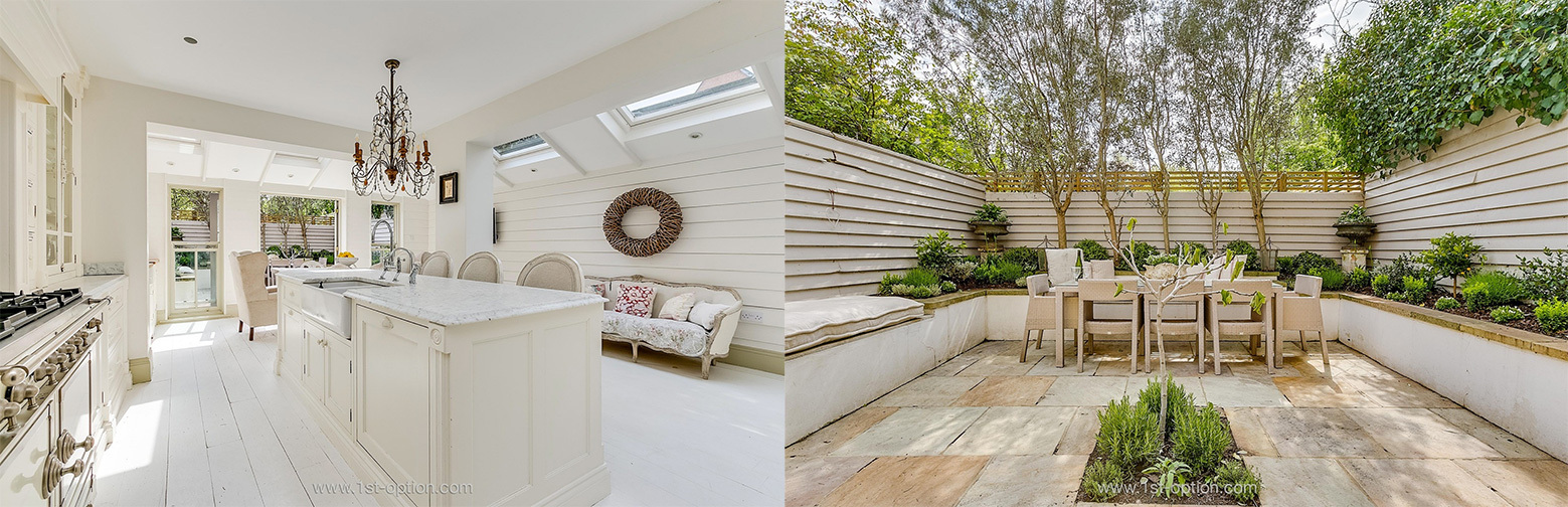
Porcelain
Looking for something slightly more crisp and elegantly trimmed? Then Porcelain is most certainly the property for you. This dainty, shabby chic shoot location, located in South West London, is a returning favourite for 1st Option and it is easy to see why. This five bedroom townhouse has a clear flow and layout that is effortlessly achieved, from the manicured garden, all the way through the interior of the property. Notable features include the gorgeous bespoke kitchen, with a fresh white colour palette, marble kitchen island and the considerable amount of wood – giving off distinct New England vibes. An abundance of windows and skylights bring out the freshness of Porcelain, producing a light and airy shoot location that is ideal for any type of photography.
Shabby chic design with a manicured garden at Porcelain
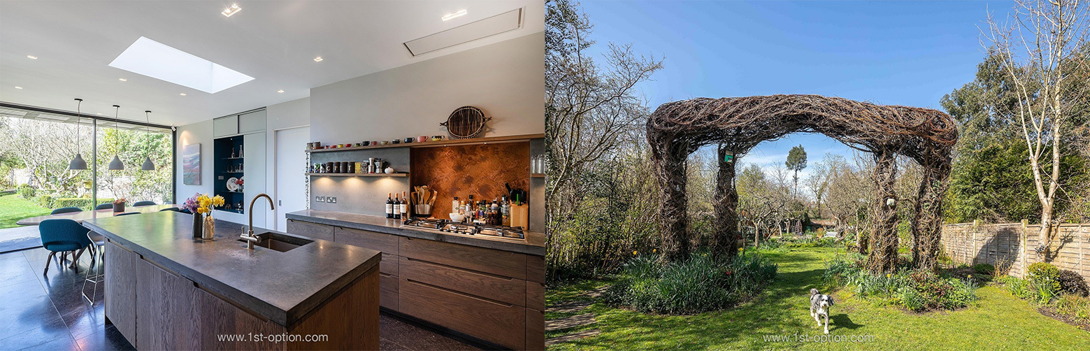
Dacres
What’s a top five without a quirky, unusual option? Dacres perfectly mixes contemporary design with quirky and artistic cues – achieved through an impeccable, modern restoration and a wealth of colour and texture. One of the standout features you cannot overlook within this property, is its extraordinary back garden that features an array of quirky trees (including a magical branch arch) and a quaint little pond. This is complimented by a quirky artist’s studio found at the back of the garden, which offers incredibly unique imagery. Upon entering the interior of the house, you are met by a gateway to a different world. This Victorian villa has been restored to an extremely high standard, with tons of premium features. These features include Belgian Blue limestone flooring, colour and texture throughout and a gorgeous kitchen island finished with concrete countertop. If you are looking for editorial shoots that blend quirky with contemporary, then Dacres is the place for you.
The blend of premium design and quirky elements at Dacres
When living in a small house or apartment, decorating can feel like an impossible task. You want to show off your personality and fit as much in as possible, but don’t want the space to feel cramped. Accommodating everything is where the challenge lies, but is also where the fun is. Creating space where there isn’t, takes hard work and creativity. Finding solutions to these obstacles is what makes the process so rewarding in the end. Whether you live in a studio apartment and want to make the most of the whole space, or you have a tight room within your house, there are tons of design ideas that can make your space feel much larger than it actually is. Too often people compromise on style when it comes to smaller locations, so read on for our favourite design ideas for tackling your space conundrum.
Avoid Clutter
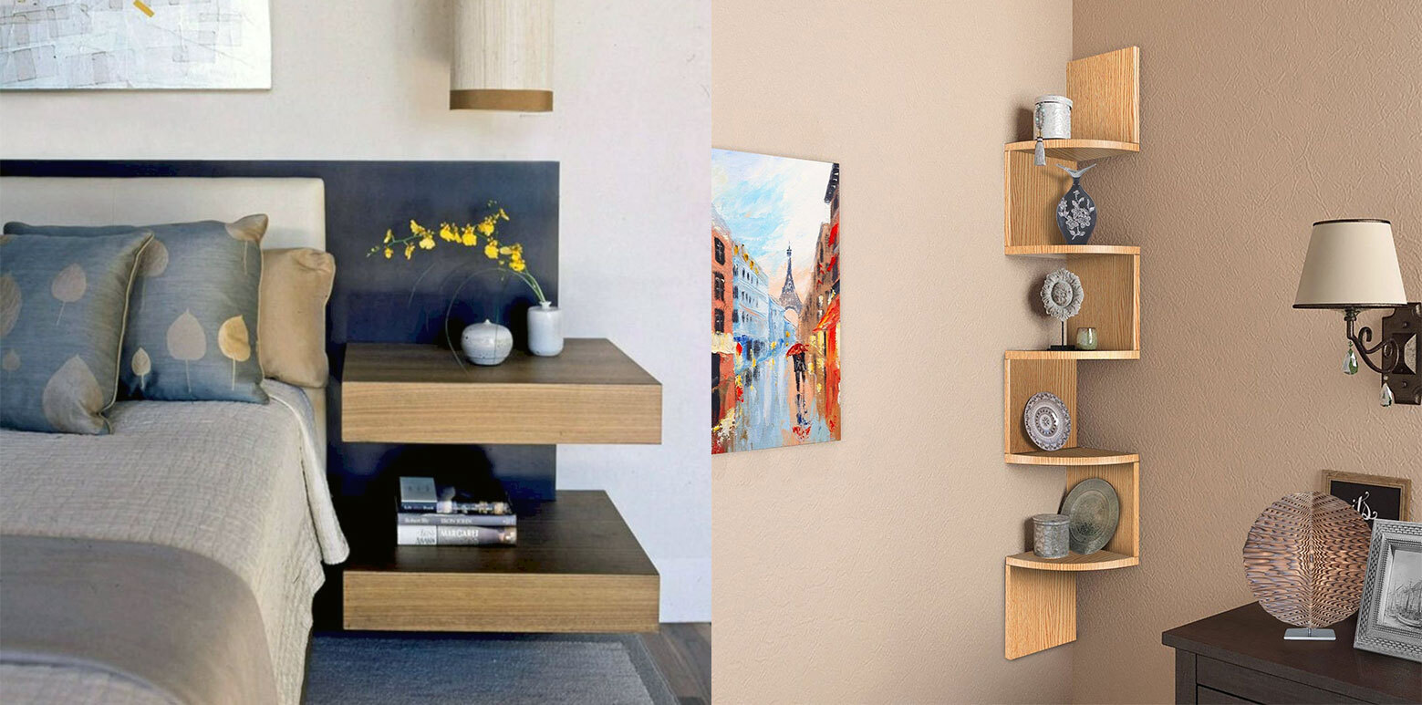
While this first point may seem fairly self evident, it is the most important and cannot be forgotten. Obviously there are essentials that are needed within any space, however, even the most elegantly designed room won’t work if you can’t walk within it. There are many ways to showcase your personality and style, without cluttering the area. Floating pieces are great; they don’t suffocate the room, while still imprinting on the area. Consider shelves and nightstands, as they keep space underneath free. Instead of buying floor lamps, take a look at sconces and wall lights.
Avoid clutter with floating and mounted furniture
Be Resourceful
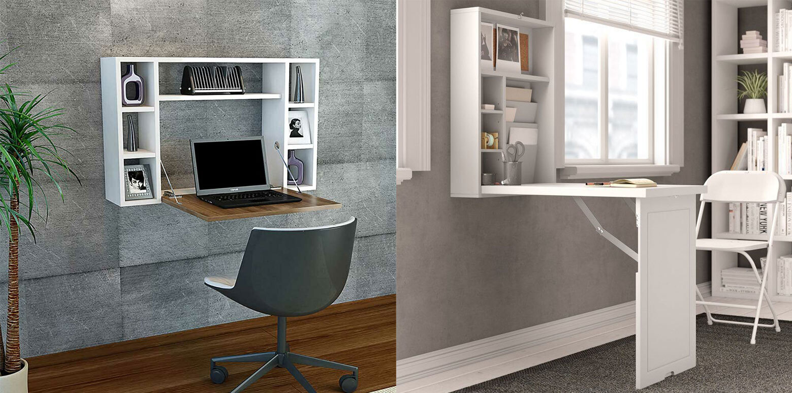
Thinking outside the box is fundamental when it comes to styling a small room or apartment. Picking furniture can be incredibly tricky, one piece could completely swarm the room and before you know it, everything is cramped. Sliding doors with substantial glass panels are a great idea – they can separate areas when needed, but also give an open plan feel that allows light to flow throughout the place. Fold away desks are also an ingenious way of creating space when needed, while still putting your spin on the room. Similarly, being resourceful with furniture helps to de-clutter; think: chairs for bedside tables, cubes that can act as coffee tables and sofas that can double up as beds.
Fold away desks free up tons of space
Light is Key
Due to cramped conditions with tiny or non-existent windows, small spaces can often feel dark and gloomy. To avoid the place feeling claustrophobic, fill rooms with light. If you don’t have much window space, think about soft lighting – achieved through wall lights and carefully positioned floor lamps. Skylights are another way to bring out the clean lines of your furniture without having to take up room within the space.
Skylights allow so much light into the smallest spaces
Reflective Materials
Reflective materials like glossy wall tiles, shiny surfaces and mirrors bounce light around the room. This creates the effect of space and leaves the place feeling airy and tranquil. If you don’t have an abundance of light, mirrors can help elevate the room – reflecting the light around and brightening up the area.
Frognal uses mirrors and Canbury uses tiles to bounce light around
Neutral Colour Scheme
While it isn’t imperative to stick with a neutral colour scheme (dark and dramatic aesthetics certainly have their place), calm and even-toned colour palettes trick the eye into the illusion of more space. To avoid making the room feel flat, make sure to texture where possible, through cushions, throws and rugs.
Eco House and Kingswood elegantly show how to use neutral colour schemes
Express Yourself
This is where designing can become a passion project rather than a chore! While neutral colours trick the brain into thinking a room is bigger than it actually is, small doesn’t have to be a white box. Decorating with bold, standout pieces draws attention and takes away from the size of the space. Since expressing through endless pieces of furniture isn’t achievable, beautifying larger units is a great way to get your personality across. Try decorating these larger units with plants, colour and other decorative elements.
Express yourself through colour and plants like Dray Gardens has here
Clear Cohesion
There are only so many things anyone can consider in a small room, so making sure items, styles and colours aren’t mismatched is imperative. Stick with one encompassing aesthetic and run with it – whether it’s light and airy or dark and moody, be confident and don’t saturate with too many colours. Having a clear flow makes the space feel bigger, so really think about every piece and whether it belongs there.
A small space doesn’t have to mean miniature furniture! In fact, having a few standout pieces intermingled with more slight furniture actually draws the eye, making the room far more memorable. Try mixing regular furniture with large walled artwork – the juxtaposition of small and large, without losing space on the ground is a great way to play with scale.
Playing with scale can make a room look a lot bigger
Use the Architectural Quirks
By now we have made it apparent that every inch counts, so taking full advantage of the architectural quirks a house has can really help maximise the space. Ledges and window sills can be used as shelving, the neglected window nook can be turned into a sofa space and investing in a radiator cover can be a subtle way of getting your character across. By adding these elements, you can forgo the bulky shelving unit and cumbersome sofa, freeing up space for other pieces.
We love the use of these window nooks here
Hide your TV
A television can be one of the biggest space wasters going! Think about mounting your TV onto a wall – not only does this regain vital floor space, but if your living room doubles up as a dining room or space for entertaining, you can hide it behind artwork.
Artwork can be a great way to hide your tv
Make every piece count
Functionality is key when it comes to decorating a space. If a piece of furniture only has one function, while taking up a lot of space, consider whether it’s worth keeping. For example, instead of having an end-of-the-bed bench, swap in a desk that can be used for working or getting ready and has space for storage underneath!
End-of-bed desks are great ways to make space
Keep it Cosy
Although the other points look at how to maximise space and create the illusion of a bigger room, sometimes leaning on the smallness of a place can end up being the best part of it. By keeping the area intimate, through bringing furniture away from the walls and closer to each other, you are able to make it inviting and cosy.
Make every room inviting and cosy regardless of size
Whether it’s lunch, landscapes or locations, the question everyone is constantly asking – is it Instagrammable? Instagram has long developed from the vocational app that people used to connect with their friends, through the medium of picture. Today we see over 1 billion people using the app monthly, and of those, 71% are under the age of 35. Instagram is growing exponentially, with experts predicting we would only hit these numbers by 2024, only two years ago. Using instagram in line with your business goals has never been more important. Check out five of our most instagrammable locations, to help with your business or personal account growth!
Blackwood House
First up is the extremely eye-catching Blackwood House. With over 1 billion monthly users, it’s safe to say that you need something extraordinary to stand out from the crowd – Blackwood House will certainly achieve this. From the exterior completely cladded in black stained wood, to the gorgeous, modern, minimalist interior, you’ll be sure to find those one-of-a-kind shots to grab users’ attention!
Clapton Tram Shed
We have established the need for unique imagery as a tool to help set you apart and Clapton Tram Shed is certainly going to achieve this! This historic tram depot has been converted into one of the most iconic studios London has to offer – it was originally used as a stable for the horses that pulled the trams of London. The studio itself is finished with white brick throughout and features skylights running the entirety of the space, so natural light is a given. However, its unforgettable element comes from the abundance of plants that swarm the space. Found on nearly every inch of the studio, days could pass and fascinating shots would still be found.
The House
Individuality can be achieved through many mediums or artforms. If Clapton Tram Shed accomplishes this through biophilia and light, The House manages it through an unforgettable run-down aesthetic. As seen in such publications as British Vogue, The House is one of the most distressed shoot locations out there. This incredible space is remarkably quirky, offering a wealth of antique furniture, distressed walls and wood panelling. If you are after moody shots, The House is the spot for you.
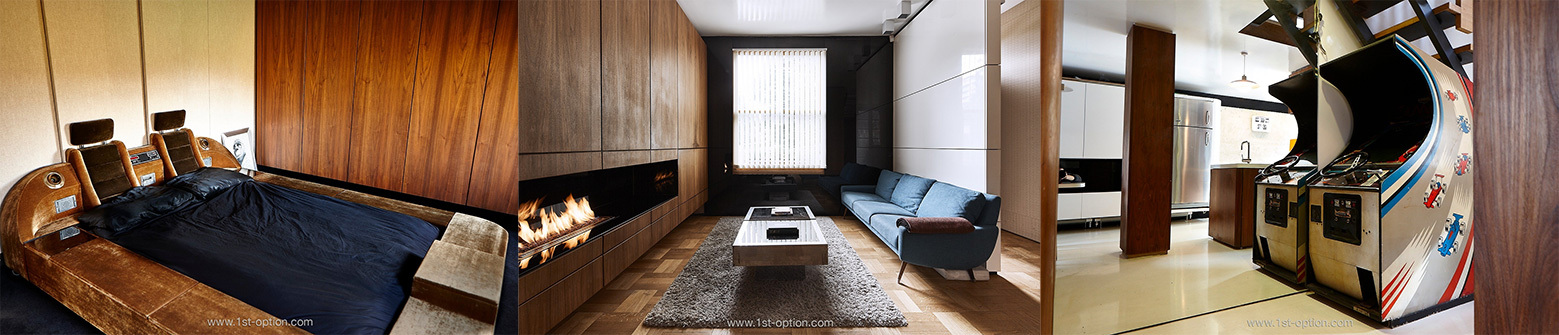
Lichfield
From antiquated and moody, to LA in the 70’s, we really do cover all bases here at 1st Option! Lichfield is a particularly unique shoot location and screams “Instagrammable” from the moment you lay eyes on the space. Upon entering the property, you are met by a punch of retro vibes that offer a myriad of memorable shots. Standout features inside include the retro arcade game, velour bed and the space pod. However, the quirky garden space and the unique built-in fire also present impressive shooting opportunities.
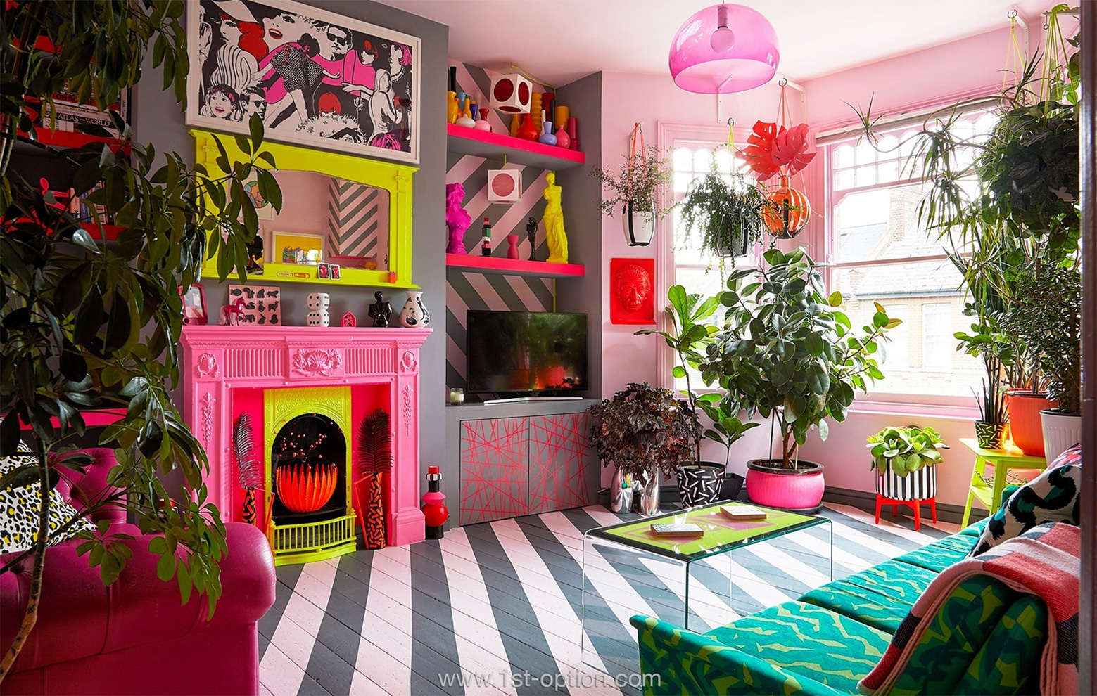
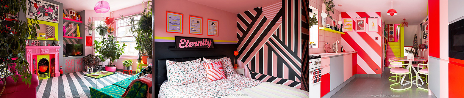
Pop
With 72% of Instagram’s users admitting that imagery has influenced their decision making, finding that standout shot is imperative. We can safely say that you won’t find just the one at Pop. Striking and unforgettable are understatements when it comes to this property! This unique shoot location features an overarching colour palette of pink and yellow, that leaves a lasting impression. In most circumstances this would be enough to satisfy the Instagram powers that be, however, Pop isn’t quite done there. With patterns galore, an astonishing amount of artwork and quirky furniture, you could be here an eternity and most likely never run out of new and exciting instagrammable content!